eBook - ePub
The Anatomy of Type
Stephen Coles
This is a test
Compartir libro
- 256 páginas
- English
- ePUB (apto para móviles)
- Disponible en iOS y Android
eBook - ePub
The Anatomy of Type
Stephen Coles
Detalles del libro
Vista previa del libro
Índice
Citas
Información del libro
The Anatomy of Type is the ultimate stylistic guide to the intricacies and design of 100 indispensable typefaces. A delightful, colorful, and visual reference guide created by Stephen Coles and Tony Seddon—two acknowledged pros in the font design world— The Anatomy of Type was developed with typographers, graphic designers, and font geeks in mind, graphically and visually expanding on the current font-mania initiated by Simon Garfields's Just My Type.
Preguntas frecuentes
¿Cómo cancelo mi suscripción?
¿Cómo descargo los libros?
Por el momento, todos nuestros libros ePub adaptables a dispositivos móviles se pueden descargar a través de la aplicación. La mayor parte de nuestros PDF también se puede descargar y ya estamos trabajando para que el resto también sea descargable. Obtén más información aquí.
¿En qué se diferencian los planes de precios?
Ambos planes te permiten acceder por completo a la biblioteca y a todas las funciones de Perlego. Las únicas diferencias son el precio y el período de suscripción: con el plan anual ahorrarás en torno a un 30 % en comparación con 12 meses de un plan mensual.
¿Qué es Perlego?
Somos un servicio de suscripción de libros de texto en línea que te permite acceder a toda una biblioteca en línea por menos de lo que cuesta un libro al mes. Con más de un millón de libros sobre más de 1000 categorías, ¡tenemos todo lo que necesitas! Obtén más información aquí.
¿Perlego ofrece la función de texto a voz?
Busca el símbolo de lectura en voz alta en tu próximo libro para ver si puedes escucharlo. La herramienta de lectura en voz alta lee el texto en voz alta por ti, resaltando el texto a medida que se lee. Puedes pausarla, acelerarla y ralentizarla. Obtén más información aquí.
¿Es The Anatomy of Type un PDF/ePUB en línea?
Sí, puedes acceder a The Anatomy of Type de Stephen Coles en formato PDF o ePUB, así como a otros libros populares de Diseño y Tipografía. Tenemos más de un millón de libros disponibles en nuestro catálogo para que explores.
Información
Categoría
DiseñoCategoría
TipografíaGeometric Sans

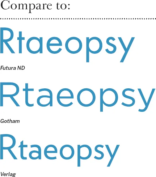
Futura ND
Avenir
Gotham
ITC Avant Grade Gothic
Calibra/Metric
FF DIN
Interstate
Verlag
Klavika
MVB Solano Gothic
Forza
Futura ND
Designer: (Paul Renner) Marie-Therésè Koreman // Foundry: (Bauer Type Foundry) Neufville // Country of origin: (Germany) Spain // Release years: (1927) 1999–2012 // Classification: Geometric Sans

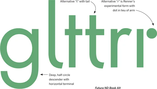
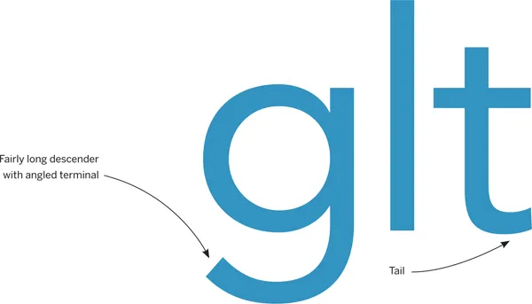
Futura has become widely known as the prototypical Geometric typeface. Bauhaus experiments in geometric form led Paul Renner to develop a typeface that was initially made entirely of straight lines and circular shapes. This was eventually tamed into more conventional letterforms, but they remained mostly Geometric. Futura’s capitals are based on classical proportions, explaining their variable widths. There are countless digital versions, but Futura ND comes directly from original sources, and the latest release includes alternatives previously unavailable. Caution: the protrusion of pointed apexes (“M,” “N,” “w”) is called “overshoot,” an optical compensation for type intended for Text sizes, but potentially distracting when large.
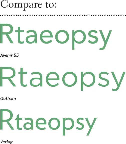
Avenir
Designer: Adrian Frutiger // Foundry: Linotype, Germany // Country of origin: France, Germany Release year: 1988 // Classification: Geometric Sans

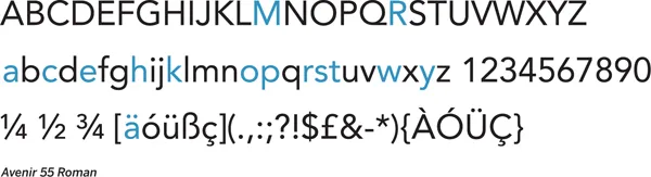
“Right from the beginning, I was convinced that Avenir is the better Futura,” said a confident Adrian Frutiger in a recent interview looking back at his 1988 creation. In some respects, his declaration was more than mere boasting — coming 60 years after Futura, Avenir remedied many of the compromises that Renner made in his quest for geometry. Frutiger abandoned pure circles and strictly even stroke weight for “corrected” curves and a bit of contrast. Letter widths are more regular, the x-height is larger, and a double-story “a” replaces the less legible single-story one. Avenir retains the simplicity and clarity of a Geometric sans serif; it just does it more gracefully, sacrificing graphical purity for readability. Good for: Comfortable geometric type.
Gotham
Designer: Tobias Frere-Jones // Foundry: Hoefler & Frere-Jones // Country of origin: United States Release year: 2000 // Classification: Geometric Sans

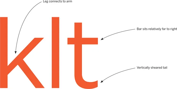
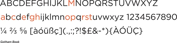
One can’t really describe this Hoefler & Frere-Jones creation better than H&FJ themselves: “Gotham. What letters look like.” The typeface is simply self-evident. Each character just feels “normal” and “right.” Inspired by mid-century architectural lettering of New York City, Gotham celebrates the alphabet’s most ...