
eBook - ePub
The Anatomy of Type
Stephen Coles
This is a test
Condividi libro
- 256 pagine
- English
- ePUB (disponibile sull'app)
- Disponibile su iOS e Android
eBook - ePub
The Anatomy of Type
Stephen Coles
Dettagli del libro
Anteprima del libro
Indice dei contenuti
Citazioni
Informazioni sul libro
The Anatomy of Type is the ultimate stylistic guide to the intricacies and design of 100 indispensable typefaces. A delightful, colorful, and visual reference guide created by Stephen Coles and Tony Seddon—two acknowledged pros in the font design world— The Anatomy of Type was developed with typographers, graphic designers, and font geeks in mind, graphically and visually expanding on the current font-mania initiated by Simon Garfields's Just My Type.
Domande frequenti
Come faccio ad annullare l'abbonamento?
È semplicissimo: basta accedere alla sezione Account nelle Impostazioni e cliccare su "Annulla abbonamento". Dopo la cancellazione, l'abbonamento rimarrà attivo per il periodo rimanente già pagato. Per maggiori informazioni, clicca qui
È possibile scaricare libri? Se sì, come?
Al momento è possibile scaricare tramite l'app tutti i nostri libri ePub mobile-friendly. Anche la maggior parte dei nostri PDF è scaricabile e stiamo lavorando per rendere disponibile quanto prima il download di tutti gli altri file. Per maggiori informazioni, clicca qui
Che differenza c'è tra i piani?
Entrambi i piani ti danno accesso illimitato alla libreria e a tutte le funzionalità di Perlego. Le uniche differenze sono il prezzo e il periodo di abbonamento: con il piano annuale risparmierai circa il 30% rispetto a 12 rate con quello mensile.
Cos'è Perlego?
Perlego è un servizio di abbonamento a testi accademici, che ti permette di accedere a un'intera libreria online a un prezzo inferiore rispetto a quello che pagheresti per acquistare un singolo libro al mese. Con oltre 1 milione di testi suddivisi in più di 1.000 categorie, troverai sicuramente ciò che fa per te! Per maggiori informazioni, clicca qui.
Perlego supporta la sintesi vocale?
Cerca l'icona Sintesi vocale nel prossimo libro che leggerai per verificare se è possibile riprodurre l'audio. Questo strumento permette di leggere il testo a voce alta, evidenziandolo man mano che la lettura procede. Puoi aumentare o diminuire la velocità della sintesi vocale, oppure sospendere la riproduzione. Per maggiori informazioni, clicca qui.
The Anatomy of Type è disponibile online in formato PDF/ePub?
Sì, puoi accedere a The Anatomy of Type di Stephen Coles in formato PDF e/o ePub, così come ad altri libri molto apprezzati nelle sezioni relative a Design e Typography. Scopri oltre 1 milione di libri disponibili nel nostro catalogo.
Informazioni
Argomento
DesignCategoria
TypographyGeometric Sans

Futura ND
Avenir
Gotham
ITC Avant Grade Gothic
Calibra/Metric
FF DIN
Interstate
Verlag
Klavika
MVB Solano Gothic
Forza
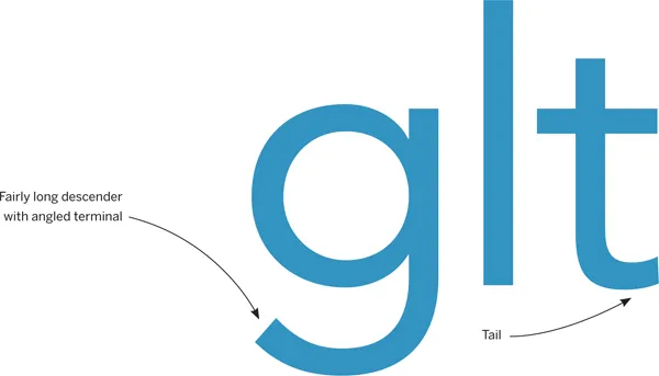
Futura ND
Designer: (Paul Renner) Marie-Therésè Koreman // Foundry: (Bauer Type Foundry) Neufville // Country of origin: (Germany) Spain // Release years: (1927) 1999–2012 // Classification: Geometric Sans

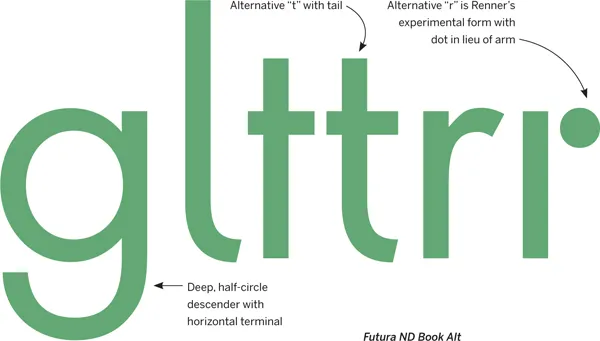
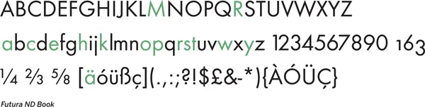
Futura has become widely known as the prototypical Geometric typeface. Bauhaus experiments in geometric form led Paul Renner to develop a typeface that was initially made entirely of straight lines and circular shapes. This was eventually tamed into more conventional letterforms, but they remained mostly Geometric. Futura’s capitals are based on classical proportions, explaining their variable widths. There are countless digital versions, but Futura ND comes directly from original sources, and the latest release includes alternatives previously unavailable. Caution: the protrusion of pointed apexes (“M,” “N,” “w”) is called “overshoot,” an optical compensation for type intended for Text sizes, but potentially distracting when large.
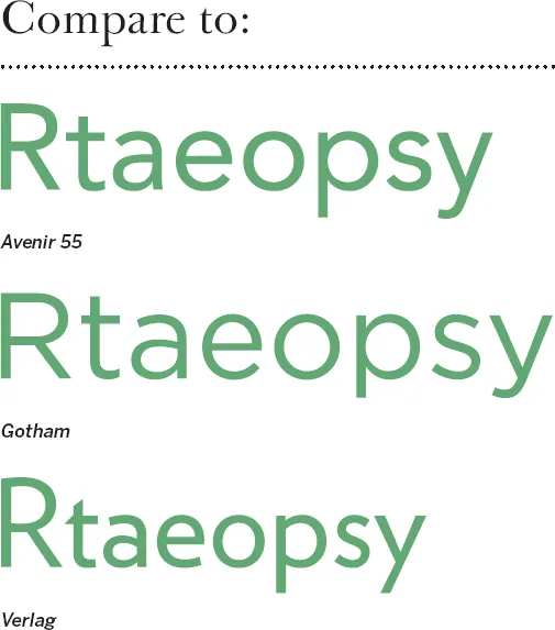
Avenir
Designer: Adrian Frutiger // Foundry: Linotype, Germany // Country of origin: France, Germany Release year: 1988 // Classification: Geometric Sans

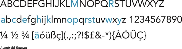
“Right from the beginning, I was convinced that Avenir is the better Futura,” said a confident Adrian Frutiger in a recent interview looking back at his 1988 creation. In some respects, his declaration was more than mere boasting — coming 60 years after Futura, Avenir remedied many of the compromises that Renner made in his quest for geometry. Frutiger abandoned pure circles and strictly even stroke weight for “corrected” curves and a bit of contrast. Letter widths are more regular, the x-height is larger, and a double-story “a” replaces the less legible single-story one. Avenir retains the simplicity and clarity of a Geometric sans serif; it just does it more gracefully, sacrificing graphical purity for readability. Good for: Comfortable geometric type.
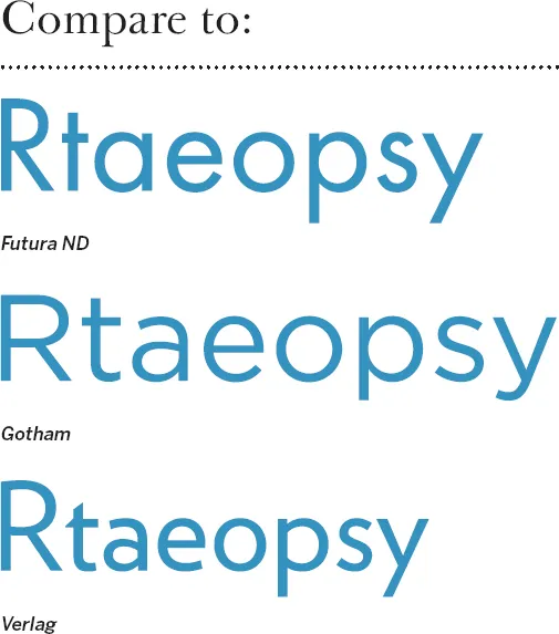
Gotham
Designer: Tobias Frere-Jones // Foundry: Hoefler & Frere-Jones // Country of origin: United States Release year: 2000 // Classification: Geometric Sans

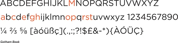
One can’t really describe this Hoefler & Frere-Jones creation better than H&FJ themselves: “Gotham. What letters look like.” The typeface is simply self-evident. Each character just feels “normal” and “right.” Inspired by mid-century architectural lettering of New York City, Gotham celebrates the alphabet’s most ...