![]()
1. Reading a “Distinctive” Brooklyn
Noticing Two Brooklyn Sign Types
SHORTLY AFTER MOVING to Brooklyn in 2003, we shared some initial field notes about our observations of the borough with John Jay College undergraduates in an Anthropology 101 class, most of whom were New York City natives. When one of us jokingly complained that Brooklyn was “the kind of place where people cram as many words as possible on a storefront sign,” the room filled with the laughter of recognition. The students’ chuckles indicated to us that they knew exactly what we were talking about. They told us that shop signs with a lot of words represented a “back-in-the-day-ness” or an “old school” Brooklyn. They explained that old school meant “origin” or “of another era,” but one deserving “respect.” We quickly realized that, with no sign in front of them to read, the students’ laughter revealed that they interpreted such signage emically as a textual norm. In other words, it was a feature of an everyday commercial landscape that they recognized and could picture in their minds. Their efforts to explain such signs with a reference to the past also revealed that this norm was in dialogue with a rapidly changing city, one that included the appearance of both the corporate signage of big chains and new shops throughout Brooklyn whose signs were quite different from these old school texts. Linguistic landscape scholars Aneta Pavlenko and Alex Mullen (2015, 114–15) have argued that interpretation of signage is “intrinsically linked to the preceding signs in the same environment and to related signs elsewhere and is thus diachronic in nature.” So the student’s laughter, and their emphasis on time, also suggested that there was a story that was perhaps worth exploring here about what we had originally perceived to be these wordy, old school signs that represented a back-in-the-day Brooklyn.
Figure 1.1. Typical Brooklyn retail block. There are often up to ten storefronts per block on each side of the street.
Figure 1.2. The Guzman Business Services storefront has more than forty words, nonstandard forms of English, repetition, and extra signage.
In order to get to this story of what the signs “say,” we would like to take the reader on a walk down several Brooklyn streets to take a careful look at these text-rich storefronts and consider what features they share. Following this tour of wordy signage, we will take a closer look at newer shop signs which have far fewer or almost no words at all. After noting the shared features of these new signs, we will consider the sociolinguistic significance of the features of each of these two types of signage and also hear from Brooklynites about how they read these different signs.
The text-rich signs, which first caught our eye, are found across Brooklyn. They mark a broad variety of businesses, many of which have been in the area for several decades. For example, Figure 1.1 shows a typical street scene in the Brooklyn neighborhood of Sunset Park. You can see that such text-dense store signs are on all sorts of retail establishments. In some cases, words cover not only the sign but the entire storefront. Reading the street from left to right, we find twenty-nine words on the sign for Kang Yue Inc. Baby Food and Formula Grocery Store. Next to it, on NB Deli Grocery’s sign are twenty-two words. And on the sign for GBS Guzman Business Services there are also twenty-two words. We know right away what sort of businesses these shops are because all three signs incorporate this information in their names and provide an explicit list of the goods or services they offer. In Figure 1.2, Guzman Business Services, for example, lists all kinds of business services on its main sign. These range from completing income taxes and registration to providing Department of Motor Vehicles services for various types of cabs (livery, black, and TLC—Taxi and Limousine Commission or yellow taxis). On the display windows below the store’s main sign, there are twenty-six more words that both repeat information already listed on the main sign (e.g., “business registrations,” “notary public,” “auto-insurance”) and add new information not previously listed (e.g., “translations, book-keeping and payroll” and “Internet”).
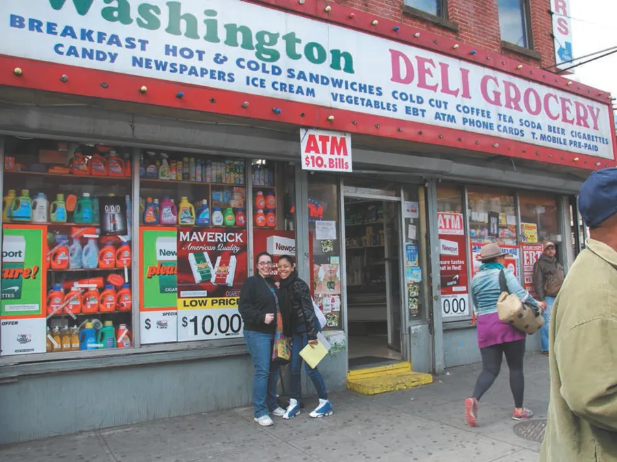
Moving over to another neighborhood, this time in Clinton Hill, we see in Figure 1.3 Washington Deli Grocery on the corner of Fulton Street and Washington Avenue. In addition to containing twenty-one words, this store’s sign includes two acronyms (EBT for Electronic Benefits Transfer, which is a state-sponsored social welfare card payment plan, and ATM for automated teller machine). Again, even though the name of the store explicitly identifies its commercial function, the sign nevertheless lists twelve items one would expect to find in a deli/grocery, including the type of phone cards the business carries. Additional smaller signs and advertisements on the storefront below the sign adds to the shop’s textual density.
Figure 1.3. Washington Deli and Grocery. This storefront includes additional signage, lists of products and services including electronic benefits transfer (EBT), and a sign advertising an ATM machine that dispenses small bills.
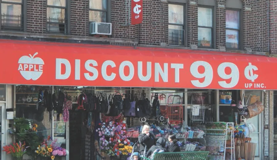
But textual density does not mean just lots of words. The term also refers to the size of a sign’s letters in its wording. Text-dense signs thus also include those whose words appear in large font-sizes that often take up almost the entire field of the sign, as seen in Figure 1.4. Large font sizes are not reserved for only discount stores. Figures 1.5 and 1.6 show two expensive Brooklyn restaurants which follow this style, utilizing large lettering not only for their names but also, as we saw in earlier examples, to advertise the food they serve. And they repeat this information with large-font text or pictures or both.
Figure 1.4. The Apple Discount sign uses large lettering, nonstandard English writing. An ancillary sign above it repeats information.
Figure 1.5. This Italian restaurant, La Sorrentina, has signage along several storefronts with large lettering, repetition, and pictures of the food that it serves.
In addition to describing what is on offer and repeating information through words and pictures or photographs on their signs, many text-rich Brooklyn storefronts also accomplish description and reiteration by showcasing the range of their products in abundant window displays (see for example Figures 1.3 and 1.5 above). Some businesses use the sidewalks as well to advertise what they sell by bringing the items out every day and putting them on racks or tables to be viewed by people as they pass by (Figure 1.4). These displays reiterate, with actual examples, the products that are written on their signs.
Another salient feature of many Brooklyn storefronts that we noticed is the presence of nonstandard or nonprescriptive forms of written English. For example, in the GBS Business Services storefront (Figure 1.2), the word TYPE (“ALL TYPE OF INSURANCE”) is missing the necessary /-s/, the morphosyntactic plural marker with which the word would occur in Standard English. Notice also that the services listed are nonparallel, meaning that plural and singular forms are mixed: “INCOME TAX RETURNS / BUSINESS REGISTRATION / BUSINESS LICENSES / NOTARY PUBLIC.” Language prescriptivists like Strunk and White (2014), who provide examples of standard American English, would require, where appropriate, all plural or all singular nouns. In the Washington Deli Grocery sign in Figure 1.3, the word cold cut is missing an s, with which the word always occurs in Standard English. In Figure 1.4, while most 99-cent stores advertise that items cost “99 cents and up,” Apple Discount elides the “and” and reads as if something is missing: “99¢ UP INC.” Other examples of nonstandard spelling and syntax will occur in text-dense sign examples throughout this book.
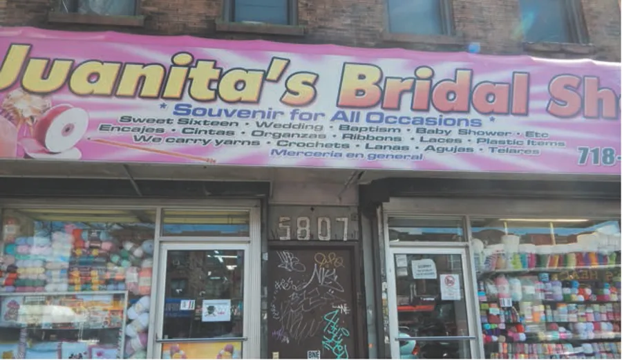
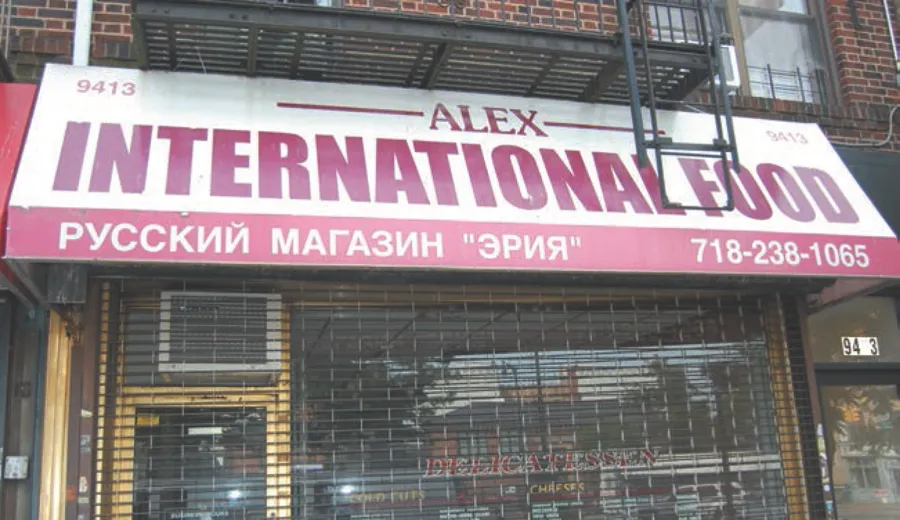
Figures 1.7 and 1.8 depict signage in Brooklyn that incorporates languages other than English. Juanita’s Bridal Shop not only explains that it provides “Souvenir for All Occasions,” but it lists them in Spanish as well. Sometimes, as is the case with the bridal shop sign, the translation to English is slightly off. The word souvenir is likely to be a translation of the Spanish word recuerdos, a term used to refer both to small trinkets one purchases on a trip (i.e., souvenirs in English) and small tokens of appreciation given by hosts to their guests as thanks for attending their event (mementos or favors in English). It seems Juanita’s Bridal Shop means mementos and not souvenirs in this case. Similarly, the translations of the Spanish words “Encajes, Cintas, Organzas” (meaning laces, ribbons, and organzas) do not map onto the English glosses that follow on the sign, which are “Ribbons, Laces, Plastic Items,” and they are listed out of order. In Figure 1.8, on the Russian deli called Alex International Food we find non-Roman script accompanying English words that refer to what is sold there.
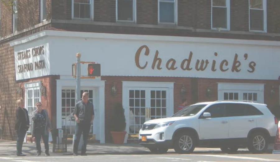
Figure 1.6. Chadwick’s is an upscale restaurant in Bay Ridge with large lettering and a list that indicates the types of food that it serves.
Figure 1.7. Juanita’s Bridal Shop’s storefront has both English and Spanish text, lists its products and services, and includes ancillary signage.
Figure 1.8. The signage for Alex International Food includes Roman and Cyrillic alphabets and large lettering.
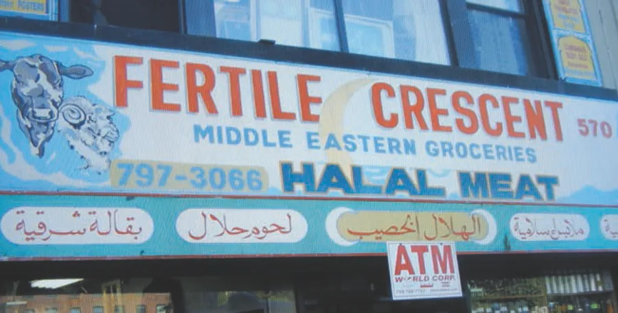
Figure 1.9. Note on this storefront the painted images of a cow and a ram as well as a nonstandard phone number, explicit religious references, and information in English (Roman script) and Arabic (Arabic script), as well as a sign for an ATM.
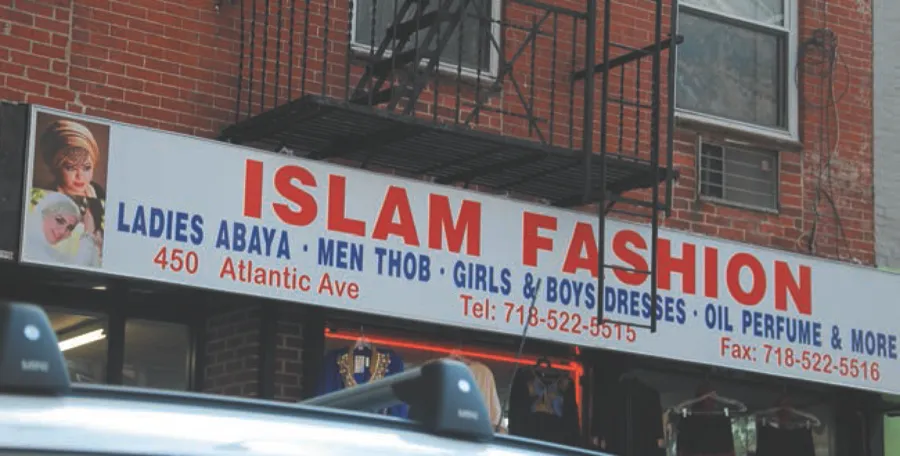
Figure 1.10. This sign includes an explicit reference to religion and images of women wearing head-scarves.
In addition to large fonts, nonstandard English, and languages other than English, some text-dense signs make direct references to religion. In Figure 1.9, Fertile Crescent, a grocery in Boerum Hill, makes several explicit references to Islam in English and in Arabic, and also pictorially, including words such as kutub a’rabia (Arabic books); milabes Islamia (Islamic clothes); alhilal al-khaseeb (fertile crescent); lhoom halal (halal meats); and baqalat sharqia (eastern groceries).1 A crescent moon, an emblem of Islam, inhabits the background of the main sign, and ancillary signs running up the sides of the second floor windows contain Islamic arches with English words advertising “Islamic clothes,” “Prayer rugs,” and “Islamic posters.” Likewise, the sign for Islam Fashion on Flatbush Avenue (Figure 1.10), includes a large picture of two women wearing head-coverings in addition to explicit text. A sign for Little Lords, Little Ladies in Bay Ridge explicitly advertises children’s wear for the Christian rituals of communions, weddings, and christenings.2 Similarly direct religious references can be spotted in Figures 1.11 and 1.12 on signs incorporating Christian and Jewish words and iconography.
Figure 1.11. Michael’s Holy Land Gifts reiterates that it sells Christian religious items.
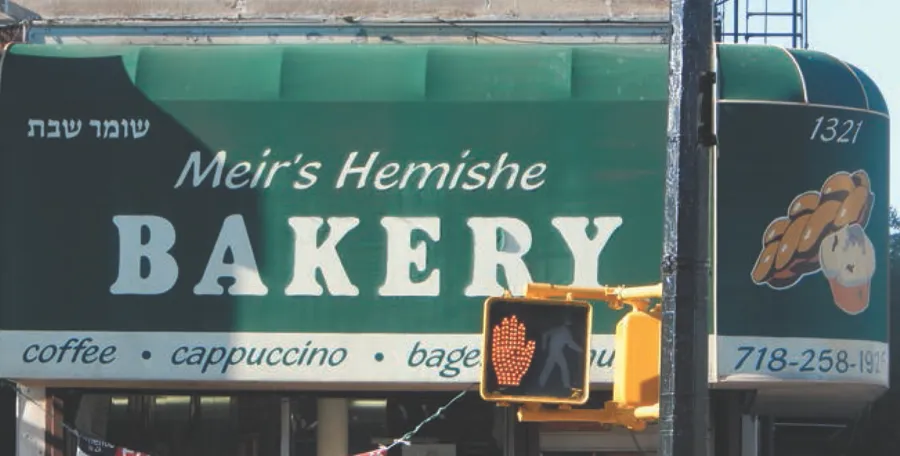
Figure 1.12. Meir’s Hemishe Bakery has large lettering with both English and Yiddish (in Roman and Hebrew script) as well as a list of beverages one can purchase inside.
Brooklyn has been known as the borough of churches because its cityscape includes multiple church steeples. But its storefronts have also been converted into houses of worship, or “storefront churches.” The Revere...