Analytics Stories
eBook - ePub

Analytics Stories

Using Data to Make Good Things Happen

Wayne L. Winston

Condividi libro
  1. English
  2. ePUB (disponibile sull'app)
  3. Disponibile su iOS e Android
eBook - ePub

Analytics Stories

Using Data to Make Good Things Happen

Wayne L. Winston

Dettagli del libro
Anteprima del libro
Indice dei contenuti
Citazioni

Informazioni sul libro

Inform your own analyses by seeinghow one of the best data analysts in the world approaches analytics problems

Analytics Stories: How to Make Good Things Happen is a thoughtful, incisive, and entertaining exploration of the application of analytics to real-world problems and situations. Covering fields as diverse as sports, finance, politics, healthcare, and business, Analytics Stories bridges the gap between theoftinscrutable world of data analytics and the concrete problems it solves.

Distinguished professor and author Wayne L. Winston answers questions like:

  • Was Liverpool over Barcelona the greatest upset in sports history?
  • Was Derek Jeter a great infielder
  • What's wrong with the NFL QB rating?
  • How did Madoff keep his fund going?
  • Does a mutual fund's past performance predict future performance?
  • What caused the Crash of 2008?
  • Can we predict where crimes are likely to occur?
  • Is the lot of the American worker improving?
  • How can analytics save the US Republic?
  • The birth of evidence-based medicine: How did James Lind know citrus fruits cured scurvy?
  • How can I objectively compare hospitals?
  • How can we predict heart attacks in real time?
  • How does a retail store know if you're pregnant?
  • How can I use A/B testing to improve sales from my website?
  • How can analytics help me write a hit song?

Perfect for anyone with the word "analyst" in their job title, Analytics Stories illuminates the process of applying analytic principles to practical problems and highlights the potential pitfalls that await careless analysts.

Domande frequenti

Come faccio ad annullare l'abbonamento?
È semplicissimo: basta accedere alla sezione Account nelle Impostazioni e cliccare su "Annulla abbonamento". Dopo la cancellazione, l'abbonamento rimarrà attivo per il periodo rimanente già pagato. Per maggiori informazioni, clicca qui
È possibile scaricare libri? Se sì, come?
Al momento è possibile scaricare tramite l'app tutti i nostri libri ePub mobile-friendly. Anche la maggior parte dei nostri PDF è scaricabile e stiamo lavorando per rendere disponibile quanto prima il download di tutti gli altri file. Per maggiori informazioni, clicca qui
Che differenza c'è tra i piani?
Entrambi i piani ti danno accesso illimitato alla libreria e a tutte le funzionalità di Perlego. Le uniche differenze sono il prezzo e il periodo di abbonamento: con il piano annuale risparmierai circa il 30% rispetto a 12 rate con quello mensile.
Cos'è Perlego?
Perlego è un servizio di abbonamento a testi accademici, che ti permette di accedere a un'intera libreria online a un prezzo inferiore rispetto a quello che pagheresti per acquistare un singolo libro al mese. Con oltre 1 milione di testi suddivisi in più di 1.000 categorie, troverai sicuramente ciò che fa per te! Per maggiori informazioni, clicca qui.
Perlego supporta la sintesi vocale?
Cerca l'icona Sintesi vocale nel prossimo libro che leggerai per verificare se è possibile riprodurre l'audio. Questo strumento permette di leggere il testo a voce alta, evidenziandolo man mano che la lettura procede. Puoi aumentare o diminuire la velocità della sintesi vocale, oppure sospendere la riproduzione. Per maggiori informazioni, clicca qui.
Analytics Stories è disponibile online in formato PDF/ePub?
Sì, puoi accedere a Analytics Stories di Wayne L. Winston in formato PDF e/o ePub, così come ad altri libri molto apprezzati nelle sezioni relative a Business e Decision Making. Scopri oltre 1 milione di libri disponibili nel nostro catalogo.

Informazioni

Editore
Wiley
Anno
2020
ISBN
9781119646044
Edizione
1
Argomento
Business

Part I
What Happened?

In This Part
  • Chapter 1: Preliminaries
  • Chapter 2: Was the 1969 Draft Lottery Fair?
  • Chapter 3: Who Won the 2000 Election: Bush or Gore?
  • Chapter 4: Was Liverpool Over Barcelona the Greatest Upset in Sports History?
  • Chapter 5: How Did Bernie Madoff Keep His Fund Going?
  • Chapter 6: Is the Lot of the American Worker Improving?
  • Chapter 7: Measuring Income Inequality with the Gini, Palm, and Atkinson Indices
  • Chapter 8: Modeling Relationships Between Two Variables
  • Chapter 9: Intergenerational Mobility
  • Chapter 10: Is Anderson Elementary School a Bad School?
  • Chapter 11: Value-Added Assessments of Teacher Effectiveness
  • Chapter 12: Berkeley, Buses, Cars, and Planes
  • Chapter 13: Is Carmelo Anthony a Hall of Famer?
  • Chapter 14: Was Derek Jeter a Great Fielder?
  • Chapter 15: “Drive for Show and Putt for Dough?”
  • Chapter 16: What's Wrong with the NFL QB Rating?
  • Chapter 17: Some Sports Have All the Luck
  • Chapter 18: Gerrymandering
  • Chapter 19: Evidence-Based Medicine
  • Chapter 20: How Do We Compare Hospitals?
  • Chapter 21: What is the Worst Health Care Problem in My Country?

CHAPTER 1
Preliminaries

Most applications of analytics involve looking at data relevant to the problem at hand and analyzing uncertainty inherent in the given situation. Although we are not emphasizing advanced analytics in this book, you will need an elementary grounding in probability and statistics. This chapter introduces basic ideas in statistics and probability.

Basic Concepts in Data Analysis

If you want to understand how analytics is relevant to a particular situation, you absolutely need to understand what data is needed to solve the problem at hand. Here are some examples of data that will be discussed in this book:
  • If you want to understand why Bernie Madoff should have been spotted as a fraud long before he was exposed, you need to understand the “reported” monthly returns on Madoff's investments.
  • If you want to understand how good an NBA player is, you can't just look at box score statistics; you need to understand how his team's margin moves when he is in and out of the game.
  • If you want to understand gerrymandering, you need to look at the number of Republican and Democratic votes in each of a state's congressional districts.
  • If you want to understand how income inequality varies between countries, you need to understand the distribution of income in countries. For example, what fraction of income is earned by the top 1%? What fraction is earned by the bottom 20%?
In this chapter we will focus on four questions you should ask about any data set:
  • What is a typical value for the data?
  • How spread out is the data?
  • If we plot the data in a column graph (called a histogram by analytics professionals), can we easily describe the nature of the histogram?
  • How do we identify unusual data points?
To address these issues, we will look at the two data sets listed in the file 
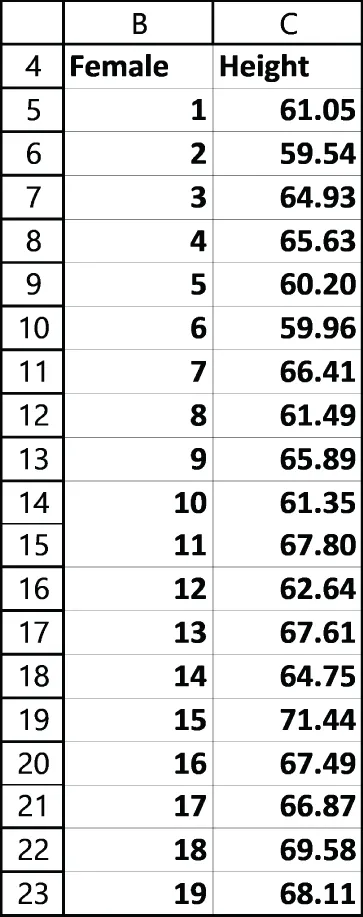
StatesAndHeights.xlsx. As shown in Figure 1.1, the Populations worksheet contains a subset of the 2018 populations of U.S. states (and the District of Columbia).
Snapshot of the U.S. state populations.
Figure 1.1: U.S. state populations
The Heights worksheet (see Figure 1.2) gives the heights of 200 adult U.S. females.
Snapshot of the heights of 200 adult U.S. women.
Figure 1.2: Heights of 200 adult U.S. women

Looking at Histograms and Describing the Shape of the Data

A histogram is a column graph in which the height of each column tells us how many data points lie in each range, or bin. Usually, we create 5–15 bins of equal length, with the bin boundaries being round numbers. Figure 1.3 shows a histogram of state populations, and Figure 1.4 shows a histogram of women's heights (in inches). Figure 1.3 makes it clear that most states have populations between 1 million and 9 million, with four states having much larger populations in excess of 19 million. When a histogram shows bars that extend much further to the right of the largest bar, we say the histogram or data set is positively skewed or skewed right.
Figure 1.4 shows that the histogram of adult women heights is symmetric, because the bars to the left of the highest bar look roughly the same as the bars to the right of the highest bar. Other shapes for histograms occur, but in most of our stories, a histogram of the relevant data would be either positively skewed or symmetric.
There is also a mathematical formula to summarize the skewness of a data set. This formula yields a skewness of 2.7 for state populations and 0.4 for women's heights. A skewness measure greater than +1 corresponds to positive skewness, a skewness between –1 and +1 corresponds to a symmetric data set, and a skewness less than –1 (a rarity) corresponds to negative skewness (meaning bars extend further to the left of the highest bar than to the right of the highest bar).
Histogram depicts the state populations.
Figure 1.3: Histogram of state populations
Histogram depicts the women's heights.
Fi...

Indice dei contenuti