Mastering Tableau 2021
Implement advanced business intelligence techniques and analytics with Tableau, 3rd Edition
Marleen Meier, David Baldwin
- 792 pagine
- English
- ePUB (disponibile sull'app)
- Disponibile su iOS e Android
Mastering Tableau 2021
Implement advanced business intelligence techniques and analytics with Tableau, 3rd Edition
Marleen Meier, David Baldwin
Informazioni sul libro
Build, design, and improve advanced business intelligence solutions using Tableau's latest features, including Tableau Prep Builder, Tableau Hyper, and Tableau Server
Key Features
- Master new features in Tableau 2021 to solve real-world analytics challenges
- Perform geo-spatial, time series, and self-service analytics using real-life examples
- Build and publish dashboards and explore storytelling using Python and R integration support
Book Description
Tableau is one of the leading business intelligence (BI) tools that can help you solve data analysis challenges. With this book, you will master Tableau's features and offerings in various paradigms of the BI domain.
Updated with fresh topics including Quick Level of Detail expressions, the newest Tableau Server features, Einstein Discovery, and more, this book covers essential Tableau concepts and advanced functionalities. Leveraging Tableau Hyper files and using Prep Builder, you'll be able to perform data preparation and handling easily. You'll gear up to perform complex joins, spatial joins, unions, and data blending tasks using practical examples. Next, you'll learn how to execute data densification and further explore expert-level examples to help you with calculations, mapping, and visual design using Tableau extensions. You'll also learn about improving dashboard performance, connecting to Tableau Server and understanding data visualization with examples. Finally, you'll cover advanced use cases such as self-service analysis, time series analysis, and geo-spatial analysis, and connect Tableau to Python and R to implement programming functionalities within it.
By the end of this Tableau book, you'll have mastered the advanced offerings of Tableau 2021 and be able to tackle common and advanced challenges in the BI domain.
What you will learn
- Get up to speed with various Tableau components
- Master data preparation techniques using Tableau Prep Builder
- Discover how to use Tableau to create a PowerPoint-like presentation
- Understand different Tableau visualization techniques and dashboard designs
- Interact with the Tableau server to understand its architecture and functionalities
- Study advanced visualizations and dashboard creation techniques
- Brush up on powerful self-service analytics, time series analytics, and geo-spatial analytics
Who this book is for
This book is designed for business analysts, business intelligence professionals and data analysts who want to master Tableau to solve a range of data science and business intelligence problems. The book is ideal if you have a good understanding of Tableau and want to take your skills to the next level.
Domande frequenti
Informazioni
8
Beyond the Basic Chart Types
- Improving popular visualizations
- Custom background images
- Tableau extensions
Improving popular visualizations
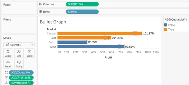
Bullet graphs
Using bullet graphs
- Navigate to https://public.tableau.com/profile/marleen.meier to locate and download the workbook associated with this chapter.
- Navigate to the worksheet entitled Bullet Graph and select the CoffeeChain data source.
- Place these fields on their respective shelves: Profit on Columns, Market on Rows, and BudgetProfit on Detail in the Marks card.
- Right-click on the x axis and select Add Reference Line.
- From the upper left-hand corner of the Edit Reference Line, Band or Box dialog box, select Line. Also, set Scope to Per Cell, Value to SUM(Budget Profit) as Average, and Label to None. Click OK:
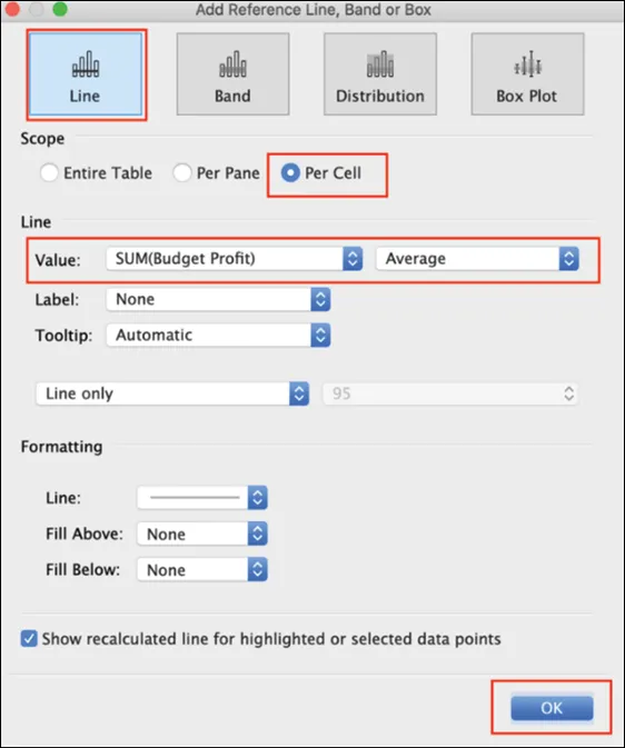 Figure 8.1: Reference line
 - Let's add another reference line. This time, as an alternative method, click on the Analytics pane and drag Reference Line onto your dashboard. (You could obviously repeat the method in Step 4 instead.)
- Within the dialog box, select Distribution and set Scope to Per Cell. Under Computation, set Value to Percentages with 90,95,100 and Percent of to SUM(Budget Profit). Set Label to None. Click OK:
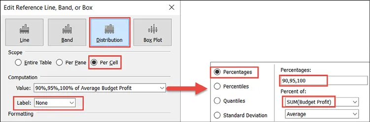 Figure 8.2: Percentiles
 - Create a calculated field called
Profit to Budget Profit Ratiowith the following code:SUM([Profit])/SUM([Budget Profit]) - Create another calculated field called
Quota Met?with the following code:SUM([Profit])>=SUM([Budget Profit]) - Right-click on Profit to Budget Profit Ratio and select Default Properties | Number Format | Percentage.
- Place Profit to Budget Profit Ratio on the Label shelf in the Marks card and Quota Met? on the Color shelf in the Marks card: