Mastering Tableau 2021
eBook - ePub

Mastering Tableau 2021

Implement advanced business intelligence techniques and analytics with Tableau, 3rd Edition

Marleen Meier, David Baldwin

Share book
  1. 792 pages
  2. English
  3. ePUB (mobile friendly)
  4. Available on iOS & Android
eBook - ePub

Mastering Tableau 2021

Implement advanced business intelligence techniques and analytics with Tableau, 3rd Edition

Marleen Meier, David Baldwin

Book details
Book preview
Table of contents
Citations

About This Book

Build, design, and improve advanced business intelligence solutions using Tableau's latest features, including Tableau Prep Builder, Tableau Hyper, and Tableau Server

Key Features

  • Master new features in Tableau 2021 to solve real-world analytics challenges
  • Perform geo-spatial, time series, and self-service analytics using real-life examples
  • Build and publish dashboards and explore storytelling using Python and R integration support

Book Description

Tableau is one of the leading business intelligence (BI) tools that can help you solve data analysis challenges. With this book, you will master Tableau's features and offerings in various paradigms of the BI domain.

Updated with fresh topics including Quick Level of Detail expressions, the newest Tableau Server features, Einstein Discovery, and more, this book covers essential Tableau concepts and advanced functionalities. Leveraging Tableau Hyper files and using Prep Builder, you'll be able to perform data preparation and handling easily. You'll gear up to perform complex joins, spatial joins, unions, and data blending tasks using practical examples. Next, you'll learn how to execute data densification and further explore expert-level examples to help you with calculations, mapping, and visual design using Tableau extensions. You'll also learn about improving dashboard performance, connecting to Tableau Server and understanding data visualization with examples. Finally, you'll cover advanced use cases such as self-service analysis, time series analysis, and geo-spatial analysis, and connect Tableau to Python and R to implement programming functionalities within it.

By the end of this Tableau book, you'll have mastered the advanced offerings of Tableau 2021 and be able to tackle common and advanced challenges in the BI domain.

What you will learn

  • Get up to speed with various Tableau components
  • Master data preparation techniques using Tableau Prep Builder
  • Discover how to use Tableau to create a PowerPoint-like presentation
  • Understand different Tableau visualization techniques and dashboard designs
  • Interact with the Tableau server to understand its architecture and functionalities
  • Study advanced visualizations and dashboard creation techniques
  • Brush up on powerful self-service analytics, time series analytics, and geo-spatial analytics

Who this book is for

This book is designed for business analysts, business intelligence professionals and data analysts who want to master Tableau to solve a range of data science and business intelligence problems. The book is ideal if you have a good understanding of Tableau and want to take your skills to the next level.

Frequently asked questions

How do I cancel my subscription?
Simply head over to the account section in settings and click on “Cancel Subscription” - it’s as simple as that. After you cancel, your membership will stay active for the remainder of the time you’ve paid for. Learn more here.
Can/how do I download books?
At the moment all of our mobile-responsive ePub books are available to download via the app. Most of our PDFs are also available to download and we're working on making the final remaining ones downloadable now. Learn more here.
What is the difference between the pricing plans?
Both plans give you full access to the library and all of Perlego’s features. The only differences are the price and subscription period: With the annual plan you’ll save around 30% compared to 12 months on the monthly plan.
What is Perlego?
We are an online textbook subscription service, where you can get access to an entire online library for less than the price of a single book per month. With over 1 million books across 1000+ topics, we’ve got you covered! Learn more here.
Do you support text-to-speech?
Look out for the read-aloud symbol on your next book to see if you can listen to it. The read-aloud tool reads text aloud for you, highlighting the text as it is being read. You can pause it, speed it up and slow it down. Learn more here.
Is Mastering Tableau 2021 an online PDF/ePUB?
Yes, you can access Mastering Tableau 2021 by Marleen Meier, David Baldwin in PDF and/or ePUB format, as well as other popular books in Computer Science & Data Visualisation. We have over one million books available in our catalogue for you to explore.

Information

Year
2021
ISBN
9781800560741
Edition
3

8

Beyond the Basic Chart Types

The assumption behind this chapter is that the reader is familiar with basic chart types such as bar, line graph, treemap, pie, and area. The focus will be on the middle ground, with the intent of relating how to improve visualization types you may already use on a regular basis, as well as introducing chart types with which you may be unfamiliar, but that are, nonetheless, widely useful. And, finally, I will introduce you to Tableau extensions, which offer some more exotic chart types.
Perhaps the most useful part of this chapter is actually not contained in the book at all, but rather in the workbook associated with the chapter. Be sure to download that workbook (the link is provided in the following section) to check out a wider range of visualization types.
This chapter will explore the following visualization types and topics:
  • Improving popular visualizations
  • Custom background images
  • Tableau extensions
Keep in mind that the content of your dashboard is the most important thing, but if you can have the same content with a nicer design, go for the nicer design. Marketing sells and will make your users happy; I hope the next sections will help you find your path and eventually make you a better dashboard designer.

Improving popular visualizations

Most popular visualizations are popular for good reason. Basic bar charts and line graphs are familiar, intuitive, and flexible and are thus widely used in data visualization. Other, less basic visualizations such as bullet graphs and Pareto charts may not be something you use every day but are nonetheless useful additions to a data analyst's toolbox. In this section, we will explore ideas for how to tweak, extend, and even overhaul a few popular chart types.

Bullet graphs

The bullet graph was invented by Stephen Few and communicated publicly in 2006 through his book Information Dashboard Design: The Effective Visual Communication of Data. Stephen Few continues to be a strong voice in the data visualization space through his books and his blog, www.perceptualedge.com. Bullet graphs communicate efficiently and intuitively by packing a lot of information into a small space while remaining attractive and easy to read. Understandably, they have gained much popularity and are being utilized for many purposes, as can be seen through a web search. The following two exercises communicate the basics of bullet graphs and how to improve on those basics. That is not to say that I have improved on the bullet graph in this chapter! The intent is merely to relay how this important visualization type can be more effectively used in Tableau. Let's get started.

Using bullet graphs

The following steps are meant to teach you the basics of a bullet graph:
  1. Navigate to https://public.tableau.com/profile/marleen.meier to locate and download the workbook associated with this chapter.
  2. Navigate to the worksheet entitled Bullet Graph and select the CoffeeChain data source.
  3. Place these fields on their respective shelves: Profit on Columns, Market on Rows, and BudgetProfit on Detail in the Marks card.
  4. Right-click on the x axis and select Add Reference Line.
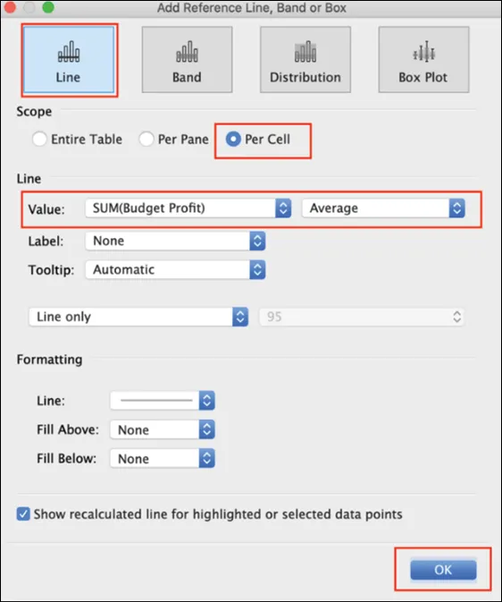
  5. From the upper left-hand corner of the Edit Reference Line, Band or Box dialog box, select Line. Also, set Scope to Per Cell, Value to SUM(Budget Profit) as Average, and Label to None. Click OK:
    A screenshot of a social media post

Description automatically generated
    Figure 8.1: Reference line
  6. Let's add another reference line. This time, as an alternative method, click on the Analytics pane and drag Reference Line onto your dashboard. (You could obviously repeat the method in Step 4 instead.)
  7. Within the dialog box, select Distribution and set Scope to Per Cell. Under Computation, set Value to Percentages with 90,95,100 and Percent of to SUM(Budget Profit). Set Label to None. Click OK:
    Figure 8.2: Percentiles
  8. Create a calculated field called Profit to Budget Profit Ratio with the following code:
    SUM([Profit])/SUM([Budget Profit]) 
  9. Create another calculated field called Quota Met? with the following code:
    SUM([Profit])>=SUM([Budget Profit]) 
  10. Right-click on Profit to Budget Profit Ratio and select Default Properties | Number Format | Percentage.
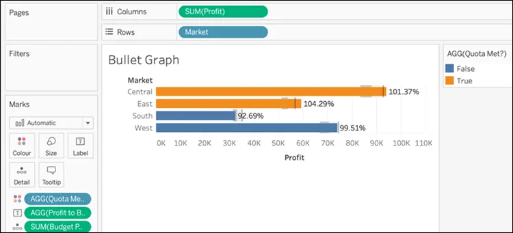
  11. Place Profit to Budget Profit Ratio on the Label shelf in the Marks card and Quota Met? on the Color shelf in the Marks card:
Figure 8.3: Preliminary bullet graph
As you survey our results thus far, you will notice that there are some important aspects to this visualization. For examp...

Table of contents