Master the challenges of Android user interface development with these sample patterns
With Android 4, Google brings the full power of its Android OS to both smartphone and tablet computing. Designing effective user interfaces that work on multiple Android devices is extremely challenging. This book provides more than 75 patterns that you can use to create versatile user interfaces for both smartphones and tablets, saving countless hours of development time. Patterns cover the most common and yet difficult types of user interactions, and each is supported with richly illustrated, step-by-step instructions.
Includes sample patterns for welcome and home screens, searches, sorting and filtering, data entry, navigation, images and thumbnails, interacting with the environment and networks, and more
Features tablet-specific patterns and patterns for avoiding results you don't want
Illustrated, step-by-step instructions describe what the pattern is, how it works, when and why to use it, and related patterns and anti-patterns
A companion website offers additional content and a forum for interaction
Android Design Patterns: Interaction Design Solutions for Developers provides extremely useful tools for developers who want to take advantage of the booming Android app development market.
Part I UX Principles and Android OS Considerations
Chapter 1 Design for Android: A Case Study
Chapter 2 What Makes Android Different
Chapter 3 Android Fragmentation
Chapter 4 Mobile Design Process
Chapter 1 Design for Android: A Case Study
This book is about what works: design patterns. Design patterns in this book build on the official Google Android design guidelines by communicating best practices while addressing the complexities involved in real design problems. The official Android guidelines (available at http://developer.android.com/design/get-started/ui-overview.html) form the foundation; this book shows you how to bring these guidelines to life as complete solutions to real-world design challenges.
With this chapter, I am laying the foundation for the 58 patterns (and 12 antipatterns) in the book by providing a case study of an app that could benefit from a more refined design—the AutoTrader app. The appropriate patterns are referenced in each section of this chapter; feel free to flip to the relevant pages to explore design solutions in more detail.
The AutoTrader app is a typical example of a straight port, which is to say that it is basically an iOS app that was quickly and minimally made to work for Android. The following sections show you how to redesign this app for Android 4.0+ (Ice Cream Sandwich). The entire app isn’t covered because this would be exceedingly tedious to write (and even more tedious to read). Instead, three representative screens are discussed: home screen with a search form, the search results screen, and the item detail screen. These three screens should give you a good idea of some unique and interesting aspects of the Android visual design and navigation, and they give you a taste of the interaction design patterns in this book. Think of this chapter as an appetizer for a rich smorgasbord of practical solutions waiting for you in Part 2 of the book.
Launch Icon
The first thing to look at is the launch icon. Most apps that do a straight port from iOS neglect the essential part of redesigning the launch icon. The Android launch icon design is not bound by the iOS square shape with rounded corners. Designers are encouraged to give their Android launch icons a distinctive outline shape. Take a look at the launch icons for Yelp and Twitter in Figure 1-1—these folks get it.
Figure 1-1: The Yelp and Twitter launch icons have distinctive shapes.
In contrast, AutoTrader, the app for the case study, did not take the time to customize its icon. Fortunately, this is often a simple modification. In the case of AutoTrader, one suggested redesign is included in Figure 1-2. You could use the letter “A” borrowed from the rebranded iOS app and remove the background fill to create a distinctive shape. You are not bound to use a part of the logo—for instance the icon could have been in the shape of a car or steering wheel. The eye more readily perceives the shape of the icon when it is different from other apps, so this enables AutoTrader customers to find the app more easily in a long list.
Figure 1-2: The initial AutoTrader launch icon isn’t distinctive, so here’s a redesigned icon.
Action Bars and Information Architecture
In general, action bars and the accompanying functions form the nerve center of an app and are important in the overall design. Unfortunately, the current design of the AutoTrader app leaves much to be desired on this front (which is what makes this such a killer case study).
Before
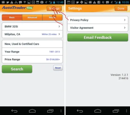
Look at the default home screen: the Car Search. The most emphasized menu function is Settings, which is prominently featured in the top-right corner (see Figure 1-3). That location is arguably the second-most important and prominent spot in the mobile UI (the most prominent spot on the screen is top left, occupied by a large logo).
Figure 1-3: The AutoTrader app emphasizes the useless Settings function in the home screen design.
Although it’s admirable to try to feature the Settings function, I unfortunately could not imagine a single primary or secondary use case that involves this function. Especially because what is labeled as Settings is nothing more than the placeholder for lawyer-fluff such as the privacy policy, visitor agreement, and a button to e-mail feedback—hardly the essential functionality that the app needs to feature so prominently!
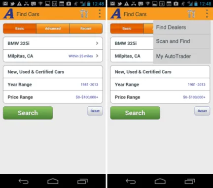
In contrast to the over-emphasized Settings button, the essential functions that need to be used, such as Find Cars, Find Dealers, Scan & Find, and My AutoTrader, are hidden in the older, Android 2.3-style navigation bar menu (see Figure 1-4).
Figure 1-4: The AutoTrader app places essential functions in the old-style navigation bar menu, which is an antipattern.
The next section describes how the app could be redesigned according to the Android 4.0 guidelines to use action bars effectively and make the most important functions more prominent.
After
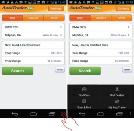
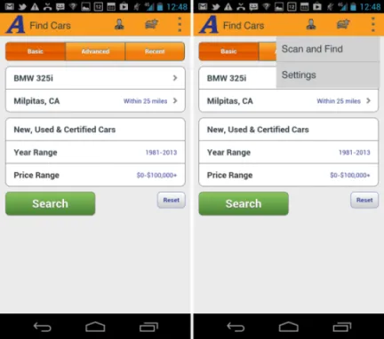
The first thing to fix is the style of the buttons. The rounder corners and bevels simply must go. So do the word-driven functions, such as Settings, in the action bar. In Android 4.0 the actions in the action bar are shown with icons, and the actions in the overflow menu are shown with text. Sticking to this scheme, the first suggestion is for the straightforward port of the old menu to the action bar, which might look like what’s shown in Figure 1-5.
Figure 1-5: Version 1 is a straightforward port to Android 4.0 with settings and actions in the overflow menu.
In this version, the settings button has become the hammer and wrench icon, and the bottom navigation menu has been moved into the overflow function on the action bar. The giant company logo is replaced by the Android 4.0 style action bar icon (which matches the launch icon “A”) and the screen title. (Note that according to the Android design guidelines, the screen title may not exceed 50 percent of the width of the screen, which is not a problem here; it’s merely something you need to keep in mind.)
Unfortunately, as discussed in the “Before” section, these changes are not nearly enough. This basic redesign takes care of the Information Architecture (IA) port to Ice Cream Sandwich, but it does not take care of the inherent shortcomings of the app’s current IA: Key functions such as Find Dealers and My AutoTrader are still hidden, and the Settings clearly does not go anywhere useful. Worse, placing Settings on the top bar would actually discourage exploration of the menu because if the customer discovers that the Settings function is basically pretty lame, that would send a strong signal that the other functions hidden in the overflow menu are even more useless. The design can be improved even more.
One possible approach would be to bubble up the Find Dealers and My AutoTrader options to the top action bar and remove the Settings to the overflow menu. Figure 1-6 shows how this might look.
Figure 1-6: In Version 2, the more useful functions are on the top action bar and settings have been moved to the overflow menu.
This is an acceptable IA, and it is in line with the current Google Android recommendations for the Ice Cream Sandwich (4.0) and Jelly Bean (4.1) OS versions. However, it points out some key challenges with the implementation of the current UI specification of the action bars...
Table of contents
Cover
Table of Contents
Title
Copyright
Dedication
About the Author
Credits
Acknowledgments
Foreword
Introduction
Part I: UX Principles and Android OS Considerations
Part II: Android Design Patterns and Antipatterns
End User License Agreement
Frequently asked questions
Yes, you can cancel anytime from the Subscription tab in your account settings on the Perlego website. Your subscription will stay active until the end of your current billing period. Learn how to cancel your subscription
No, books cannot be downloaded as external files, such as PDFs, for use outside of Perlego. However, you can download books within the Perlego app for offline reading on mobile or tablet. Learn how to download books offline
Perlego offers two plans: Essential and Complete
Essential is ideal for learners and professionals who enjoy exploring a wide range of subjects. Access the Essential Library with 800,000+ trusted titles and best-sellers across business, personal growth, and the humanities. Includes unlimited reading time and Standard Read Aloud voice.
Complete: Perfect for advanced learners and researchers needing full, unrestricted access. Unlock 1.4M+ books across hundreds of subjects, including academic and specialized titles. The Complete Plan also includes advanced features like Premium Read Aloud and Research Assistant.
Both plans are available with monthly, semester, or annual billing cycles.
We are an online textbook subscription service, where you can get access to an entire online library for less than the price of a single book per month. With over 1 million books across 990+ topics, we’ve got you covered! Learn about our mission
Look out for the read-aloud symbol on your next book to see if you can listen to it. The read-aloud tool reads text aloud for you, highlighting the text as it is being read. You can pause it, speed it up and slow it down. Learn more about Read Aloud
Yes! You can use the Perlego app on both iOS and Android devices to read anytime, anywhere — even offline. Perfect for commutes or when you’re on the go. Please note we cannot support devices running on iOS 13 and Android 7 or earlier. Learn more about using the app
Yes, you can access Android Design Patterns by Greg Nudelman in PDF and/or ePUB format, as well as other popular books in Computer Science & Software Development. We have over one million books available in our catalogue for you to explore.