Master the challenges of Android user interface development with these sample patterns
With Android 4, Google brings the full power of its Android OS to both smartphone and tablet computing. Designing effective user interfaces that work on multiple Android devices is extremely challenging. This book provides more than 75 patterns that you can use to create versatile user interfaces for both smartphones and tablets, saving countless hours of development time. Patterns cover the most common and yet difficult types of user interactions, and each is supported with richly illustrated, step-by-step instructions.
Includes sample patterns for welcome and home screens, searches, sorting and filtering, data entry, navigation, images and thumbnails, interacting with the environment and networks, and more
Features tablet-specific patterns and patterns for avoiding results you don't want
Illustrated, step-by-step instructions describe what the pattern is, how it works, when and why to use it, and related patterns and anti-patterns
A companion website offers additional content and a forum for interaction
Android Design Patterns: Interaction Design Solutions for Developers provides extremely useful tools for developers who want to take advantage of the booming Android app development market.
Preguntas frecuentes
¿Cómo cancelo mi suscripción?
Simplemente, dirígete a la sección ajustes de la cuenta y haz clic en «Cancelar suscripción». Así de sencillo. Después de cancelar tu suscripción, esta permanecerá activa el tiempo restante que hayas pagado. Obtén más información aquí.
¿Cómo descargo los libros?
Por el momento, todos nuestros libros ePub adaptables a dispositivos móviles se pueden descargar a través de la aplicación. La mayor parte de nuestros PDF también se puede descargar y ya estamos trabajando para que el resto también sea descargable. Obtén más información aquí.
¿En qué se diferencian los planes de precios?
Ambos planes te permiten acceder por completo a la biblioteca y a todas las funciones de Perlego. Las únicas diferencias son el precio y el período de suscripción: con el plan anual ahorrarás en torno a un 30 % en comparación con 12 meses de un plan mensual.
¿Qué es Perlego?
Somos un servicio de suscripción de libros de texto en línea que te permite acceder a toda una biblioteca en línea por menos de lo que cuesta un libro al mes. Con más de un millón de libros sobre más de 1000 categorías, ¡tenemos todo lo que necesitas! Obtén más información aquí.
¿Perlego ofrece la función de texto a voz?
Busca el símbolo de lectura en voz alta en tu próximo libro para ver si puedes escucharlo. La herramienta de lectura en voz alta lee el texto en voz alta por ti, resaltando el texto a medida que se lee. Puedes pausarla, acelerarla y ralentizarla. Obtén más información aquí.
¿Es Android Design Patterns un PDF/ePUB en línea?
Sí, puedes acceder a Android Design Patterns de Greg Nudelman en formato PDF o ePUB, así como a otros libros populares de Computer Science y Software Development. Tenemos más de un millón de libros disponibles en nuestro catálogo para que explores.
Part I UX Principles and Android OS Considerations
Chapter 1 Design for Android: A Case Study
Chapter 2 What Makes Android Different
Chapter 3 Android Fragmentation
Chapter 4 Mobile Design Process
Chapter 1 Design for Android: A Case Study
This book is about what works: design patterns. Design patterns in this book build on the official Google Android design guidelines by communicating best practices while addressing the complexities involved in real design problems. The official Android guidelines (available at http://developer.android.com/design/get-started/ui-overview.html) form the foundation; this book shows you how to bring these guidelines to life as complete solutions to real-world design challenges.
With this chapter, I am laying the foundation for the 58 patterns (and 12 antipatterns) in the book by providing a case study of an app that could benefit from a more refined design—the AutoTrader app. The appropriate patterns are referenced in each section of this chapter; feel free to flip to the relevant pages to explore design solutions in more detail.
The AutoTrader app is a typical example of a straight port, which is to say that it is basically an iOS app that was quickly and minimally made to work for Android. The following sections show you how to redesign this app for Android 4.0+ (Ice Cream Sandwich). The entire app isn’t covered because this would be exceedingly tedious to write (and even more tedious to read). Instead, three representative screens are discussed: home screen with a search form, the search results screen, and the item detail screen. These three screens should give you a good idea of some unique and interesting aspects of the Android visual design and navigation, and they give you a taste of the interaction design patterns in this book. Think of this chapter as an appetizer for a rich smorgasbord of practical solutions waiting for you in Part 2 of the book.
Launch Icon
The first thing to look at is the launch icon. Most apps that do a straight port from iOS neglect the essential part of redesigning the launch icon. The Android launch icon design is not bound by the iOS square shape with rounded corners. Designers are encouraged to give their Android launch icons a distinctive outline shape. Take a look at the launch icons for Yelp and Twitter in Figure 1-1—these folks get it.
Figure 1-1: The Yelp and Twitter launch icons have distinctive shapes.
In contrast, AutoTrader, the app for the case study, did not take the time to customize its icon. Fortunately, this is often a simple modification. In the case of AutoTrader, one suggested redesign is included in Figure 1-2. You could use the letter “A” borrowed from the rebranded iOS app and remove the background fill to create a distinctive shape. You are not bound to use a part of the logo—for instance the icon could have been in the shape of a car or steering wheel. The eye more readily perceives the shape of the icon when it is different from other apps, so this enables AutoTrader customers to find the app more easily in a long list.
Figure 1-2: The initial AutoTrader launch icon isn’t distinctive, so here’s a redesigned icon.
Action Bars and Information Architecture
In general, action bars and the accompanying functions form the nerve center of an app and are important in the overall design. Unfortunately, the current design of the AutoTrader app leaves much to be desired on this front (which is what makes this such a killer case study).
Before
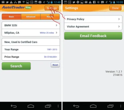
Look at the default home screen: the Car Search. The most emphasized menu function is Settings, which is prominently featured in the top-right corner (see Figure 1-3). That location is arguably the second-most important and prominent spot in the mobile UI (the most prominent spot on the screen is top left, occupied by a large logo).
Figure 1-3: The AutoTrader app emphasizes the useless Settings function in the home screen design.
Although it’s admirable to try to feature the Settings function, I unfortunately could not imagine a single primary or secondary use case that involves this function. Especially because what is labeled as Settings is nothing more than the placeholder for lawyer-fluff such as the privacy policy, visitor agreement, and a button to e-mail feedback—hardly the essential functionality that the app needs to feature so prominently!
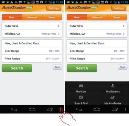
In contrast to the over-emphasized Settings button, the essential functions that need to be used, such as Find Cars, Find Dealers, Scan & Find, and My AutoTrader, are hidden in the older, Android 2.3-style navigation bar menu (see Figure 1-4).
Figure 1-4: The AutoTrader app places essential functions in the old-style navigation bar menu, which is an antipattern.
The next section describes how the app could be redesigned according to the Android 4.0 guidelines to use action bars effectively and make the most important functions more prominent.
After
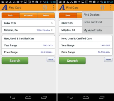
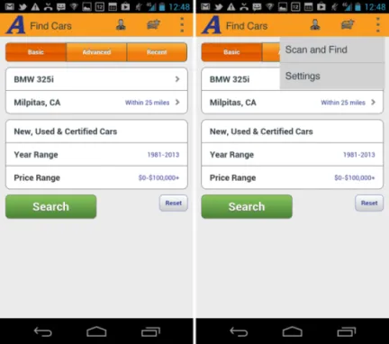
The first thing to fix is the style of the buttons. The rounder corners and bevels simply must go. So do the word-driven functions, such as Settings, in the action bar. In Android 4.0 the actions in the action bar are shown with icons, and the actions in the overflow menu are shown with text. Sticking to this scheme, the first suggestion is for the straightforward port of the old menu to the action bar, which might look like what’s shown in Figure 1-5.
Figure 1-5: Version 1 is a straightforward port to Android 4.0 with settings and actions in the overflow menu.
In this version, the settings button has become the hammer and wrench icon, and the bottom navigation menu has been moved into the overflow function on the action bar. The giant company logo is replaced by the Android 4.0 style action bar icon (which matches the launch icon “A”) and the screen title. (Note that according to the Android design guidelines, the screen title may not exceed 50 percent of the width of the screen, which is not a problem here; it’s merely something you need to keep in mind.)
Unfortunately, as discussed in the “Before” section, these changes are not nearly enough. This basic redesign takes care of the Information Architecture (IA) port to Ice Cream Sandwich, but it does not take care of the inherent shortcomings of the app’s current IA: Key functions such as Find Dealers and My AutoTrader are still hidden, and the Settings clearly does not go anywhere useful. Worse, placing Settings on the top bar would actually discourage exploration of the menu because if the customer discovers that the Settings function is basically pretty lame, that would send a strong signal that the other functions hidden in the overflow menu are even more useless. The design can be improved even more.
One possible approach would be to bubble up the Find Dealers and My AutoTrader options to the top action bar and remove the Settings to the overflow menu. Figure 1-6 shows how this might look.
Figure 1-6: In Version 2, the more useful functions are on the top action bar and settings have been moved to the overflow menu.
This is an acceptable IA, and it is in line with the current Google Android recommendations for the Ice Cream Sandwich (4.0) and Jelly Bean (4.1) OS versions. However, it points out some key challenges with the implementation of the current UI specification of the action bars...