Type Rules!, Fourth Edition is an up-to-date, thorough introduction to the principles and practices of typography. From the fundamentals to cutting-edge applications, this edition has everything today's serious designer needs to use type effectively. Dozens of exercises reinforce authoritative coverage on such topics as how to select the appropriate type for the job, how to set type like a pro, and how to design a typeface, as well as how to fully harness the power of major design packages including the Adobe Creative Suite.Includes video clips showing examples of projects discussed in Chapter 11- Type on the Web and Chapter 12- Type in Motion
- English
- ePUB (mobile friendly)
- Available on iOS & Android
eBook - ePub
About this book
Trusted by 375,005 students
Access to over 1.5 million titles for a fair monthly price.
Study more efficiently using our study tools.
Information
CHAPTER ONE
A BRIEF HISTORY OF TYPE
The story of type doesn’t begin with type per se, rather it starts with the beginning of mankind and civilization. Type has only existed for about 560 years, but its beginnings are rooted in the life of the caveman himself, as it was his developing needs and habits that led civilization on a path toward the evolution of the alphabet and subsequently the invention of type and printing. It is certainly possible to learn to use type effectively and tastefully without knowing its roots, but to fully understand and appreciate type today, it is important to know something of the past.
Milestones in the history of type are highlighted throughout this chapter. Some of the dates, chronology, and details vary from source to source, but the spirit of the events remains the same. These events have taken mankind on a glorious ride from the crudest cave drawings to the bits and bytes of type in the digital age.
SOUNDS TO SYMBOLS
For many years, early humans communicated purely with sound. Verbal language—which is heard and not seen as opposed to visual language (or visible language, as it is often called)—has many limitations: it is gone the instant it is spoken and heard, and it is therefore temporary. Stories, history, and other information could not be passed from generation to generation in a permanent way, only by direct word of mouth.

The earliest attempts to record stories and ideas were through cave drawings; the first known is dated around 25,000 BC. These drawings, or pictographs, were very simple representations of people, places, and things, and for this reason, they were relatively easy to learn and understand. Although this was a very simple form of written communication, it was certainly more permanent than sound, and much of it has survived the ravages of time and still exists today. (Fig. 1-1)
Figure 1-1 This Aboriginal rock painting (c. 13,000 BC), located in a cave in Queensland, Australia, is a distinctive example of the earliest form of written communication.
Photograph courtesy of Axel Poignant Archive.

Around 3000 BC the Sumerians developed cuneiform, a writing system that consisted of wedge-shaped forms carved into clay tablets and other hard surfaces. Cuneiform evolved from the pictographs that the Sumerians had adapted earlier and was one of the first writing systems to read left to right. Its wedge-shaped forms were the result of the use of a stylus, a writing tool whose straight edges and triangular corners produced these geometric forms.
As time passed, there was a need for more symbols to represent ideas and other concepts in addition to just “things.” This led to the development of ideograms, or symbols, to represent ideas and actions. This new, expanded system was more difficult for the masses to understand, as it was not purely representational but more symbolic in nature. This separated society into two groups: those who could understand this system and those who could not. The spoken and written language had become very different from each other, requiring the learning of two unrelated systems of communication.
As society became more complex, the existing writing system did not meet its increasing needs and was no longer satisfactory; something more was needed. This need subsequently led to the development of letter symbols that, when put together, represented words.
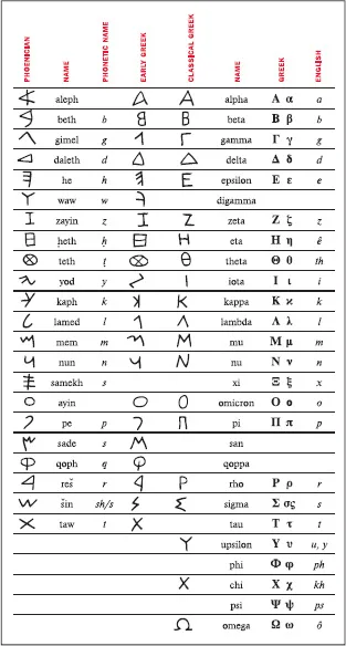
The Phoenicians, a society of traders and skilled craftsmen on the eastern coast of the Mediterranean Sea, took written language a giant step forward from the pictograms and ideograms of the Sumerians. Around 1000 BC the Phoenicians developed twenty-two symbols that corresponded to the twenty-two key sounds of their language. Their idea was to connect these symbols (representing sounds) to imitate spoken words, thus eliminating the need for memorization of hundreds of unrelated symbols. This was the first attempt to connect the written language with the spoken word; we now call this phonetics. (Fig. 1-2)
Figure 1-2 This chart shows the evolution of the Greek alphabet, which was originally adapted from the twenty-two-character, all-consonant Phoenician alphabet. The Greeks added several new characters as well as vowels.
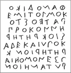
Around 800 BC, the Greeks embraced the Phoenician invention and took it a step further by adding vowels and naming the symbols. They also employed boustrophedon (meaning “as the ox plows”), a system in which one reads from left to right on one line and right to left on the next. (Fig. 1-3)
Figure 1-3 The Greek writing system employed boustrophedon (“as the ox plows”), a system in which one reads from left to right on one line and right to left on the next. Notice how the letters are reversed from one line to another.
Much later, the Romans, a highly developed society, made further changes by adding more letters, bringing this writing system even closer to our modern-day alphabet. They made other advances as well. The Roman scribes, in their attempt to write more quickly and efficiently, began joining and slanting letters in harmony with the natural motion of the hand. In addition, they added ascenders and descenders, as well as condensed forms of the alphabet in order to conserve space.
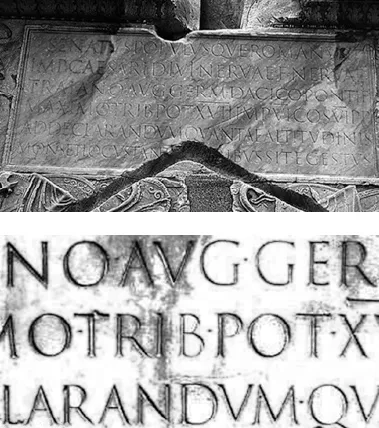
One of the Romans’ most important contributions to early writing was Trajan’s Column, dated 114 AD. It showcases one of the most beautiful and best-known examples of Roman letterforms. The lettering, which is incised at the base of the column, is a classical, elegant, and exquisitely balanced combination of form, proportion, and simplicity. It has been, and continues to be, a powerful inspiration to type designers throughout the world. (Fig. 1-4 and Fig. 1-5)
Figure 1-4 (Upper) The lettering at the base of Trajan’s Column, dated 114 AD, one of the best-known and most beautiful examples of Roman letterforms. (Lower) Close-up of the inscription.
Photographs courtesy of Bill Thayer & Graphion.
Special mention should be made here of the tremendous contributions to the art of writing by the Chinese and by other Asian cultures. Although their writing systems are not alphabetic but rather consist of thousands of symbols, their extreme artistry, subtlety of form, and mastery of the art of calligraphy have been a continuous source of beauty, poetic elegance, and inspiration to all who come in contact with them.
GUTENBERG AND MOVABLE TYPE
Until the fifteenth century, all books were hand copied by scribes, as exemplified by the many breathtakingly beautiful and exquisitely written and illustrated manuscripts created for religious purposes in monasteries.
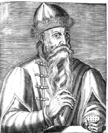
In 1448 that all changed with the birth of printing, after which the world would never be quite the same. Johannes Gutenberg, a goldsmith from Mainz, Germany, is credited with the invention of movable type. (There is some controversy about this, as some people credit Laurens Coster of Haarlem in the Netherlands with its invention; others credit Pi Sheng of China with inventing movable type in 1045, more than four hundred years earlier.) Gutenberg accomplished his invention of movable type by carving the characters of the alphabet in relief onto metal punches, which were then driven into other pieces of metal called matrices. Molten metal was poured into these matrices, making the actual type, which was identical to the original relief punches. The type was then fit into printing presses that were capable of printing multiple images in a very short time. This was referred to as letterpress printing, and its distinct characteristic is that each character makes a slight impression on the paper, giving it a rich, tactile quality. (Fig. 1-6)
Figure 1-6 Engraved portrait of Johannes Gutenberg from Andre Thevet’s Les vrais portraits et vie des hommes, Paris, 1584.
Courtesy of Huntington Library.
Early type design imitated the pen-drawn styles of the scribes. Gutenberg’s first typeface was in the style of the heavy blackletter popular in Germany at that time. It contained over three hundred characters, including ligatures an...
Table of contents
- Cover
- Title page
- Copyright page
- Dedication
- Acknowledgements
- Preface
- Introduction
- Chapter One: A Brief History of Type
- Chapter Two: From Metal to MAC
- Chapter Three: What Makes a Typeface Look the Way it Does?
- Chapter Four: Selecting the Right Type for the Job
- Chapter Five: Formatting your Type
- Chapter Six: Typographic Hierarchy and Emphasis
- Chapter Seven: Fine-Tuning and Tweaking your Type
- Chapter Eight: Spacing Considerations
- Chapter Nine: Finessing your Type
- Chapter Ten: Figures, Fractions, Signs, Symbols, and Dingbats
- Chapter Eleven: Type on the Web (and other Digital Formats)
- Chapter Twelve: Type in Motion
- Chapter Thirteen: Designing your own Typeface
- Appendix
- Glossary
- Bibliography
- Picture Credits
- Index
Frequently asked questions
Yes, you can cancel anytime from the Subscription tab in your account settings on the Perlego website. Your subscription will stay active until the end of your current billing period. Learn how to cancel your subscription
No, books cannot be downloaded as external files, such as PDFs, for use outside of Perlego. However, you can download books within the Perlego app for offline reading on mobile or tablet. Learn how to download books offline
Perlego offers two plans: Essential and Complete
- Essential is ideal for learners and professionals who enjoy exploring a wide range of subjects. Access the Essential Library with 800,000+ trusted titles and best-sellers across business, personal growth, and the humanities. Includes unlimited reading time and Standard Read Aloud voice.
- Complete: Perfect for advanced learners and researchers needing full, unrestricted access. Unlock 1.5M+ books across hundreds of subjects, including academic and specialized titles. The Complete Plan also includes advanced features like Premium Read Aloud and Research Assistant.
We are an online textbook subscription service, where you can get access to an entire online library for less than the price of a single book per month. With over 1.5 million books across 990+ topics, we’ve got you covered! Learn about our mission
Look out for the read-aloud symbol on your next book to see if you can listen to it. The read-aloud tool reads text aloud for you, highlighting the text as it is being read. You can pause it, speed it up and slow it down. Learn more about Read Aloud
Yes! You can use the Perlego app on both iOS and Android devices to read anytime, anywhere — even offline. Perfect for commutes or when you’re on the go.
Please note we cannot support devices running on iOS 13 and Android 7 or earlier. Learn more about using the app
Please note we cannot support devices running on iOS 13 and Android 7 or earlier. Learn more about using the app
Yes, you can access Type Rules by Ilene Strizver in PDF and/or ePUB format, as well as other popular books in Design & Graphic Design. We have over 1.5 million books available in our catalogue for you to explore.