
eBook - ePub
Type Rules
The Designer's Guide to Professional Typography
Ilene Strizver
This is a test
Buch teilen
- English
- ePUB (handyfreundlich)
- Über iOS und Android verfügbar
eBook - ePub
Type Rules
The Designer's Guide to Professional Typography
Ilene Strizver
Angaben zum Buch
Buchvorschau
Inhaltsverzeichnis
Quellenangaben
Über dieses Buch
Type Rules!, Fourth Edition is an up-to-date, thorough introduction to the principles and practices of typography. From the fundamentals to cutting-edge applications, this edition has everything today's serious designer needs to use type effectively. Dozens of exercises reinforce authoritative coverage on such topics as how to select the appropriate type for the job, how to set type like a pro, and how to design a typeface, as well as how to fully harness the power of major design packages including the Adobe Creative Suite.Includes video clips showing examples of projects discussed in Chapter 11- Type on the Web and Chapter 12- Type in Motion
Häufig gestellte Fragen
Wie kann ich mein Abo kündigen?
Gehe einfach zum Kontobereich in den Einstellungen und klicke auf „Abo kündigen“ – ganz einfach. Nachdem du gekündigt hast, bleibt deine Mitgliedschaft für den verbleibenden Abozeitraum, den du bereits bezahlt hast, aktiv. Mehr Informationen hier.
(Wie) Kann ich Bücher herunterladen?
Derzeit stehen all unsere auf Mobilgeräte reagierenden ePub-Bücher zum Download über die App zur Verfügung. Die meisten unserer PDFs stehen ebenfalls zum Download bereit; wir arbeiten daran, auch die übrigen PDFs zum Download anzubieten, bei denen dies aktuell noch nicht möglich ist. Weitere Informationen hier.
Welcher Unterschied besteht bei den Preisen zwischen den Aboplänen?
Mit beiden Aboplänen erhältst du vollen Zugang zur Bibliothek und allen Funktionen von Perlego. Die einzigen Unterschiede bestehen im Preis und dem Abozeitraum: Mit dem Jahresabo sparst du auf 12 Monate gerechnet im Vergleich zum Monatsabo rund 30 %.
Was ist Perlego?
Wir sind ein Online-Abodienst für Lehrbücher, bei dem du für weniger als den Preis eines einzelnen Buches pro Monat Zugang zu einer ganzen Online-Bibliothek erhältst. Mit über 1 Million Büchern zu über 1.000 verschiedenen Themen haben wir bestimmt alles, was du brauchst! Weitere Informationen hier.
Unterstützt Perlego Text-zu-Sprache?
Achte auf das Symbol zum Vorlesen in deinem nächsten Buch, um zu sehen, ob du es dir auch anhören kannst. Bei diesem Tool wird dir Text laut vorgelesen, wobei der Text beim Vorlesen auch grafisch hervorgehoben wird. Du kannst das Vorlesen jederzeit anhalten, beschleunigen und verlangsamen. Weitere Informationen hier.
Ist Type Rules als Online-PDF/ePub verfügbar?
Ja, du hast Zugang zu Type Rules von Ilene Strizver im PDF- und/oder ePub-Format sowie zu anderen beliebten Büchern aus Design & Graphic Design. Aus unserem Katalog stehen dir über 1 Million Bücher zur Verfügung.
Information
CHAPTER ONE
A BRIEF HISTORY OF TYPE
The story of type doesn’t begin with type per se, rather it starts with the beginning of mankind and civilization. Type has only existed for about 560 years, but its beginnings are rooted in the life of the caveman himself, as it was his developing needs and habits that led civilization on a path toward the evolution of the alphabet and subsequently the invention of type and printing. It is certainly possible to learn to use type effectively and tastefully without knowing its roots, but to fully understand and appreciate type today, it is important to know something of the past.
Milestones in the history of type are highlighted throughout this chapter. Some of the dates, chronology, and details vary from source to source, but the spirit of the events remains the same. These events have taken mankind on a glorious ride from the crudest cave drawings to the bits and bytes of type in the digital age.
SOUNDS TO SYMBOLS
For many years, early humans communicated purely with sound. Verbal language—which is heard and not seen as opposed to visual language (or visible language, as it is often called)—has many limitations: it is gone the instant it is spoken and heard, and it is therefore temporary. Stories, history, and other information could not be passed from generation to generation in a permanent way, only by direct word of mouth.

The earliest attempts to record stories and ideas were through cave drawings; the first known is dated around 25,000 BC. These drawings, or pictographs, were very simple representations of people, places, and things, and for this reason, they were relatively easy to learn and understand. Although this was a very simple form of written communication, it was certainly more permanent than sound, and much of it has survived the ravages of time and still exists today. (Fig. 1-1)
Figure 1-1 This Aboriginal rock painting (c. 13,000 BC), located in a cave in Queensland, Australia, is a distinctive example of the earliest form of written communication.
Photograph courtesy of Axel Poignant Archive.

Around 3000 BC the Sumerians developed cuneiform, a writing system that consisted of wedge-shaped forms carved into clay tablets and other hard surfaces. Cuneiform evolved from the pictographs that the Sumerians had adapted earlier and was one of the first writing systems to read left to right. Its wedge-shaped forms were the result of the use of a stylus, a writing tool whose straight edges and triangular corners produced these geometric forms.
As time passed, there was a need for more symbols to represent ideas and other concepts in addition to just “things.” This led to the development of ideograms, or symbols, to represent ideas and actions. This new, expanded system was more difficult for the masses to understand, as it was not purely representational but more symbolic in nature. This separated society into two groups: those who could understand this system and those who could not. The spoken and written language had become very different from each other, requiring the learning of two unrelated systems of communication.
As society became more complex, the existing writing system did not meet its increasing needs and was no longer satisfactory; something more was needed. This need subsequently led to the development of letter symbols that, when put together, represented words.
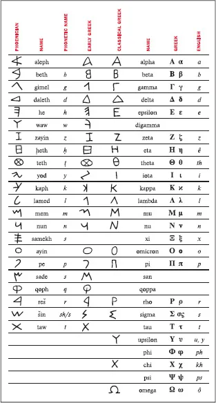
The Phoenicians, a society of traders and skilled craftsmen on the eastern coast of the Mediterranean Sea, took written language a giant step forward from the pictograms and ideograms of the Sumerians. Around 1000 BC the Phoenicians developed twenty-two symbols that corresponded to the twenty-two key sounds of their language. Their idea was to connect these symbols (representing sounds) to imitate spoken words, thus eliminating the need for memorization of hundreds of unrelated symbols. This was the first attempt to connect the written language with the spoken word; we now call this phonetics. (Fig. 1-2)
Figure 1-2 This chart shows the evolution of the Greek alphabet, which was originally adapted from the twenty-two-character, all-consonant Phoenician alphabet. The Greeks added several new characters as well as vowels.
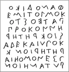
Around 800 BC, the Greeks embraced the Phoenician invention and took it a step further by adding vowels and naming the symbols. They also employed boustrophedon (meaning “as the ox plows”), a system in which one reads from left to right on one line and right to left on the next. (Fig. 1-3)
Figure 1-3 The Greek writing system employed boustrophedon (“as the ox plows”), a system in which one reads from left to right on one line and right to left on the next. Notice how the letters are reversed from one line to another.
Much later, the Romans, a highly developed society, made further changes by adding more letters, bringing this writing system even closer to our modern-day alphabet. They made other advances as well. The Roman scribes, in their attempt to write more quickly and efficiently, began joining and slanting letters in harmony with the natural motion of the hand. In addition, they added ascenders and descenders, as well as condensed forms of the alphabet in order to conserve space.
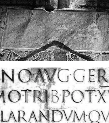
One of the Romans’ most important contributions to early writing was Trajan’s Column, dated 114 AD. It showcases one of the most beautiful and best-known examples of Roman letterforms. The lettering, which is incised at the base of the column, is a classical, elegant, and exquisitely balanced combination of form, proportion, and simplicity. It has been, and continues to be, a powerful inspiration to type designers throughout the world. (Fig. 1-4 and Fig. 1-5)
Figure 1-4 (Upper) The lettering at the base of Trajan’s Column, dated 114 AD, one of the best-known and most beautiful examples of Roman letterforms. (Lower) Close-up of the inscription.
Photographs courtesy of Bill Thayer & Graphion.
Special mention should be made here of the tremendous contributions to the art of writing by the Chinese and by other Asian cultures. Although their writing systems are not alphabetic but rather consist of thousands of symbols, their extreme artistry, subtlety of form, and mastery of the art of calligraphy have been a continuous source of beauty, poetic elegance, and inspiration to all who come in contact with them.
GUTENBERG AND MOVABLE TYPE
Until the fifteenth century, all books were hand copied by scribes, as exemplified by the many breathtakingly beautiful and exquisitely written and illustrated manuscripts created for religious purposes in monasteries.
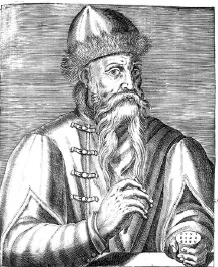
In 1448 that all changed with the birth of printing, after which the world would never be quite the same. Johannes Gutenberg, a goldsmith from Mainz, Germany, is credited with the invention of movable type. (There is some controversy about this, as some people credit Laurens Coster of Haarlem in the Netherlands with its invention; others credit Pi Sheng of China with inventing movable type in 1045, more than four hundred years earlier.) Gutenberg accomplished his invention of movable type by carving the characters of the alphabet in relief onto metal punches, which were then driven into other pieces of metal called matrices. Molten metal was poured into these matrices, making the actual type, which was identical to the original relief punches. The type was then fit into printing presses that were capable of printing multiple images in a very short time. This was referred to as letterpress printing, and its distinct characteristic is that each character makes a slight impression on the paper, giving it a rich, tactile quality. (Fig. 1-6)
Figure 1-6 Engraved portrait of Johannes Gutenberg from Andre Thevet’s Les vrais portraits et vie des hommes, Paris, 1584.
Courtesy of Huntington Library.
Early type design imitated the pen-drawn styles of the scribes. Gutenberg’s first typeface was in the style of the heavy blackletter popular in Germany at that time. It contained over three hundred characters, including ligatures an...