Offering a common language, better processes, and a set of practical tools, Convergence Marketing is a real-world guide that successfully combines the best of brand and direct into something more powerful and effective than either can be on its own. Convergence marketing offers the kind of real-time accountability that positions marketing as a vital and effective component of leadership's overall business strategy. Convergence brings brand and direct together with respect to both disciplines, within the same silos. And it offers the necessary tools and processes that deliver better results. Our global market demands nothing less than this fully integrated approach. Convergence Marketing is the key to shifting marketing communications efforts from a cost-based to a profit-driven model and will have your CFO begging you to spend more money.
Trusted by 375,005 students
Access to over 1.5 million titles for a fair monthly price.
MEASURING THE INTENTION AND SUCCESS: PROCESS TOOLS AND PRACTICAL APPLICATIONS
4
ACCELERATE AND DRIVE
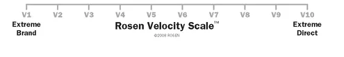
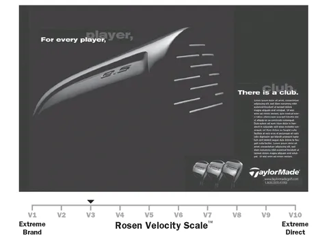
The Rosen Velocity Scale™
The Rosen Velocity Scale is a business process tool used to drive and measure the speed with which the communication stimulates an interaction between the individual and the brand. It can be applied to all media. That’s right; we can actually tune the assertiveness of any communication to the level of interaction we want it to have with the individual. Using this tool allows us to strategically plot out the desired velocity for each communication in a campaign that uses multiple media and predetermine the speed of interaction for each piece of the campaign. We then measure to see if we achieved the anticipated planned results.
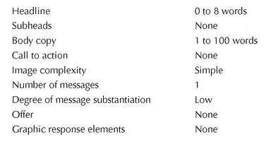
There is a lot more to this than meets the eye, or ear, for that matter. Designing an advertisement to meet the desired result requires a specific balance of image, copy, offer, and target. Each element affects the pull of the ad and must be critically considered to achieve the predetermined result. Please see Figure 4.1. Have fun, for many a person after a speech has walked up to me and simply said, “Thank you. You have saved me years.” As you go through it, think about what it looks like in print and how you might adapt it for all other media.
Figure 4.1The Rosen Velocity Scale
The scale goes from V1 to V10. The far left, at V1, represents Extreme Brand. At the opposite end of the scale, V10 represents Extreme Direct. So the opposite ends of the scale represent the extremes of each discipline. With our new goal of balancing brand and direct to achieve a predetermined result, we need to look toward the center. It seems obvious that we need to be centered to have balance in our communication. So it is at V5, the middle of the scale, where we will create more interaction with the individual while showing equal respect for the brand.
THE VISUAL MANIFESTATION OF THE GOAL
One of the things I love most about the scale is that it is the visual manifestation of the goal of the communication. Everyone, from marketing and advertising to sales, IT, and finance can see it, and, therefore, it provides a basis for our common language. Everyone understands the intention and goal of the communication. The scale can be used to define the level of communication with the client, the product managers, and literally everyone throughout the company. And not only can you use it to clarify the visual media, but also you can use it to set the expectations for each medium.
We’re not using it to measure the effectiveness of the creative; we are using it to measure the velocity of the interaction. The design of the ad must use the elements of image, copy, design, and offer to create the desired velocity of the communication. To help us design the communication, we need to consider the tone, the behavioral change agents, and how it all comes together to move the individual forward at our predetermined speed.
It is important to understand that we can build brand and demand anywhere along the scale and create communications that drive awareness, to engagement, to interaction. We need to create ads that work harder than ever, and now we have the tools to help us do so.
How the Scale Works
On the extreme left, at V1, we have the pure brand-awareness ads, also known as the big idea—like Nike’s “Just Do It” ads. The ad is designed to catch the attention of the individuals and create a favorable attitude in their minds. In the category of new products, the idea is to link the product closely to its existing category so that the brand name becomes synonymous with the product. Perfect examples of this are Levi’s, Coke, Kleenex, and Xerox. Awareness advertising is all about the big picture, the broad spectrum. This is where the general advertising agencies make their living, win their awards, and often wow us with brilliant ideas.
Most of traditional advertising sits in this first quadrant, between V1 and V3 on the scale, emulating brand awareness campaigns. However, most companies don’t have the large budget to drive the necessary frequency to gain complete mind share of the individual. These ads are not designed for interaction or response. This is why many campaigns fall short of what they could have accomplished, great on creative, but short on velocity and profit.
As we move toward the center of the scale, there are several key issues that I need to clarify. First of all, the velocity does not equate with budget because it’s based upon interaction rather than frequency. Therefore, we design an ad to spark interaction. We don’t need to run it a bazillion times to get it into their heads to gain mindshare. Second, we are going to quantify the ad into a specific place on the scale so that we are all clear on what we want the ad to achieve. A lot of creative directors will throw up their hands and tell you it’s not possible to quantify the creative process. But I can assure you it is. I’ve been doing it for years.
Now we move to the middle of the scale, centered at V5, which represents the balance of both extremes. Moving away from the pure awareness ads toward the middle of the scale creates more interaction with the individual while still respecting the brand. V5 respects the brand while incorporating strategies and tactics from both sales and direct to get the individual to interact with you faster, using less money.
However, as you move further right, toward Extreme Direct, at about V9, you have reached the epitome of short-term sales. Terms like “Buy Now!” and “Free-Offer!” compromise the brand. The least amount of money is spent, and high velocity is achieved, but it is done at the expense of the brand.
SURE, BUT WILL IT FLY? CRITERIA FOR THE ROSEN VELOCITY SCALE
Just like any great idea, the general concept is intriguing, but do we have the scientific proof that it will do the job it’s meant to do? It’s like Orville and Wilbur Wright pondering over blueprints in their efforts to fly. Sure, they were smart, had a really nice bicycle shop, and hung out with some of the most brilliant inventors of their day. But I’m sure a lot of folks scratched their heads. Sure, it looks good on paper—but will it fly?
I can assure you this machine flies. The scale is a great tool for the common language, and the science involved is specific. If you follow it, you will achieve the velocity you intend. And what could be better than designing an ad to do a specific job and seeing it do exactly that?
I’m going to walk through the criteria using print ads from TaylorMade Golf. I did some work with TaylorMade back in the late 1990s, and these ads do a great job of taking us through each step. It’s important to note that we started with the gorgeous awareness ad from their general agency, Foot Cone Belding, and built upon it to show the full spectrum of the scale from V1 through V10. These ads never ran, but they perfectly illustrate the function and criteria for print advertising.
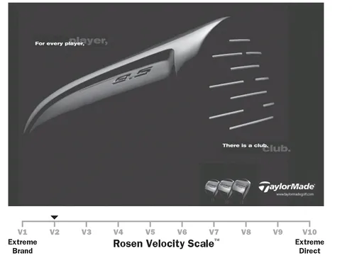
The first ad (see Figure 4.2) began the campaign. It sits at V1 on the scale and is a pure brand awareness ad designed to build awareness. It is designed for long-term brand building. The ad is 100 percent brand and 0 percent direct or interaction. Because of the wide range of creativity in advertising, each piece of the criteria will not be presented in every print ad. However, the criteria are general guidelines for a preponderance of criteria that indicate where the ad sits on the Velocity Scale. In this ad, you can see that simplicity is paramount. Only one message is presented, in a clean, elegant, and uncluttered way, with minimal copy. There is no attempt to interact, no call to action, no offer, nor any other device that detracts from the power of the concept.
Figure 4.2TaylorMade Ad V1
The following are criteria for a successful V1 print ad:
A V2 is 90 percent brand and 10 percent direct (see Figure 4.3). Branding is still extremely important, but we’re going to spark a response. The differences between a V1 and V2 are very small.
Figure 4.3TaylorMade Ad V2
We’ve added a web site to the lower right corner, directly under the logo, and we’ve added a small image of golf club heads to the same area. These elements will pull minor response and are aligned with the goal of a V2, which is to start interaction and lead generation rather than engaging a sale. The ad does reach out to the individual with a mechanism to communicate directly with the company to obtain more information. This can be done by way of a toll-free number or a web site address, as we’ve done, and simply adding that information is a minimum response technique. This subtle approach pulls poor response and might get a few A leads to react. Adding the word call will increase the response; “Call for more information” will increase response even higher, and adding the word free, as in “Call for free information,” will get an even higher response.
There are a number of ways to say free, and each has a different level of response. The softer terms, such as no cost, are more aligned with branding, especially if the product is more sophisticated. However, the word free is preferable in most cases. The more you draw attention to the word, the higher the response. FREE will pull a higher response than free. Of course, this is predicated on the free offer being something desirable to your target.
Adding call-to-action words to the copy increases the interaction of the ad, while increasing the brand awareness aspect as well. Keep in mind that you are adding a second message. So your goal must be well-defined before you start designing and writing the copy for your ad, so as to diminish the feeling of aesthetic trade-off. Adding elements can dilute the branding message, so it’s important to maintain the right balance of image, copy, and offer to achieve your goal.
The following are criteria for a successful V2 print ad:
The changes from V1 to V2 are very subtle, but they make a difference in the overall performance of the ad.
As we move further to the right of the scale, we up the ante on interaction with the individual. Moving to a V3 (see Figure 4.4),
Figure 4.4TaylorMade Ad V3
we are at 80 to 70 percent brand and 20 to 30 percent interaction. You will most likely have an increase in body copy because there is a need to give more information to engage the individual to interact. In addition to the expansion of copy, we have a change in the overall appearance of the ad. Depending upon the strength of the brand, we want to make the call to action stronger. We can add a graphic element to draw attention to an offer, deadline, or some new idea being introduced.
The following are criteria for a successful V3 print ad
The V3 print ad may not have the elegance of a V1, but the brand is still very strong. What it does achieve quite well is to initiate a response through the right balance of additional copy and a bolder call to action.
Before I move forward, it is important to note that moving further to the right isn’t really about throwing in a bunch of stuff. This is the mistake most people make when looking at these print ads at face value. The balance of placement of the copy, image, and offer is crucial.
The V4 print ad still centers on the awareness ad created by the general agency, but we are expanding the Gestalt creative with an offer of golf balls, creating a stronger call to action and a glimpse of the product (See Figure 4.5). The ad is 60 percent brand and 40 percent interaction. And we are clearly moving into a dual-purpose ad, which is not flashy; that’s not its purpose. A V4 is designed to build and maintain the brand ...
Table of contents
Praise
Title Page
Copyright Page
Dedication
Introduction
I - CONVERGENCE OF BRAND AND DIRECT
II - MEASURING THE INTENTION AND SUCCESS: PROCESS TOOLS AND PRACTICAL APPLICATIONS
III - PERFORMANCE AND BALANCE
INDEX
Frequently asked questions
Yes, you can cancel anytime from the Subscription tab in your account settings on the Perlego website. Your subscription will stay active until the end of your current billing period. Learn how to cancel your subscription
No, books cannot be downloaded as external files, such as PDFs, for use outside of Perlego. However, you can download books within the Perlego app for offline reading on mobile or tablet. Learn how to download books offline
Perlego offers two plans: Essential and Complete
Essential is ideal for learners and professionals who enjoy exploring a wide range of subjects. Access the Essential Library with 800,000+ trusted titles and best-sellers across business, personal growth, and the humanities. Includes unlimited reading time and Standard Read Aloud voice.
Complete: Perfect for advanced learners and researchers needing full, unrestricted access. Unlock 1.5M+ books across hundreds of subjects, including academic and specialized titles. The Complete Plan also includes advanced features like Premium Read Aloud and Research Assistant.
Both plans are available with monthly, semester, or annual billing cycles.
We are an online textbook subscription service, where you can get access to an entire online library for less than the price of a single book per month. With over 1.5 million books across 990+ topics, we’ve got you covered! Learn about our mission
Look out for the read-aloud symbol on your next book to see if you can listen to it. The read-aloud tool reads text aloud for you, highlighting the text as it is being read. You can pause it, speed it up and slow it down. Learn more about Read Aloud
Yes! You can use the Perlego app on both iOS and Android devices to read anytime, anywhere — even offline. Perfect for commutes or when you’re on the go. Please note we cannot support devices running on iOS 13 and Android 7 or earlier. Learn more about using the app
Yes, you can access Convergence Marketing by Richard Rosen,Jane C. Rosen in PDF and/or ePUB format, as well as other popular books in Business & Marketing. We have over 1.5 million books available in our catalogue for you to explore.