A traditional approach to developing multivariate statistical theory is algebraic. Sets of observations are represented by matrices, linear combinations are formed from these matrices by multiplying them by coefficient matrices, and useful statistics are found by imposing various criteria of optimization on these combinations. Matrix algebra is the vehicle for these calculations. A second approach is computational. Since many users find that they do not need to know the mathematical basis of the techniques as long as they have a way to transform data into results, the computation can be done by a package of computer programs that somebody else has written. An approach from this perspective emphasizes how the computer packages are used, and is usually coupled with rules that allow one to extract the most important numbers from the output and interpret them. Useful as both approaches are--particularly when combined--they can overlook an important aspect of multivariate analysis. To apply it correctly, one needs a way to conceptualize the multivariate relationships that exist among variables.
This book is designed to help the reader develop a way of thinking about multivariate statistics, as well as to understand in a broader and more intuitive sense what the procedures do and how their results are interpreted. Presenting important procedures of multivariate statistical theory geometrically, the author hopes that this emphasis on the geometry will give the reader a coherent picture into which all the multivariate techniques fit.
Trusted by 375,005 students
Access to over 1.5 million titles for a fair monthly price.
Multivariate statistics concerns the analysis of data in which several variables are measured on each of a series of individuals or subjects. The goal of the analysis is to examine the interrelationships among the variables: how they vary together or separately and what structure underlies them. These relationships are typically quite complex, and their study is made easier if one has a way to represent them graphically or pictorially. There are two complementary graphical representations, each of which contributes different insights. This chapter describes these two ways to view a set of multivariate data.
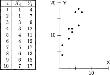
Any description of multivariate data starts with a representation of the observations and the variables. Consider an example. Suppose that one has ten observations of two variables, X and Y, as shown in Figure 1.1. For the ith. subject, denote the scores by Xi and Yi. Summary statistics for these data give the two means as
their standard deviations as
and their correlation as 0.904.
Figure 1.1: Ten bivariate observations and their scatterplot.
The first way to picture these data is as a scatterplot. One variable, here X, is assigned to the horizontal axis and the other variable, here Y, is assigned to the vertical axis. Each subject’s scores are plotted as a point; thus, the first subject is plotted at the point (1, 4), the second subject at the point (1, 7), and so on. This scatterplot is shown on the right of Figure 1.1. In it the axes are the variables, and each point expresses the data from a single subject. Several things are immediately clear from a glance at the scatterplot. First, the points do not cluster about the origin, so the means are nonzero. Second, the points are more spread out along the Y axis than along the X axis, so variable Y has greater variability than variable X. Third, high scores on one variable correspond closely with high scores on the other variable, so there is a substantial association between the variables. Finally, the connection between the variables does not bend and can be approximately represented by a straight line.
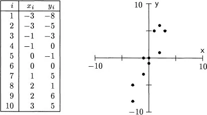
If one is only interested in how the individual values of X and Y go together, then the location of the origin of the scatterplot is unimportant. The X-Y relationship is the same, no matter where the axes are put. In most of multivariate statistics, the analysis of association is simplified by shifting the center of the plot to the origin. This shift is accomplished by subtracting the mean of each variable from every score, thereby creating new variables, here represented by lowercase letters,
Figure 1.2: Centered data from Figure 1.1.
This operation is known as centering the variables. Subtracting the means
= 4 and
= 12 from the scores in Figure 1.1 gives the new scores and scatterplot in Figure 1.2. The means of the centered scores are now zero, but the standard deviations and correlation are unchanged. Except for the position of the axes, the scatterplot is identical to the raw score plot. Centered variables are easier to work with than the raw scores, yet convey almost as much information. With a few exceptions, all the variables considered in these notes are centered.
The scatterplot is a very useful way to look at a set of data. It clearly shows the pattern of individual observations. Almost every multivariate analysis involves (or should involve) several of these plots. However, in one respect the very characteristic of the scatterplot that makes it useful also limits it. The scatterplot places emphasis on the observations, not on the variables as general entities. When one wants to talk about the variables, a different type of graph often gives a clearer picture.
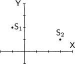
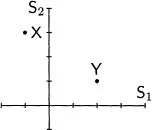
The second way to plot a set of multivariate data exchanges the roles of subjects and variables from that in the scatterplot. Consider two bivariate observations: subject S1 receives the score −1 on variable X and 2 on variable Y, and subject S2 receives the scores 3 and 1. The scatterplot has an axis for each variable and a point for each subject:
In the new graph, there is an axis for each subject. Each variable is represented by a point, variable X by the point (−1, 3) and variable Y by the point (2, 1):
The two plots picture the data in different spaces. In the scatterplot, the axes are defined by the variables, so the plot is said to be located in variable space. The entities plotted are the observations, each of which is denoted by a point. In the new plot, the axes are defined by the observations or subjects, so it is said to be located in subject space. The entities plotted here are the variables themselves.
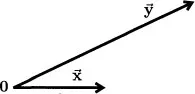
The trick now is to extend the subject-space plot to more than two observations. For the data in Figure 1.1, there is one axis for each subject, making ten axes in all. There are two points in this ten-dimensional space, one for X and one for Y. For the uncentered data in Figure 1.1 these points are
Here a problem arises. The data demand a ten-dimensional space, but ten-dimensional graph paper is hard to come by. On the face of it, subject space seems an impossible place to plot data or even to think about. However, the problem of visualization is vastly simplified because the plot contains only three objects. There is one landmark at the origin, one point for variable X, and another point for variable Y. To see the relationships among the variables, one need look only at the relative positions of these three points. Usually one can concentrate on the plane in subject space that they determine and can ignore the rest of the space. By dropping the original axes, the number of dimensions needed to draw the picture in subject space is no greater than the number of variables.
When drawing a picture of subject space, it is convenient to represent the variables not by points, as on a scatterplot, but by arrows, known as vectors, drawn from the origin (denoted by a boldface 0) to the points. There are only a few points in the space and the vectors help them stand out. To suggest their geometric nature, the vectors are indicated in this book by boldface letters with an arrow above them. Variable X becomes the vector
and variable Y becomes the vector
. Figure 1.3 shows these vectors for the centered data in Figure 1.2.
Figure 1.3: The centered data of Figure 1.2 plotted in subject space.
Two important properties of the variables are apparent in this plot (they were actually used to draw it). First, the lengths of the vectors indicate the variability of the corresponding variables. Variables X and Y have standard deviations of 2.06 and 4.55, and so
is 4.55/2.06 = 2.21 times as long as
. Second, the angle between the vectors measures how similar the variables are to each other. Vectors that represent highly...
Table of contents
Cover
Title Page
Copyright Page
Table of Contents
1 Variable space and subject space
2 Some vector geometry
3 Bivariate regression
4 Multiple regression
5 Configurations of regression vectors
6 Statistical tests
7 Conditional relationships
8 The analysis of variance
9 Principal-component analysis
10 Canonical correlation
Frequently asked questions
Yes, you can cancel anytime from the Subscription tab in your account settings on the Perlego website. Your subscription will stay active until the end of your current billing period. Learn how to cancel your subscription
No, books cannot be downloaded as external files, such as PDFs, for use outside of Perlego. However, you can download books within the Perlego app for offline reading on mobile or tablet. Learn how to download books offline
Perlego offers two plans: Essential and Complete
Essential is ideal for learners and professionals who enjoy exploring a wide range of subjects. Access the Essential Library with 800,000+ trusted titles and best-sellers across business, personal growth, and the humanities. Includes unlimited reading time and Standard Read Aloud voice.
Complete: Perfect for advanced learners and researchers needing full, unrestricted access. Unlock 1.5M+ books across hundreds of subjects, including academic and specialized titles. The Complete Plan also includes advanced features like Premium Read Aloud and Research Assistant.
Both plans are available with monthly, semester, or annual billing cycles.
We are an online textbook subscription service, where you can get access to an entire online library for less than the price of a single book per month. With over 1.5 million books across 990+ topics, we’ve got you covered! Learn about our mission
Look out for the read-aloud symbol on your next book to see if you can listen to it. The read-aloud tool reads text aloud for you, highlighting the text as it is being read. You can pause it, speed it up and slow it down. Learn more about Read Aloud
Yes! You can use the Perlego app on both iOS and Android devices to read anytime, anywhere — even offline. Perfect for commutes or when you’re on the go. Please note we cannot support devices running on iOS 13 and Android 7 or earlier. Learn more about using the app
Yes, you can access The Geometry of Multivariate Statistics by Thomas D. Wickens in PDF and/or ePUB format, as well as other popular books in Psychology & History & Theory in Psychology. We have over 1.5 million books available in our catalogue for you to explore.