![]()
Chapter 1
Variable space and subject space
Multivariate statistics concerns the analysis of data in which several variables are measured on each of a series of individuals or subjects. The goal of the analysis is to examine the interrelationships among the variables: how they vary together or separately and what structure underlies them. These relationships are typically quite complex, and their study is made easier if one has a way to represent them graphically or pictorially. There are two complementary graphical representations, each of which contributes different insights. This chapter describes these two ways to view a set of multivariate data.
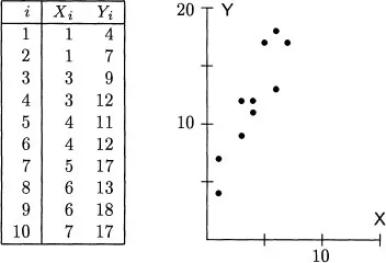
Any description of multivariate data starts with a representation of the observations and the variables. Consider an example. Suppose that one has ten observations of two variables, X and Y, as shown in Figure 1.1. For the ith. subject, denote the scores by Xi and Yi. Summary statistics for these data give the two means as
their standard deviations as
and their correlation as 0.904.
Figure 1.1: Ten bivariate observations and their scatterplot.
The first way to picture these data is as a scatterplot. One variable, here X, is assigned to the horizontal axis and the other variable, here Y, is assigned to the vertical axis. Each subject’s scores are plotted as a point; thus, the first subject is plotted at the point (1, 4), the second subject at the point (1, 7), and so on. This scatterplot is shown on the right of Figure 1.1. In it the axes are the variables, and each point expresses the data from a single subject. Several things are immediately clear from a glance at the scatterplot. First, the points do not cluster about the origin, so the means are nonzero. Second, the points are more spread out along the Y axis than along the X axis, so variable Y has greater variability than variable X. Third, high scores on one variable correspond closely with high scores on the other variable, so there is a substantial association between the variables. Finally, the connection between the variables does not bend and can be approximately represented by a straight line.
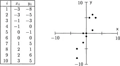
If one is only interested in how the individual values of X and Y go together, then the location of the origin of the scatterplot is unimportant. The X-Y relationship is the same, no matter where the axes are put. In most of multivariate statistics, the analysis of association is simplified by shifting the center of the plot to the origin. This shift is accomplished by subtracting the mean of each variable from every score, thereby creating new variables, here represented by lowercase letters,
Figure 1.2: Centered data from Figure 1.1.
This operation is known as
centering the variables. Subtracting the means
= 4 and
= 12 from the scores in
Figure 1.1 gives the new scores and scatterplot in
Figure 1.2. The means of the centered scores are now zero, but the standard deviations and correlation are unchanged. Except for the position of the axes, the scatterplot is identical to the raw score plot. Centered variables are easier to work with than the raw scores, yet
convey almost as much information. With a few exceptions, all the variables considered in these notes are centered.
The scatterplot is a very useful way to look at a set of data. It clearly shows the pattern of individual observations. Almost every multivariate analysis involves (or should involve) several of these plots. However, in one respect the very characteristic of the scatterplot that makes it useful also limits it. The scatterplot places emphasis on the observations, not on the variables as general entities. When one wants to talk about the variables, a different type of graph often gives a clearer picture.
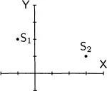
The second way to plot a set of multivariate data exchanges the roles of subjects and variables from that in the scatterplot. Consider two bivariate observations: subject S1 receives the score −1 on variable X and 2 on variable Y, and subject S2 receives the scores 3 and 1. The scatterplot has an axis for each variable and a point for each subject:
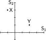
In the new graph, there is an axis for each subject. Each variable is represented by a point, variable X by the point (−1, 3) and variable Y by the point (2, 1):
The two plots picture the data in different spaces. In the scatterplot, the axes are defined by the variables, so the plot is said to be located in variable space. The entities plotted are the observations, each of which is denoted by a point. In the new plot, the axes are defined by the observations or subjects, so it is said to be located in subject space. The entities plotted here are the variables themselves.
The trick now is to extend the subject-space plot to more than two observations. For the data in Figure 1.1, there is one axis for each subject, making ten axes in all. There are two points in this ten-dimensional space, one for X and one for Y. For the uncentered data in Figure 1.1 these points are
(1, 1, 3, 3, 4, 4, 5, 6, 6, 7) and (4, 7, 9, 12, 11, 12, 17, 13, 18, 17),
and for the centered data in Figure 1.2 they are
(−3, −3, −1, −1, 0, 0, 1, 2, 2, 3) and (−8, −5, −3, 0, −1, 0, 5, 1, 6, 5).
Here a problem arises. The data demand a ten-dimensional space, but ten-dimensional graph paper is hard to come by. On the face of it, subject space seems an impossible place to plot data or even to think about. However, the problem of visualization is vastly simplified because the plot contains only three objects. There is one landmark at the origin, one point for variable X, and another point for variable Y. To see the relationships among the variables, one need look only at the relative positions of these three points. Usually one can concentrate on the plane in subject space that they determine and can ignore the rest of the space. By dropping the original axes, the number of dimensions needed to draw the picture in subject space is no greater than the number of variables.
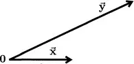
When drawing a picture of subject space, it is convenient to represent the variables not by points, as on a scatterplot, but by arrows, known as
vectors, drawn from the origin (denoted by a boldface 0) to the points. There are only a few points in the space and the vectors help them stand out. To suggest their geometric nature, the vectors are indicated in this book by boldface letters with an arrow above them. Variable X becomes the vector
and variable Y becomes the vector
.
Figure 1.3 shows these vectors for the centered data in
Figure 1.2.
Figure 1.3: The centered data of Figure 1.2 plotted in subject space.
Two important properties of the variables are apparent in this plot (they were actually used to draw it). First, the lengths of the vectors indicate the variability of the corresponding variables. Variables X and Y have standard deviations of 2.06 and 4.55, and so
is 4.55/2.06 = 2.21 times as long as
. Second, the angle between the vectors measures how similar the variables are to each other. Vectors that represent highly...