![]()
Designing the Graphic Layout
Representation Strategies: Graphic Design Basics
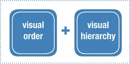
Visual Order and Visual Hierarchy
Typography
Graphic Punctuation
Graphics: How Far Is Too Far
Project Narrative Visual Representation
Determining Holes in the Project Narrative
Representing Work: Does Additional Material Need to Be Produced?
How Many Projects Should Be Included?
Visual and Verbal Representation of Design Thinking
Architectural Symbols and Conventions for Presentation Drawings
Text in Your Portfolio: What it Says and How it Looks
What it Says: The Value of Words
How it Looks: The Graphic Presence of Text in a Portfolio
Content and Visual Goals of Text in a Portfolio
Architecture Specific Text Issues
Editing and Reviewing Your Work
Visual Review Process
Editing Checklists
![]()
Representation Strategies: Graphic Design Basics
Design Actions
- Establish visual order and visual hierarchy.
- Get a handle on graphic rules of typography and implement them.
- Learn correct graphic punctuation and put what you’ve learned to good use.
- Don’t screw it all up with goofy graphics.
There are quite a few ideas that can be borrowed from the profession of graphic design to use as guidelines for our purposes in portfolio design. This section covers graphic issues of primary importance. For additional information, there are many good texts on graphic design available. Keep in mind, however, that graphic design and architecture are two very different professions. Graphic design should be viewed through an architectural lens to stay relevant to issues of visual communication in architecture. Not all graphic design principles apply to visual communication in the realm of architecture.
Visual Order and Visual Hierarchy
Visual order and visual hierarchy are two design principles that are very closely related; yet these two principles achieve different goals for a design layout. For the purposes of this discussion, relate both of these ideas to the specific design of page layouts and spreads.
Visual Order
Visual order describes the visual cohesiveness of objects ordered together on a page. In general, the visual goal is for a two-page spread to read as a cohesive ordered set of information. There could be an instance where visual discordance works for visual emphasis, but this situation should be the exception to the rule of cohesive order. There are several principles to discuss relative to visual order; keep in mind the goal of visual cohesion and order on your designed portfolio spread with each one.
Visual Hierarchy
Visual hierarchy and visual order are very closely related. Properly applied strategies of visual hierarchy actually strengthen the visual order and vice versa. Remember, to create visual hierarchy, objects on the page must recede visually in order for something else to come forward. Incidentally, this is also an apt description of principles of visual order.
To simplify: Visual order helps with the legibility of your graphics. Visual hierarchy is one of the primary tools used to establish visual order.
Many different components of the design portfolio are discussed in this publication. Principles of visual hierarchy are embedded in the majority of these discussions. In fact, the entire section on Project Narrative Visual Representation and all of the organizational strategies found throughout this book are describing the complexity of systems that lead to visual order through visual hierarchy. Pay attention to typeface relationship and hierarchy, image adjacency and hierarchy, relationship of the content to the page, a variety of levels of reading of a portfolio, and the list goes on. Suffice it to say, all things related to graphic layout have visual hierarchy as an underpinning.
Visual order and visual hierarchy work together and act as ordering systems for the content in your portfolio.
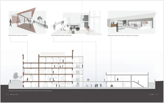
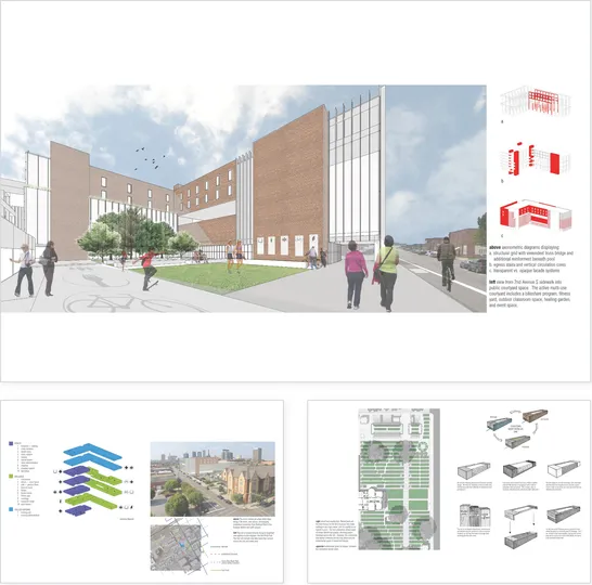
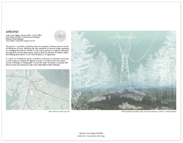
Primary image—longitudinal section—is supported by secondary explanatory images. Portfolio design by Katherine Lynch.
Location of Primary Images
Primary images—those images that have been identified as most important to the message being delivered— need to be carefully sized and placed on the designed spread. Do not be afraid to make the primary image(s) significantly larger than other images on the page. In fact, they can be the only image on the page! If all of the images are the same size, the eye won’t understand where to focus on the page and the ability to clearly, visually deliver your ideas will be lost.
Images versus Text
On each and every layout, determine what element(s) should be the most visually prominent. This decision depends on what component of the content narrative is most important to deliver. A clear understanding of what type of content best conveys that goal is needed.
Keep in mind that images and text will often visually compete with one another, particularly if an appropriate visual hierarchy hasn’t been determined. A typical strategy is to say that on project introduction pages, there is a specific balance between text—project title information—and the main introduction image. On project content pages, the images have hierarchical precedent over the visual presence of the text.
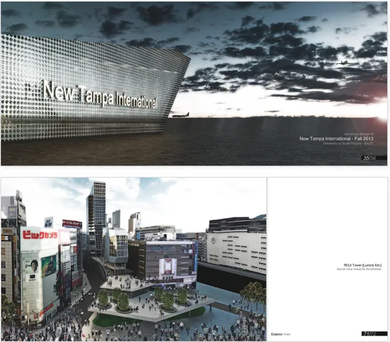
Single primary images allow the reviewer to focus on exactly what is being visually described in each selected image. Portfolio design by Israel B. Sanchez.
White Space and Adjacencies
White space gets a lot of discussion as a design tool. In this application—the understanding of visual order on a designed spread—white space can be used to help understand which elements on a page belong to one another. Considering all of the elements that need to be combined on a page to convey meaning, it is important to be able to group the relevant information together. These groups are visual packs that together deliver a message about your project. The adjacency relationship between these elements relies on white space to be able to recognize the appropriate separations and adjacencies.
The use of designed white space to gather and pack images together adds visual organization to the design layout for a variety of project types. Portfolio design by Callie Eitzen.
opposite: Uniform margins between sets of images separate visual information into similar content sets. These sets can then be understood together. As you can see, white space doesn’t actually have to be white. Portfolio design by Devin Dobrowolski.
Visual weight is focused on the right-hand side of the spread.
Portfolio design by Ibrahim W. Salman.
Visual Weight
There are a few different ways to look at the issue of visual weight as it relates to the designed page. One is a consideration of the western reader’s relationship to the physicality of a printed book and the other is a consideration of the perceived relationship between the reviewer and gravity.
Relationship to Printed Book
The way a person flips through a physical book generates guidelines related to visual weight on the page. This phenomenon is only applicable to the design of a physical book that will be printed. When a reader flips through a book, the tendency is to hold the book spine in the left hand and flip through the book with the right hand. This action displays the majority of the right-hand pages of a book. It stands to reason that to catch someone’s eye and get them to actually take some time to look through a portfolio, graphic material of visual importance should be located on the right-hand side of the page layout.
Relationship to Gravity
Our relationship to the three-dimensional world translates to our relationship to the two-dimensional world primarily through our understanding of gravity.
For the purposes of this discussion, let’s think about gravity as a force that attracts us to any other physical body of mass—the force that attracts the body to the center of the earth. This is a principle we readily understand. Considering the visual representation of the idea of gravity, think of the image of small objects clustering around a larger object—this automatically sets up a visual hierarchy and thus order. Or consider the visual weight on the page relative to the two-dimensional expression of gravity with the visual weight located at the bottom of the page.
Visual weight located at the bottom of the page. Portfolio design by Fani Christina Papadopoulou.
Use of Color
Color can also play a significant role in the application of visual hierarchy. Consider the use of color for visual hierarchy in two ways.
First, think of color used in a color family to help an entire spread order itself visually. In this case, a color family on a designed spread can visually coalesce the material on the page. You can also think of color in a singular application that will draw the eye and either pull something forward or help it recede.
Color can be used as a visual organizer within a project or throughout the entire portf...