Data Visualization for Design Thinking helps you make better maps. Treating maps as applied research, you'll be able to understand how to map sites, places, ideas, and projects, revealing the complex relationships between what you represent, your thinking, the technology you use, the culture you belong to, and your aesthetic practices. More than 100 examples illustrated with over 200 color images show you how to visualize data through mapping. Includes five in-depth cases studies and numerous examples throughout.
- 284 pages
- English
- ePUB (mobile friendly)
- Available on iOS & Android
eBook - ePub
About this book
Trusted by 375,005 students
Access to over 1.5 million titles for a fair monthly price.
Study more efficiently using our study tools.
Information
Chapter 1: Maps as Objects of Explanation
When on high the heaven had not been named,
Firm ground below had not been called by name,
Naught but primordial Apsu, their begetter,
(And) Mummu Tiamat, she who bore them all,
Their waters commingling as a single body,
No reed but had been matted, no marsh land had appeared,
When no gods whatever had been brought into being,
Un-named, their destinies yet undetermined—
Then it was that the gods were emerged from within them.
Lahmu and Lahamu were came forth, were called by name,
Before they had grown in age and stature.
Enuma Elish1
And now good-morrow to our waking souls,
Which watch not one another out of fear;
For love, all love of other sights controls,
And makes one little room an everywhere.
Let sea-discoverers to new worlds have gone,
Let maps to other, worlds on worlds have shown,
Let us possess one world, each hath one, and is one.
Excerpt from ‘The Good-Morrow’ by John Donne, 1572–1631
The Map as Artifact and Process
There was a great cartographic moment some years back on a television program called The West Wing. I often make students watch this particular bit from the show, which doesn’t take more than a couple of minutes. In this episode several White House staff members meet with the Organization of Cartographers for Social Equity who request that an inverted version of the Gall–Peters projection replace the Mercator projection (see Figures 3.12 and 3.13). The conversation is rather funny and worth giving in full:
—Why are we changing maps?
—Because, C.J., the Mercator projection has fostered European imperialist attitudes for centuries and created an ethnic bias against the Third World. The map enlarges areas at the poles to create straight lines of constant bearing or geographic direction. So, it makes it easier to cross an ocean. But … It distorts the relative size of nations and continents.
—Are you saying the map is wrong?
—Oh, dear, yes. Uh, look at Greenland. Now look at Africa. Would it blow your mind if I told you that Africa is in reality fourteen times larger?
—Yes.
—Here we have Europe drawn considerably larger than South America when at 6.9 million square miles South America is almost double the size of Europe’s 3.8 million. Germany appears in the middle of the map when it’s in the northernmost quarter of the Earth.
—Wait, wait. Relative size is one thing, but you’re telling me Germany isn’t where we think it is?
—Nothing’s where you think it is.
—Where is it?
—I’m glad you asked. [brings up a new map, which has its continents significantly squished northward] The Peters Projection.
—What the hell is that?
—It’s where you’ve been living this whole time. Should we continue?
—When Third World countries are misrepresented they’re likely to be valued less. When Mercator maps exaggerate the importance of Western civilization, when the top of the map is given to the northern hemisphere and the bottom is given to the southern … then people will tend to adopt top and bottom attitudes.
—But … wait. How … Where else could you put the Northern Hemisphere but on the top?
—On the bottom.
—How?
—Like this. [The map is flipped over.]
—Yeah, but you can’t do that.
—Why not?
—’Cause it’s freaking me out.2
The chapter explores maps as artifacts: semiotic, representational, social, historical and otherwise. Moving beyond the map as picture or representation (however constructed) we explore maps as process: what James Corner refers to as the creative agency of mapping ‘unfolds potential’ connecting cartographer and map reader to their cognitive and perceptual contexts with new and diverse consequences: ‘maps do not represent geographies or ideas; rather they effect their actualization’ (emphasis in original).3 As in the West Wing quote, we are ‘freaked out’ when the picture changes, but unpacking what it means to think cartographically allows the agency of the map to be ‘a productive and liberating instrument’4—particularly in the world of design of the built environment.
But first—why are we unsettled when the picture changes? Maps are after all abstractions of spatial organization—we don’t confuse the map for the thing entirely, but answering the why suggests we need to look carefully at just what we are confusing for what. The example using the Gall–Peters and Mercator maps uses terrestrial geography to demonstrate the point, but we could have easily used scientific models of the atomic universe from Newtonian space and time compared to the Einstein–Minkowski space-time revolution.5 One model offered a view of the universe in which time is absolute; the other makes time and space relative and contingent. Robert Harbison suggests maps and the picture of the world they provide link to our sense of self in that world:
we do not imagine the land out from ourselves flexibly in all directions, but are always standing in the same place when we think of it and facing the same way like a statue. Maps sedulously reinforce and protect our sense of where we are, a sense which can be very elaborate without being deliberately worked out, and derange artificially by obliterating the reference point east or west to which we habitually look.6
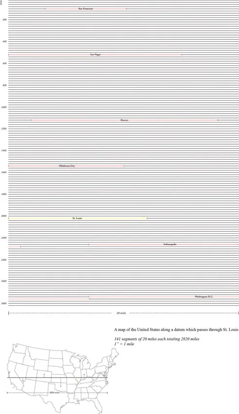
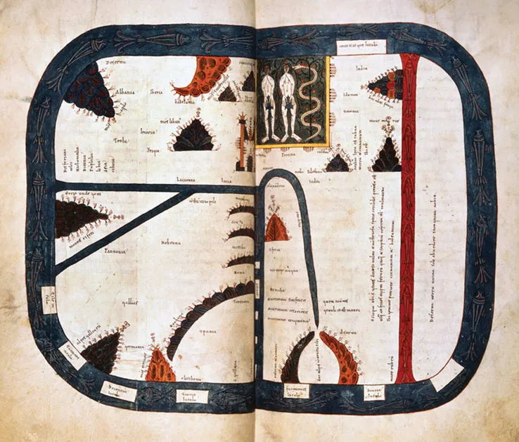
The map of the United States along a Datum (Figure 1.1) by Brad Cooke is a translation between distance and geography presenting a ‘map’ of the US in a completely unfamiliar way. Cooke’s map redraws the geography as pure distance represented as a single scaled line with a few familiar cities. This is the space of a single straight line drawn from coast to coast crossing through St. Louis. Similarly, the Beatus or Beatine map (Figure 1.2) is a medieval mappa mundi presenting a view of the world unfamiliar to modern sensibilities. The map depicts the geography associated with the diaspora of the apostles from accounts given by Ptolemy, St. Isidore of Seville and biblical text. The Beatus is one of the earliest representations of the T and O map (T-O map). These maps are drawn according to the physical characteristics of the world described by Isidore where the inhabited part of dry land is round with a circular Ocean dividing it into three parts, Asia, Europe and Africa. The circular ocean or ‘O’ is inscribed with the ‘T’ of intersecting channels made between the landmasses. Jerusalem, the umbilicus mundi, is placed as the literal and spiritual center of the world. The Garden of Eden is located in the eastern end of Asia. This particular map orients eastward rather than the familiar northward. The Earth was thought to be a plane sustaining the vault of heaven where the Sun, Moon and other luminaries moved. The waters above the firmament occasionally fell to earth in the form of rain and waters below nurtured the rivers, oceans and seas. However, before you judge the map a representation of a flat world, it should be noted Beatus-type maps are based on the principle the Earth is globular, an idea largely accepted by scholars from the time of Aristotle. The T-O maps represent one half of the spherical Earth because it was thought impossible to cross the equatorial clime and reach the antipodes, as the unknown lands were called. The map operates on several levels of understanding: 1) a physical description, 2) an itinerary map identifying the travels of the apostles, 3) a map of important biblical events, and 4) a reminder the spiritual center of the Earth is Jerusalem. For the medieval mind Jerusalem is the physical and metaphysical center of the known terrestrial world. The Beatus isn’t a lesser world map for lack of what we might consider concrete geographical evidence, but a robust way of representing a complex of ideas and places encompassing a rich world view. This map like all maps represents a mode of knowledge as much as an epistemology. If the meaning of the map symbolism is unfamiliar it is because we do not share the same semiotic context as the mapmaker. David Harvey notes maps are replete with the values, beliefs, and judgments of the cultures producing them.7 His neo-Marxist reading of maps tends to equate map symbology with power structures in a post-modern worldview, but this applies equally to the pre-modern world where spiritual ideologies color cosmology. Early maps similarly are social constructions instantiating and supporting dominant socio-political cadres.
1.1
Map of United States along a Datum translates the linear travel distance from the east to west coast through St. Louis, Missouri, into a graphic table of 141 20-mile line segments totaling 2950 miles scaled to 1 in equals 1 mile. Brad Cooke, Washington University in St. Louis, 2012.
Map of United States along a Datum translates the linear travel distance from the east to west coast through St. Louis, Missouri, into a graphic table of 141 20-mile line segments totaling 2950 miles scaled to 1 in equals 1 mile. Brad Cooke, Washington University in St. Louis, 2012.
1.2
The Manchester (a.k.a. Rylands) Beatus mappa mundi, ca. 1175 ascribed to the monastery of San Pedro de Cardeña in the region of Toledo. It is part of a larger family of maps based on a map originally drawn by the Spanish monk Beatus of Liébana. Unknown author, Ryland Beatus, ca. 1175, Toledo, Spain, 32 × 43 cm (12.6 × 16.9 in) and is one of the best preserved of all the Beatus group.
The Manchester (a.k.a. Rylands) Beatus mappa mundi, ca. 1175 ascribed to the monastery of San Pedro de Cardeña in the region of Toledo. It is part of a larger family of maps based on a map originally drawn by the Spanish monk Beatus of Liébana. Unknown author, Ryland Beatus, ca. 1175, Toledo, Spain, 32 × 43 cm (12.6 × 16.9 in) and is one of the best preserved of all the Beatus group.
David Harvey along with Brian Harley, Denis Cosgrove, Denis Wood, Jeremy Crampton and John Krygier are part of a larger movement in cartographical discourse termed ‘critical cartography’ which entails new mapping practices and a theoretical critique linking geographic knowledge and power.8 Harley specifically linked power, ideology and surveillance. Arguably this isn’t a new use of the map. For Vauban, Louis XIV’s principal military engineer, cartography was an aid to the science of siege whose maps and the fortifications they represented were part of stabilizing France’s national borders.9 As Armand Mattelart shows, for Vauban, building fortifications and drawing up the map were part of the same process ultimately linking networks, communication and state. Harley and colleagues theorizing in a post-structuralist manner situate maps as social documents understood in their historical context. Harley even argues that for new maps, mapmakers are ethically responsible for the effects their maps have on society, albeit they may not be the only agents deciding what is included or excluded from a given map. For critical cartographers, maps actively construct knowledge as ‘graphic representations that facilitate spatial understanding’ across multiple disciplines.
J. B Harley is one of the first of the critical cartographers to recognize maps are part of a larger problem in the representation of space and the space of representation. He moved beyond the history of the science of mapmaking to consider the practices and social relations underlying the discipline. As Vincent Del Casino notes, ‘Harley presents a way of understanding the map and cartography as both parts and products of social discourses and, therefore, employments of power’ where ‘social power is inscribed in maps by cartographers operating within dominant discourses and institutions.’10 One of the techniques Harley introduces is analysis of the entire map including titles, legends, pictures and descriptive text usually placed at the margins of the page.11 The critique leveled at Harley is his assumption the space represented in the map is unproblematic. There are few ambiguities in Harley’s view of cartography, ‘no possibility the meaning of the spaces and identities represented in maps may be continually reproduced with changes in context.’12 However, as Del Casino notes, maps are ‘intertextual’: they are made and used in a broad range of existing representations of the place being mapp...
Table of contents
- Cover
- Half Title
- Title Page
- Copyright Page
- Dedication
- Table of Contents
- Foreword
- Preface
- Acknowledgments
- Figure Credits
- Introduction
- Chapter 1: Maps as Objects of Explanation
- Chapter 2: Terms of the Map
- Chapter 3: Maps as Power, Identity and Utopia
- Chapter 4: Case Studies
- Further Reading
- Index
Frequently asked questions
Yes, you can cancel anytime from the Subscription tab in your account settings on the Perlego website. Your subscription will stay active until the end of your current billing period. Learn how to cancel your subscription
No, books cannot be downloaded as external files, such as PDFs, for use outside of Perlego. However, you can download books within the Perlego app for offline reading on mobile or tablet. Learn how to download books offline
Perlego offers two plans: Essential and Complete
- Essential is ideal for learners and professionals who enjoy exploring a wide range of subjects. Access the Essential Library with 800,000+ trusted titles and best-sellers across business, personal growth, and the humanities. Includes unlimited reading time and Standard Read Aloud voice.
- Complete: Perfect for advanced learners and researchers needing full, unrestricted access. Unlock 1.5M+ books across hundreds of subjects, including academic and specialized titles. The Complete Plan also includes advanced features like Premium Read Aloud and Research Assistant.
We are an online textbook subscription service, where you can get access to an entire online library for less than the price of a single book per month. With over 1.5 million books across 990+ topics, we’ve got you covered! Learn about our mission
Look out for the read-aloud symbol on your next book to see if you can listen to it. The read-aloud tool reads text aloud for you, highlighting the text as it is being read. You can pause it, speed it up and slow it down. Learn more about Read Aloud
Yes! You can use the Perlego app on both iOS and Android devices to read anytime, anywhere — even offline. Perfect for commutes or when you’re on the go.
Please note we cannot support devices running on iOS 13 and Android 7 or earlier. Learn more about using the app
Please note we cannot support devices running on iOS 13 and Android 7 or earlier. Learn more about using the app
Yes, you can access Data Visualization for Design Thinking by Winifred E. Newman in PDF and/or ePUB format, as well as other popular books in Design & Architecture General. We have over 1.5 million books available in our catalogue for you to explore.