CHAPTER 1
Primary Color Correction: Tonal Range Primer
Color correction is generally broken down into two distinct processes: primary and secondary color correction. These two processes will probably always be referred to as two distinct processes, but the technology itself is starting to change the perception of how and why these two processes are used and when the colorist moves from one process to another.
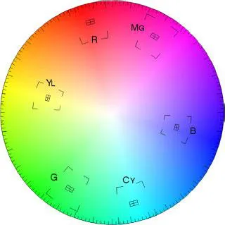
Primary color correction is the process of setting the overall tone, contrast, and color balance of the image. Secondary color correction is an additional step that refines the image in specific geographical regions of the image or in specific color vectors of the image. Don’t let that word “vector” scare you. There are a number of definitions of the word “vector” that are used when discussing color space. It basically means the specific location or coordinates of a color. A vector can also mean the direction that something is heading, from one point in space towards another. So, essentially, in the color correction world, “vector” is just the technical word that defines a specific “color.” Think of a vectorscope, which is a tool that allows you to kind of see the “color wheel” (Figure 1.1). The vectorscope shows you where parts of the picture are on the color wheel. So the vectorscope shows you the vector—or location on the color wheel—for the elements of your video image.
The first step in any color correction is to assess the tonal range of the picture. What are the problems with the tonal range and how can you address them? From a purely technical standpoint, it seems like an easy question to answer. As a matter of fact, many color correction plug-ins or color correction systems built into nonlinear editors have “automatic” buttons that will attempt to spread out the tonal range for you based on purely technical information. These automatic systems assume that the brightest parts of the picture should be as bright as possible while remaining “legal.” The darkest part of the picture is also set automatically to be as low as possible while remaining “legal.”
Definition
legal: For video-based images, “legal” means that the brightness and color saturation of an image does not exceed minimum or maximum levels that have been determined for a specific delivery channel for a video. This usually implies broadcast, but can also pertain to duplication. Each duplicator or broadcaster sets their own specific requirements for video levels, but in general these levels adhere to national and international standards and describe that the darkest portions of the luminance of the picture can not fall below 0IRE for NTSC digital video (and most other international video of any type) or 7.5IRE for composite NTSC in the United States. The brightest pixels are not to pass 100IRE when monitoring luminance only or, when combined with chroma, cannot pass 110IRE. (There are other ways to measure the signal other than IRE, such as in millivolts.) Also, as our delivery systems become more and more digitally based, “gamut” is also included in “legal” levels. Not all waveform monitors or vectorscopes can monitor gamut levels. These gamut levels are the legal amounts—or values—of certain colors. It is possible for the luminance of an image to be well under legal levels, but because of a combination of saturation and luminance, the legal gamut levels can be exceeded. We’ll get into this more later in the book. In addition to “legal” levels, there is a second, similar term called “valid” levels.
vector: A position or coordinate in space or a direction between two coordinates. On a vectorscope, the vector is the specific position of a color in the two-dimensional circle defined by the vectorscope. The “targeted” vectors on the vectorscope are the three primary colors—red, green, and blue—and the secondary colors fall between them—magenta, cyan, and yellow.
valid levels: Levels that remain legal when transferred, translated, or transcoded between formats.
gamma: Technically gamma is a curve, but in some software programs, gamma is the label for the midtone adjustment slider. For all intents and purposes, gamma and midtone are synonymous in color correction.
There are two big problems with this behavior. Simply setting the brightest pixel to 100 and the darkest pixel to 0 with all of the intermediate pixels spread evenly between them does not necessarily provide the best spread of the tonal range across the most visually important parts of the image. The other problem is that the image may not need to have either its brightest pixel at 100 or its darkest pixel at 0.
The first problem is solved with some experience. Great colorists know tricks that can enhance the perception of an image’s tonal range. They know that they can sacrifice the detail in a certain tonal range where it may not be noticed so that they can use that tonal range to enhance a more visually important part of the picture. These are tricks that you will learn in this chapter and throughout the rest of the book, Automatic software doesn’t know what is visually important, so it treats all areas of the image equally.
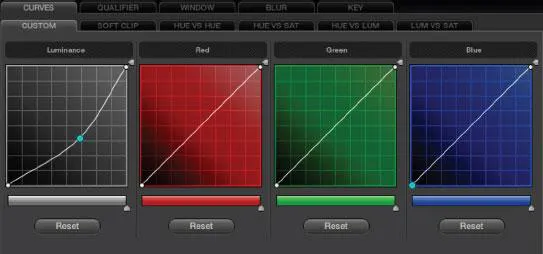
Even if the image should be spread from 0 to 100, that still leaves out one critical component: gamma. Spreading out the tonal range really serves to increase contrast, but the real impression of how bright or dark the image is relies largely on your gamma or midtone controls. Gamma really refers to a curve. The reason that midtones are sometimes referred to as “gamma” is because by lifting or lowering the midtones, you are creating a curve between the white point and the black point instead of a simple straight line (Figure 1.2).
Great colorists know tricks that can enhance the perception of an image’s tonal range.
The second problem is that the image may not require an expanded tonal range (Figure 1.5). Most shots should have a pretty wide tonal latitude (range) with rich blacks and sparkling whites, but there are those images that should not take advantage of the full tonal range. Some examples: an igloo in a snow storm; a dark, moonlit close-up of a Navy SEAL creeping through the underbrush; a foggy, early morning rowboat ride; a long lens shot of a smoggy city at dusk. Each of these may only have a partial tonal range, lacking either a deep black or bright highlights. However, these examples are usually the exceptions to the rules. But they do require the colorist to consider the clues in the image itself to determine whether anything in the image deserves to be completely black or bright white.
The colorist must consider the clues in the image itself to determine whether anything in the image deserves to be completely black or bright white.
Definition
tonal range (singular): The tonal range is the difference between the brightest and darkest areas of the image, sometimes also called the dynamic range, luminance range, or contrast range, though these terms can have slightly different technical definitions. The tonal range of the image—and how those tones are spread throughout the tonal range—defines its contrast. For some applications of this phrase, tonal range indicates the actual number of levels of tones that a recording medium can record (256 per channel in the case of RGB 8-bit, or 1025 per channel in the case of RGB 10-bit). For our purposes, we will refer to tonal range (singular) as the range of tones between brightest and darkest. Ansel Adams and other proponents of the Zone System break the tonal range of an image into 11 distinct tonal ranges.
tonal ranges (plural): The three commonly used tonal ranges that are used to break down the description (and control) of an image are shadows, midtones, and highlights. Sometimes shadows are referred to as blacks, pedestal, set-up, lift, or even lowlights. Midtones are often referred to as gamma, but also as grays or mids. Highlights are sometimes also referred to as whites, gain, luma, or even video. These are not necessarily technically correct terms, but they are terms that were used by the colorists as they were verbally conveying the use of these individual tonal ranges. The terminology in the book will not remain the same, because in real life, these terms are often interchanged—sometimes even by the same speakers.
Gamut: The complete range of colors that can be captured, displayed, or broadcast by a device or a system of devices. Most cameras or color correction devices have a much wider gamut (range of colors) than those that can be used further on in the production stream. For example, the gamut of colors later in the production stream that could require a limited gamut can be those: recorded to tape, burned to a DVD, encoded for the Web, broadcast from a TV transmitter, or viewed on a TV set. So there are multiple gamuts that have to be considered (see the previous definition for “legal” and “valid”).
Automatic Corrections Are Bad
Let’s run an experiment to show that you are already a better colorist than the automatic color correction tools available in most software packages. Even if you aren’t tempted to use these automatic features, this little experiment is an important lesson in using your eyes instead of the numbers or doing things technically perfectly.
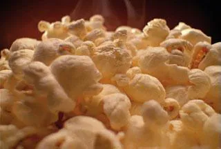
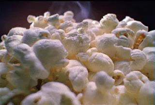
Open the “Artbeats Popcorn” image (from Artbeats’ beautiful Food1 collection; Figure 1.3) in any application that allows you to automatically color correct. Most of these tools automatically spread the tonal values and “white balance.” But because these tools don’t know what the image actually looks like, they do everything by the numbers. Sometimes using them can get you in the ballpark very quickly, and sometimes it makes an image look worse.
For my example, I brought the popcorn QuickTime into Avid Xpress Pro and color corrected it using the automatic color correction tools. To be fair to Avid and other applications with these tools, these automatic corrections can sometimes do a pretty good job. If you’re in a rush, give each image a shot with them, but be prepared to take matters into your own hands. Doing things manually is actually a good thing. If all someone needed to do was push a button, then there’d be nothing special about the skills you’re trying to develop.
Anyway, after running the popcorn image through the auto color correction, it doesn’t look nearly as appetizing as the beautifully color corrected original image.
Most of these tools figure that you want something that’s pretty “white” or neutral-looking and with a tonal range that’s completely spread out. In the case of the popcorn image, the image needs to have a nice, warm golden tone. Also, the original image doesn’t really go much beyond 80IRE in brightness, yet the autocorrection spreads the tonal values over the entire range, which causes the steam rising from the popcorn to take on a harsher feel and the brighter parts of the popcorn come close to clipping out, destroying detail by overexposing (Figure 1.4). (See definition of clipping on page 22.)
This point is a good thing to keep in mind as you’re color correcting things by hand. Not all images need to be at 100IRE and not all color casts are a bad ...