eBook - ePub
Visual Usability
Principles and Practices for Designing Digital Applications
- 342 pages
- English
- ePUB (mobile friendly)
- Available on iOS & Android
eBook - ePub
Visual Usability
Principles and Practices for Designing Digital Applications
About this book
Imagine how much easier creating web and mobile applications would be if you had a practical and concise, hands-on guide to visual design. Visual Usability gets into the nitty-gritty of applying visual design principles to complex application design.You'll learn how to avoid common mistakes, make informed decisions about application design, and elevate the ordinary. We'll review three key principles that affect application design – consistency, hierarchy, and personality – and illustrate how to apply tools like typography, color, and layout to digital application design. Whether you're a UI professional looking to fine-tune your skills, a developer who cares about making applications beautiful and usable, or someone entirely new to the design arena, Visual Usability is your one-stop, practical guide to visual design.
- Discover the principles and rules that underlie successful application design
- Learn how to develop a rationale to support design strategy and move teams forward
- Master the visual design toolkit to increase user-friendliness and make complicated processes feel straightforward for your product
Trusted by 375,005 students
Access to over 1.5 million titles for a fair monthly price.
Study more efficiently using our study tools.
Information
Topic
ConceptionSubtopic
ProgrammationPart I
The Meta-Principles
Chapter 1 Consistency
Chapter 2 Hierarchy
Chapter 3 Personality
Chapter 1
Consistency
“If in doubt, do it consistently.”
—A. Marcus, Graphic Documents for Electronic Documents and User Interfaces, p. 43
What do we mean by consistency?
How do you learn to use an application that looks different on every page? That uses icons for actions in some places, and links for the same actions in others? Or that applies colors and fonts unreliably, emphasizing content and features without any discernible rules?
You can, but it won’t be easy. To help users—and avoid common interface design mistakes—designers and developers need to establish rules for placement and treatment of interface elements and then stick to them. Just as you can’t speak in English, French, and German and expect to be clearly understood, you can’t mix visual interface characteristics without causing confusion.
Visual language, like verbal language, requires rules applied consistently to be recognized and interpreted. You can learn to interpret inconsistent cues or you can guess, but in applications that help people get things done, guessing games aren’t fun.
Consistency may sound boring. There are no awards for “most consistent” interface. Whether you’re designing an application or cooking dinner, doing something exactly the same way over and over isn’t exciting. What is exciting is watching people use your interface to do the things they want to do. Keep in mind that consistency isn’t about pleasing yourself—it’s about pleasing others by giving them what they understand and can rely on.
Consistency and the marketplace
This book focuses on the design of digital applications that help people get things done—everything from complex tasks like online banking or software download, to simple tasks like leaving yourself a reminder on your cell phone. Even the smallest changes, such as moving the location of a button, can make a big difference in perception and usability. Creating a consistent interface that people can quickly grasp and figure out how to interact with is critical for the success of this kind of application.
Some types of applications have changed more rapidly than others. At this time, consumer interfaces are breaking new ground in terms of combining evolving technical capabilities with interaction and visual design. (Pinterest, which uses endless scroll to display a rich variety of images, is one example of this.) Still, there are a lot of people using awful-looking and awkward applications every day. Frequent users create workarounds—sequences of actions that they repeat to do what they need to despite an interface that doesn’t fit their goals or methods of working—or they simply give up, and place costly calls to tech support.
Establishing consistency
Establishing consistency means setting and maintaining expectations by using elements people are familiar with. Expectations are set by what people see onscreen, as well as what they’ve seen in the past. For example, someone filling in payment information on a checkout screen may interpret the flow of the form based on the fields and organization they see, as well as what they saw on the login screen they just left. What they expect is affected by what they’ve seen on other login and payment information screens. They’re likely to look for the “Submit” button in the same place they’ve seen it on other screens within the application, or they may look where they’ve seen it on payment forms elsewhere.
Establishing consistency depends on awareness of user expectations (Figure 1.1). Part of it is the expectation you set via visible conventions on the current screen; another part is the expectation set on other screens in the same application. A third part is beyond our control—it’s set by what users have seen on separate applications.
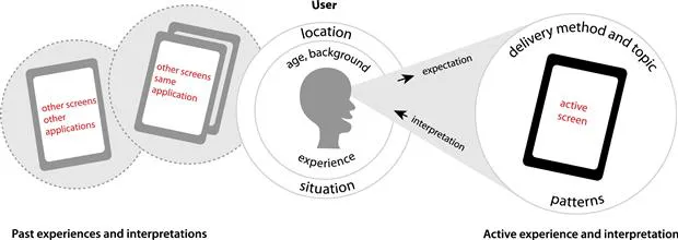
Figure 1.1 How people interpret what they see on a screen is affected by what they actively see, as well as what they’ve seen elsewhere in the same and in other applications.
If we’re aware of what screens users perceive as related, we can anticipate their expectations. You’re more likely to establish consistency successfully if you base design decisions on what users expect, discerning the patterns they’ve seen and incorporating what’s relevant. You can, and in some cases must, adopt patterns used on related screens or applications into your interfaces to provide what people expect. (User-centered design methods like contextual inquiry and prototype tests can help you determine this; see Chapter 3 for more information.) Understanding user expectations is part of defining interface conventions—creating rules and a rationale for how your application’s visual language will work.
Types of consistency: internal versus external
Consistency between screens within an application can be called internal consistency, while consistency between applications can be called external consistency. Put another way:
1. External consistency: Are the application’s design, content, and behavior similar to other applications used by the same audience?
2. Internal consistency: Do the application’s design, content, and behavior remain largely the same within screens and features, as well as within the boundaries of platform-specific limitations and requirements?
Internal and external consistency intersects when an application is part of a suite of related programs. In these circumstances, internally consistent elements of one application may apply to its suite-mates, or may conflict with their audience needs and requirements. You may not be able to make everything perfectly consistent, but the harder you try, the more likely it is your users will be able to painlessly switch between applications.
External consistency
External consistency can be very important. If your audience is accustomed to certain conventions—for example, faceted navigation controls to the left of search results—then you may need to adopt these same conventions to help people feel comfortable and well served. But unless you’re designing an interface that’s part of a suite or overall product line, external consistency for the sake of it is, frankly, ridiculous. Your audience may not have the same needs as the audience for the website or mobile application your CEO has fallen in love with, and the choices those designers made to help their users aren’t necessarily the best choices for your users.
Thinking about and reviewing external consistency are great ways to start defining interface conventions for a new application started from scratch. If your...
Table of contents
- Cover image
- Title page
- Table of Contents
- Copyright
- Acknowledgments
- About the Authors
- Introduction
- Part I: The Meta-Principles
- Part II: The Visual Usability Tools
- Summary: Interface Design as Visual Conversation
- Recommended Resources
- Bibliography
- Index
Frequently asked questions
Yes, you can cancel anytime from the Subscription tab in your account settings on the Perlego website. Your subscription will stay active until the end of your current billing period. Learn how to cancel your subscription
No, books cannot be downloaded as external files, such as PDFs, for use outside of Perlego. However, you can download books within the Perlego app for offline reading on mobile or tablet. Learn how to download books offline
Perlego offers two plans: Essential and Complete
- Essential is ideal for learners and professionals who enjoy exploring a wide range of subjects. Access the Essential Library with 800,000+ trusted titles and best-sellers across business, personal growth, and the humanities. Includes unlimited reading time and Standard Read Aloud voice.
- Complete: Perfect for advanced learners and researchers needing full, unrestricted access. Unlock 1.5M+ books across hundreds of subjects, including academic and specialized titles. The Complete Plan also includes advanced features like Premium Read Aloud and Research Assistant.
We are an online textbook subscription service, where you can get access to an entire online library for less than the price of a single book per month. With over 1.5 million books across 990+ topics, we’ve got you covered! Learn about our mission
Look out for the read-aloud symbol on your next book to see if you can listen to it. The read-aloud tool reads text aloud for you, highlighting the text as it is being read. You can pause it, speed it up and slow it down. Learn more about Read Aloud
Yes! You can use the Perlego app on both iOS and Android devices to read anytime, anywhere — even offline. Perfect for commutes or when you’re on the go.
Please note we cannot support devices running on iOS 13 and Android 7 or earlier. Learn more about using the app
Please note we cannot support devices running on iOS 13 and Android 7 or earlier. Learn more about using the app
Yes, you can access Visual Usability by Tania Schlatter,Deborah Levinson in PDF and/or ePUB format, as well as other popular books in Conception & Programmation. We have over 1.5 million books available in our catalogue for you to explore.