eBook - ePub
Designing Science Presentations
A Visual Guide to Figures, Papers, Slides, Posters, and More
- 384 pages
- English
- ePUB (mobile friendly)
- Available on iOS & Android
eBook - ePub
Designing Science Presentations
A Visual Guide to Figures, Papers, Slides, Posters, and More
About this book
Designing Science Presentations guides researchers and graduate students of virtually any discipline in the creation of compelling science communication. Most scientists never receive formal training in the creation, delivery, and evaluation of such material, yet it is essential for publishing in high-quality journals, soliciting funding, attracting lab personnel, and advancing a career.
This clear, readable volume fills that gap and provides visually intensive guidance at every step—from the construction of original figures to the presentation and delivery of those figures in papers, slideshows, posters, and websites. It provides pragmatic advice on the preparation and delivery of exceptional scientific presentations; demonstrates hundreds of visually striking presentation techniques, giving readers inspiration for creating their own; and is structured so that readers can easily find answers to particular questions.
- Clear heading for each section indicates its message, highlighted with graphic illustrations
- Two summary paragraphs that complement the visual images and clearly discuss the main point
- Numerous examples of high-quality figures, page layouts, slides, posters, and web pages to help stimulate readers' ideas for their own presentations
- Numerous "before and after" examples to illustrate the contrast between poor and outstanding presentations
Trusted by 375,005 students
Access to over 1.5 million titles for a fair monthly price.
Study more efficiently using our study tools.
Information
Topic
MedicinePart 1
Designing Exceptional Science Presentations
1 Scientists as Designers
2 Design Goals for Different Presentation Formats
3 Twenty-One Characteristics Shared by Exceptional Presenters
1
Scientists as Designers
As scientists, we don’t normally think of ourselves as designers. If anything, we think of design in terms of designing the best scientific experiments. Yet when it comes to scientific presentations, all scientists should embrace design. If a scientific idea matters, then the design and delivery of a presentation necessary to communicate that idea matters. And as we shall see, you don’t need a special degree or certificate to think like a designer. You just need to care.
Necessary Ingredients in any Science Presentation
All science presentations are essentially composed of three ingredients:
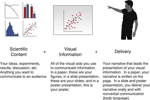
In this book, we will not discuss methods of improving scientific content. That part is up to you. This book is principally concerned with the other two ingredients: the design and delivery of a world class science presentation.
Doesn’t Good Scientific Content Speak for Itself?
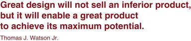
Experienced scientists know that good content does not speak for itself. When scientists fail to appreciate the importance of designing effective presentations, good studies are rejected by scientific journals, good ideas are denied by grant agencies, good stories are ignored by audiences, and good projects are passed by at poster sessions. Without a well-designed presentation, good science is essentially speechless.
The goal of designing a great presentation is not to take bad scientific content and disguise it as great. The goal is to communicate great content in a clear, succinct, and inspiring way…to value and respect your content by presenting it in the best possible light.
If you have spent time and effort pursuing a scientific goal, you owe it to yourself and your work to design and deliver a great presentation. Design matters because your content matters.
Any Scientist Can Be a Designer
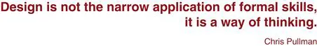
Some people are intimidated by the concept of design because they “aren’t designers.” Indeed, the term “designer” seems to imply attendance at some sort of professional design program and/or an advanced skill set. However, design can be thought of as more than just a skill set—design is also a process, a way of thinking about creating a finished product for an audience.
All you need to do to practice design is to choose design as a process. By choosing to design, you choose to actively communicate information and provide the best possible experience for your audience. You reject lazy default presentation choices, old habits, dogma, and quick fixes for an active, deliberate approach.
Artistic tricks come with time and experience, but they are ultimately not what good design is all about. Good design is about considering the needs of your audience and choosing to care.
What is Design?
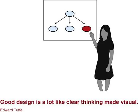
Design is surprisingly hard to define. Most people think of design as the way something looks. While it is true that good design ultimately causes something to “look better,” there is much more to design than just aesthetics.
Design is ultimately about determining what impact you want to have on an audience and then establishing the best way to achieve that objective.
One of the hallmarks of good design is that it is often invisible. The final product seems obvious, inevitable, and natural—like it could not have existed in any other way. In truth, well-designed science presentations indicate hard work on the part of the presenter, someone who intentionally chose what to add and what to take away to provide a deliberate experience to an audience.
What Design Is Not
Design is not decoration. Design is not showing off the cute clip-art you found or the fancy tricks your presentation software can do. Design is not adding a random graphic to your poster or making text sparkle when it appears on a presentation slide. Design is not adding anything meaningless that lacks information or purpose.
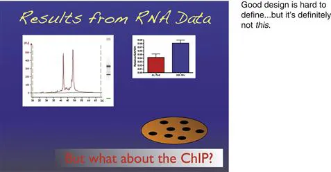
Design does not call too much attention to itself. Design is not a way for the author to show off how clever or brilliant he or she can be. Design is not about how many graphs can be placed on a slide, how many figures can be placed on a poster, or how many supplementary figures can be added to a research article.
Design is not laziness. Design is not accepting the default settings on presentation software, using pre-made templates, or blindly copying someone else’s visual style.
Design is not anything that gets in the way of your communication with an audience.
Design Is Ultimately about the Audience
What does it mean to design an effective presentation? Ultimately, the quality of a presentation is measured by its ability to impact an audience. Therefore, the best way to ensure that your presentation will succeed is to design a presentation not for you, not for your data, but for the people who you want to impact.
You can design presentations for your audience in multiple ways:
• Determine who your audience will be and what they are likely to already know and not know. Design an introduction that quickly conveys necessary information while avoiding obvious background material.
• Consider the strengths and limitations of your presentation format. Design a presentation that plays to the strengths and, whenever possible, makes up for the limitations.
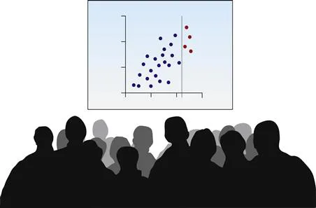
• Design tables, figures, diagrams, and photographs that quickly convey information to an audience. Discard all elements that do not convey information or enhance a message.
• When appropriate, design strategies to emotionally engage your audience. Take advantage of presentation elements likely to appeal to emotion, enthusiasm, passion, or concern.
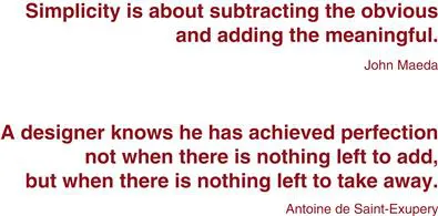
Embrace Simplicity
One of the key tenets of good design is simplicity. To design a simple presentation means to distinguish between what is meaningful and what is unnecessary, presenting the former and avoiding the latter. It is about filtering out all of the obvious, distracting, and unimportant elements in a presentation and focusing on what is truly important.
Simplicity doesn’t tend to come naturally for us scientists. We are trained to think about and analyze complex datasets, keeping track of multiple details, numbers, and experiments throughout the day. How we process information in our own minds, however, is different from the best way to communicate this information to others.
The genius of a good presentation is often about what you leave out rather than what you put in. It is easy to add more and more facts, visual elements, and discussion to a presentation. It is much harder to subtract, deliberately taking away elements that don’t add much value.
A simple presentation is not synonymous with a boring presentation. In fact, many of the most memorable, effective presentations are also the most simple. They resonate with audiences, sometimes long after they are presented, because everything in them is important and impactful.
About “The Rules”
The principles of good design can sometimes come across like a list of rules. This book is filled with many guidelines that might seem to limit freedom rather than inspire creativity. Interestingly, the opposite is true. These guidelines promote good design rather than limit it.
Think of the rules of design like a dance routine. Without learning the right moves, you look like a fool on the dance floor. But once you know the proper steps, your freedom and creativity increases and you can express yourself in new and inventive ways.
Also like dancing, it is occasionally okay to break a rule. Good dancers occasionally break from prescribed dance moves, adding a stylistic flourish while keeping within their traditional routine. Likewise, it is sometimes beneficial to break from tradition and ignore a design guideline. The key is to be aware of why you are breakin...
Table of contents
- Cover image
- Title page
- Table of Contents
- Copyright
- Foreword
- Acknowledgments
- Goals of This Book
- Part 1: Designing Exceptional Science Presentations
- Part 2: Visual Elements in Science Presentations
- Part 3: Written Presentations
- Part 4: Slide Presentations
- Part 5: Oral Presentations Without Slides
- Part 6: Poster Presentations
- Appendices
- Index
Frequently asked questions
Yes, you can cancel anytime from the Subscription tab in your account settings on the Perlego website. Your subscription will stay active until the end of your current billing period. Learn how to cancel your subscription
No, books cannot be downloaded as external files, such as PDFs, for use outside of Perlego. However, you can download books within the Perlego app for offline reading on mobile or tablet. Learn how to download books offline
Perlego offers two plans: Essential and Complete
- Essential is ideal for learners and professionals who enjoy exploring a wide range of subjects. Access the Essential Library with 800,000+ trusted titles and best-sellers across business, personal growth, and the humanities. Includes unlimited reading time and Standard Read Aloud voice.
- Complete: Perfect for advanced learners and researchers needing full, unrestricted access. Unlock 1.5M+ books across hundreds of subjects, including academic and specialized titles. The Complete Plan also includes advanced features like Premium Read Aloud and Research Assistant.
We are an online textbook subscription service, where you can get access to an entire online library for less than the price of a single book per month. With over 1.5 million books across 990+ topics, we’ve got you covered! Learn about our mission
Look out for the read-aloud symbol on your next book to see if you can listen to it. The read-aloud tool reads text aloud for you, highlighting the text as it is being read. You can pause it, speed it up and slow it down. Learn more about Read Aloud
Yes! You can use the Perlego app on both iOS and Android devices to read anytime, anywhere — even offline. Perfect for commutes or when you’re on the go.
Please note we cannot support devices running on iOS 13 and Android 7 or earlier. Learn more about using the app
Please note we cannot support devices running on iOS 13 and Android 7 or earlier. Learn more about using the app
Yes, you can access Designing Science Presentations by Matt Carter in PDF and/or ePUB format, as well as other popular books in Medicine & Medical Theory, Practice & Reference. We have over 1.5 million books available in our catalogue for you to explore.