![]()
Maps in the Humanities and Social Sciences
MAPS HAVE AN IMPORTANT PLACE IN SCHOLARLY writing. Historians, sociologists, and other humanists and social scientists often write about territories and neighborhoods, about global disputes and local conflicts, and about causes and correlations involving areal differences, regional clusters, and other spatial patterns. By helping readers visualize regions and comprehend relative distances and other geographic relationships, maps amplify an author’s sentences and paragraphs. After all, a two-dimensional stage may be more efficient than a one-dimensional trail of words for recreating and explaining a two-dimensional event. And symbols spread across a map can more effectively communicate the details and structure of neighborhoods, landscapes, and battle zones than words alone. Military strategists and urban planners need maps, and so do scholars whose subjects have any geographic aspect.
But not everyone who should use maps does. I am perpetually perplexed by the work of geographers who seem to have little interest in employing maps to communicate, interpret, or explain. At times, I ask myself if these colleagues are really practicing geography. And often it is clear that they aren’t. Yet, as the holder of a Ph.D. in geography and a faculty position in a department of geography, I am often both pleased and puzzled that many noncredentialed geographers are doing interesting geography in other academic disciplines. Scholarship is not bound by the labels we use to mark territory at universities; nongeographers should practice geography if they choose, just as geographers should feel free to contribute to other social sciences, philosophy, the humanities, computer science, or statistics. Indeed, the domain of geographic scholarship is not only too broad for the meager community of researchers trained in the discipline, but also too important to be limited to people with geography degrees.
The misuses of maps amaze and even delight me. The map is a robust medium, and even bad maps may communicate, albeit crudely and inefficiently. That noncredentialed geographic scholars may seem compelled to use them attests to the map’s inherent role in “earth writing”—the literal meaning of “geography.” But it is astonishing that careful writers who have spent considerable time planning, sculpturing, and polishing their prose often have little appreciation that mapping, like writing, can be done lucidly and elegantly. Helping the conscientious scholar create and use visually efficient, aesthetically satisfactory maps is my goal in this book.
This chapter begins with a brief commentary on the limitations of verbal discussion and on the neglect of cartographic illustration in master’s and doctoral programs in the humanities and social sciences. It then examines location and spatial pattern as elements in scholarly work, and the consequent need for maps.
WORDS AND MAPS
As National Geographic has demonstrated for decades, maps and other pictures help explorers share with readers their insights and discoveries about both large and minute parts of the world. Humanists and social scientists are explorers, too, and many are geographers in spirit if not in disciplinary affiliation. Because their explorations touch several aspects of place and space, maps can have an important role in their writing. For instance, the literary scholar focusing on Dickens needs to develop and share a broader, more concrete knowledge of the scale and structure of nineteenth-century London than Dickens’s classic novels provide. Similarly, the medieval historian might need to know and communicate not only the locations of fortresses and monasteries, but also the theologically influenced cosmological-cartographic world view of twelfth-century nobility. And the student of Napoleon needs to appreciate and explain the effects of the terrain and climate of the Russian steppes, as well as the tribal diversity and economic resources of eighteenth- and early nineteenth-century Europe. The list of non-credentialed geographers is long and includes the anthropologist, the archaeologist, the art historian, the economist, the literary scholar, the political scientist, and the sociologist.
Like a writer for National Geographic, an academic explorer needs to appreciate the marvelous capacity of the eye-brain system for processing pictorial, two-dimensional data. Photographs and other pictorial illustrations allow the reader to see what the explorer saw, at least from an insightfully selected vantage point. The reader can form mental images that foster comprehension and understanding. Scholarly pursuits often call for more complex pictures, such as the spatially meaningful arrangements of abstract symbols on maps and statistical diagrams. These images help the reader see how the academic explorer has organized, processed, analyzed, or interpreted observations and measurements. The author who relies solely upon words may hobble the reader by obscuring facts and hiding information.
Consider two examples from the work of military historian, naval officer, and sea-power advocate Alfred T. Mahan, whose writings include the two-volume Sea Power and Its Relationship to the War of 1812. Mahan used numerous maps to explain the geographic settings and the choreography of naval engagements. Figure 1.1, which reconstructs the costly victory of the American warship Constitution over the British frigate Java off the coast of Brazil on December 29, 1812, illustrates how maps complement verbal description. Mahan tells his readers that this was not a typical artillery duel but “a succession of evolutions resembling the changes of position, the retreats and advances, of a fencing or boxing match, in which the opponents work round the ring.” His map both dramatizes and documents this spatial complexity, as each ship is shown maneuvering to attack with more of its guns facing fewer of its opponent’s guns. An arrow indicates wind direction, contrasting boatlike symbols differentiate the two ships, dashed lines portray their courses, and numbers show the time in hours and minutes for various simultaneous positions between 2:10 p.m. and 5:50 p.m. Although the Java damaged the American ship’s wheel, the Constitution’s guns destroyed all but one of her opponent’s masts. After moving away around 4:35 to repair its own damage, the Constitution returned at 5:50, and the British surrendered. By helping the reader organize two pages of details about individual attacks and their effects, the map makes its author’s words more comprehensible and convincing.
FIGURE 1.1. “Plan of the engagement between Constitution and Java.”
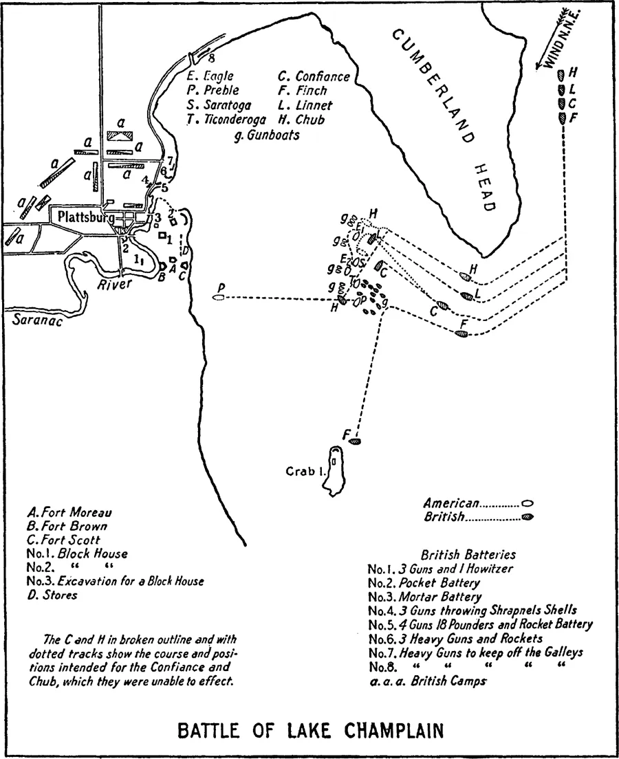
Not all of Mahan’s illustrations address events on a featureless sea. Figure 1.2, a less dramatic but more graphically complex map, provides the geographic framework for a 24-page examination of the “decisive” Battle of Lake Champlain on September 11, 1814. Mahan’s text describes the weeks preceding the battle, as British troops under Sir George Prevost advanced southward along the western shore of the lake, sacked Plattsburg, surrounded the town, and set up heavy guns on the Saranac River opposite the group of American forts and blockhouses identified on the map. Contrasting open and shaded boat symbols differentiate the American and British ships, smaller open boat symbols indicate American gunboats, and letters and numbers identify individual warships and important land positions. Solid lines show the shore of Lake Champlain, and dashed lines portray the paths of individual ships. Both sides had prepared a strategy, with each vessel assigned to engage a particular opponent, and dotted lines represent the intended courses of three of the four British ships. The American commander Thomas Macdonough positioned his vessels at the entrance to Plattsburg Bay, out of the range of British cannon and sufficiently far north that the British had to approach head on. An arrow indicates the north-northeast wind that brought the British ships around the tip of Cumberland Head into the bay but failed to carry them to their assigned positions. By maneuvering the Eagle and the Saratoga so that most of their guns were on the “engaged” side, the Americans gained an advantage over the British, who had also counted on support from their heavy artillery at Plattsburg. By the end of this intense two-and-a-half-hour battle, the Finch had retreated to Crab Island, and the other three British vessels had surrendered. Mahan’s use of this and other maps reflects not only a military commander’s experience with battle plans but also a historian’s concern with organized and illuminating communication of important details.
FIGURE 1.2. “Battle of Lake Champlain.”
Integrating maps and words is the focus of this essay, not the question of whether one is better than the other. When an article, book, or dissertation concerns interaction among places, words with maps can be far more powerful as a vehicle for scholarly exposition than the same words without maps. Scholarly writing always has and always will depend largely on words. To be useful, maps must complement our sentences and paragraphs, not compete with them. The committed scholar must learn when and how to use all relevant communication tools, graphic as well as literary, and how to employ them in concert, not in isolation.
Most academic researchers—even some geographers, sad to say—know little about making maps. Most undergraduate courses fail to address, much less advocate, the possibilities of employing graphics to explain spatial concepts, and anthropologists, historians, and others who could make frequent and effective use of maps rarely study cartography. Graduate programs in the humanities and social sciences ignore map making as an analytical and expository skill. Indeed, graduate training and disciplinary tradition have treated map making as a service that one buys, rather than as a potentially important part of the scholar’s creative work. Thus, when maps are used at all, it seems, someone else draws them, perhaps an illustrator hired by the university press but more likely a free-lancing undergraduate majoring in geography, art, or architecture. The “map author” often relies too heavily on the cartographic advice of an assistant whose only asset is superior hand-eye coordination. The resulting maps at best are visually pleasant, decorative props rather than important supporting players. And at worst, they distract, confuse, or mislead the reader.
Neglect of expository communication in master’s and doctoral training programs partly explains the neglect of mapping in the humanities and social sciences. Academic disciplines live and grow by collecting and organizing facts and by developing, refining, and sometimes purging theories to explain these facts. Training programs quite naturally emphasize observing, sampling, and theorizing, and sometimes also a particular research skill such as statistical analysis, computer programming, or reading German. A single course on research methodology might address bibliographic sources, data-collection strategies, and proposal writing. Except in creative-writing programs, graduate faculty presume (often naively) that their students have learned to write as undergraduates. Tradition and a focus on current paradigms preempt formal instruction in writing and other communication skills; professorial mentors rely largely on occasional marginal reminders of the value of topic sentences, active voice, and concise wording. Good writing habits may be reinforced by such informal admonishments, but students usually have no previous academic experience in cartography to rely upon or recall.
Western society’s word-oriented view of literacy and expository expression also partly accounts for the limited use of maps by humanists and social scientists. Although reading and writing are no doubt the paramount communication skills of the educated person, the complete scholar should cultivate three important companions to literacy: articulacy, numeracy, and graphicacy.
Articulacy refers to fluency in oral expression and relates to both stage presence and command of language. Sometimes training in articulacy is a formal undergraduate requirement, under the course title “Public Speaking.” It may be particularly prized by scholars who want to share their knowledge and enthusiasm with public-television audiences or large-enrollment lecture classes. Other scholars often regard a highly articulate colleague with a mixture of envy and suspicion, considering him or her gifted but perhaps too entertaining, and thus somewhat shallow.
Numeracy refers to fluency in the manipulation of numbers. American educators have a supportive but restrained view of numeracy: school boards are pleased if high-school graduates can balance a checkbook, and college faculties insist that students at least have a minimal exposure to algebra and trigonometry. Among the humanities and social sciences, respect for numerical competence varies widely with the discipline’s ability to generate or exploit quantitative data. In the postwar era, “quantitative revolutions” occasioned much paradigmatic blood-letting in disciplines in which “quantifiers” and “nonquantifiers” fought for power in the name of principle. Even today, some humanists condemn as too narrowly reductionist any research employing counts and averages, and some social scientists steeped in highly abstract mathematics regard as trivially empiricist studies that are based on actual numbers.
Graphicacy refers to fluency with graphs, maps, diagrams, and photographs. The most spatial of the four groups of communication skills, graphicacy has asserted itself in schools and colleges in courses in commercial art, illustration, and mechanical drawing, all of which apparently are too technical and not relevant enough for the needs of liberal arts majors. Yet even some inherently graphic disciplines ignore the value of graphics to organize and elucidate: statistics majors often emerge with no training in exploratory graphical data analysis, for instance, and some geography majors are not offered or required to take a course in cartography.
Attempts to increase the amount of graphic material in publications can provoke bitter debate. For instance, American newspaper publishers who redesigned their papers in the 1970s to counter circulation losses blamed on television opened an old and sometimes heated journalistic conflict between “word people,” who couldn’t care less about news photos and other editorial artwork, and “picture people,” who had a more catholic view of news presentation. Since there were limited budgets for both personnel and space in the publication, what one person or group gained could be someone else’s loss; competition for space and influence often reflected competition for salaries and staff. Thus, a decision to use more information graphics commonly increased the number of artists and the salary and prestige of the art director, possibly at the expense of reporters and junior news editors. The attempts that were made to explain such struggles with intriguing left-brain/right-brain hypotheses ignored the tenuous origin of brain-hemisphere theories in clinical studies of brain-damaged accident victims. In reality, the journalistic furor was a minor debate between stubborn traditionalists and those less conservative in the adoption of new technology. Publishers, owners, and senior editors decided in favor of more graphics because surveys indicated that consumers wanted a more visually appealing, better organized, more readily understood newspaper. Although USA Today received much attention for its spectacular color printing and editorial artwork, the New York Times, Christian Science Monitor, Washington Post, and other “elite” newspapers had increased their use of information graphics even before the appearance of their more colorful competitor.
Technology clearly was the driving force. Before computers, electronic publishing, and graphics networks, the print media used fewer information graphics largely because they cost too much and took too long to produce. Newspaper firms are businesses, after all, and news is a perishable commodity. That newspapers at one time used woodblock engraving and other tedious techniques to illustrate with maps their accounts of important battles attests to the expository power of two-dimensional representations. That newspapers used comparatively little editorial art attests to journalism’s word-oriented origins in the “news-letters” of the fifteenth and sixteenth centuries. Advances in photographic engraving in the 1880s, electronic facsimile transmission in the 1930s, and computer graphics in the 1980s allowed news publishers to add more graphics and to more effectively explain spatial events in a spatial format.
Despite successes in integrating words and graphics in newspapers and weekly news magazines, the print media have yet to integrate words and graphics in the creative routine of working journalists. Ever since the cottage-industry newsp...