A classic and essential text for designers since 2009, Layout Essentials: 100 Design Principles for Using Grids just got better with a fresh exploration of its design principles, updated text, and new photos and international graphics.
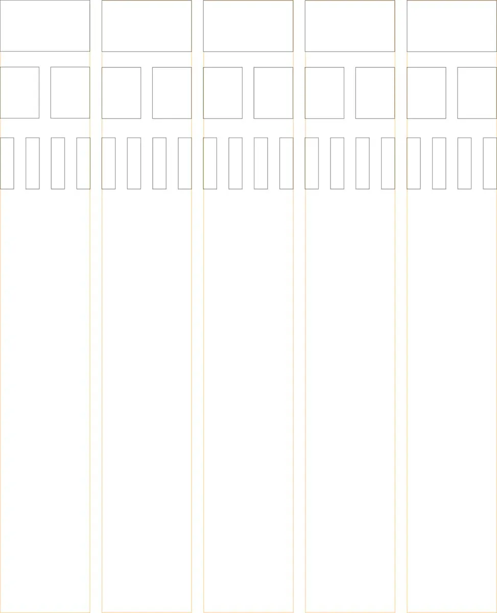
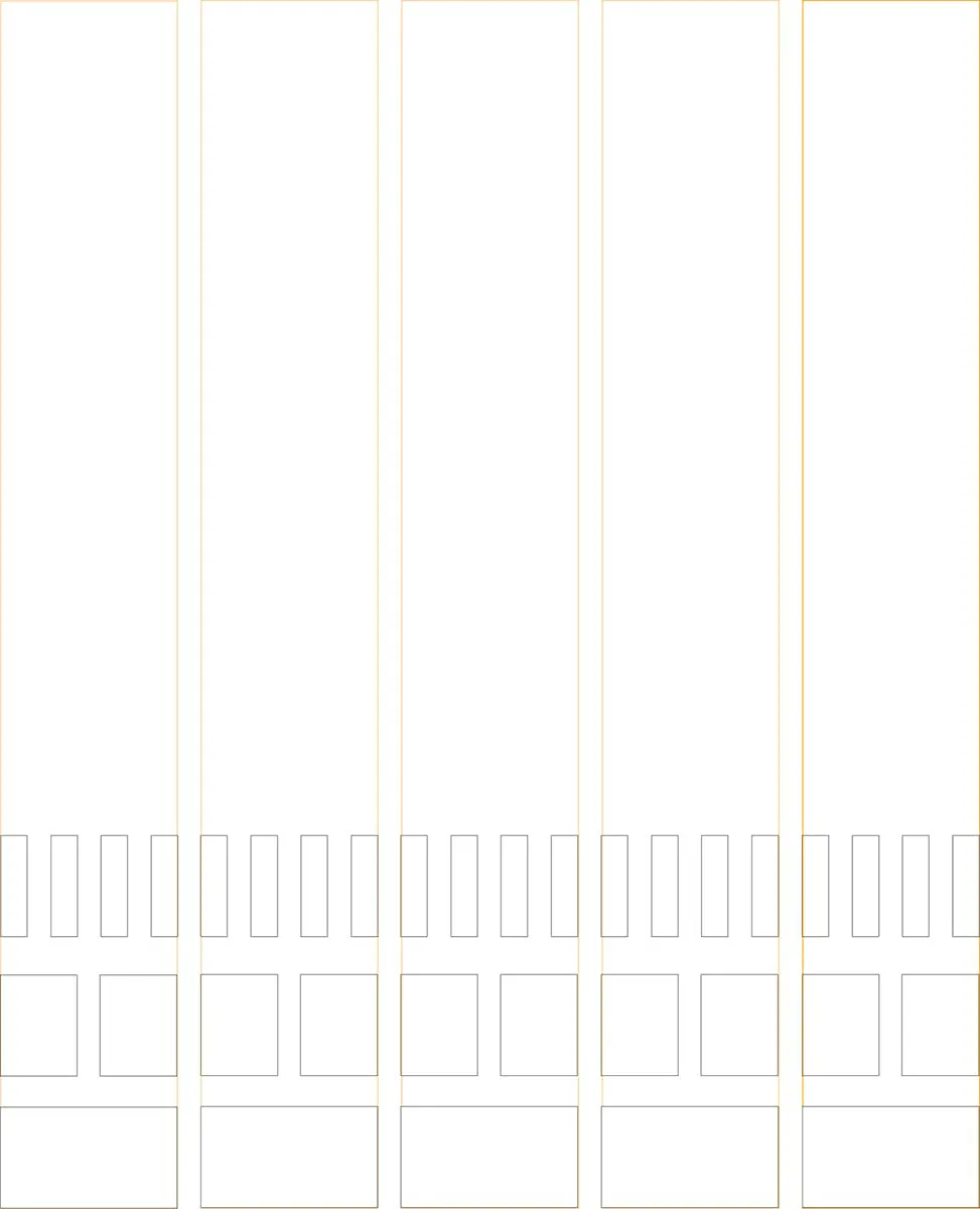
Grids are the basis for all design projects, and learning how to work with them is fundamental for all graphic designers. From working with multi-column formats to using type, color, images, and more, Layout Essentials not only demonstrates, using real world examples, how to use grids effectively, but shows you how to break the rules to use them effectively, too.
This revised and updated version of Layout Essentials is your one-stop reference and resource for all layout design projects.