From the basics such as working with typography through using images and working with color, exploring different pre-press techniques and the processes involved in bringing a product to press and with a resulting pleasing end product, the authors present everything that the reader needs to know in a straightforward and visually strong way. This new edition completely updates the information on the production process, highlighting new techniques and expanding its coverage on digital technologies. In addition, new interviews are included from design studios using creative or unique production techniques. Since students may eventually be working with international clients, the authors includes both metric and imperial measurements so that students will become familiar with the differences. Expanded coverage of environmental and sustainability issues, especially as they relate to paper choice and use of special processes/inks has also been added.
- 192 pages
- English
- ePUB (mobile friendly)
- Available on iOS & Android
eBook - ePub
The Production Manual
About this book
Trusted by 375,005 students
Access to over 1 million titles for a fair monthly price.
Study more efficiently using our study tools.
Information
chapter one
typography
Typography is fundamental to a design, whether it has prominence or is in the background. While typography is most commonly used as text, it can also be used as a visual device or image in its own right. As designers often seek to highlight and emphasize text using different production processes, we thought it important to look more closely at this topic.
Type is comprised of various components that include thin lines, serifs and other features, and for these to reproduce well with production processes such as screen printing and foil blocking, some thought and planning will be required. The typography used in a design will naturally have an impact on the specifications for the job, whether in the printing processes used or the materials required.

Neenah Paper
This poster was created by designer Matthias Ernstberger at Sagmeister design studio for Neenah Paper. It features an image of a revolver, using an apostrophe for the trigger. The poster is part of a series in which each design celebrates a different typographical element.
measurements
Graphic design involves the use of measurements to specify everything from type sizes and page divisions to format sizes. Understanding how different measurements are used helps to prevent problems in job development and specifications between the different professionals involved in the process.
absolute and relative
Two types of measurement are used in typographic processes: absolute and relative measurements. As these are fundamental to the development of any design project, it is important to understand the differences between them.
absolute measurements
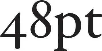
Absolute measurements are measurements of fixed values. For example, an inch is a precisely defined increment within a foot. Equally, points and picas, the basic typographic measurements, have fixed values, such as the 48pt text above. All absolute measurements are expressed in finite terms that cannot be altered.
relative measurements
In typography, many measurements, such as character spacing, are linked to type size, which means that their relationships are defined by a series of relative measurements. Ems and ens, for example, are relative measurements that have no prescribed, absolute size. Their size is relative to the size of type that is being set.

the lower case alphabet
The lower case alphabet, while not being a formal measurement, is used as a guide when setting type. The two alphabets shown left are both set in 18pt type, but the bottom alphabet (set in Century Gothic) has wider characters and extends further across the page than the top alphabet (set in Hoefler). This has an impact on typesetting, as a wider typeface can be set in a wider measure or column width and still be comfortable to read.
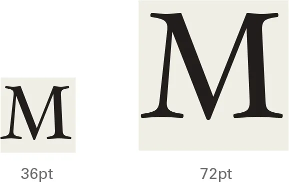
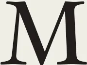
the em
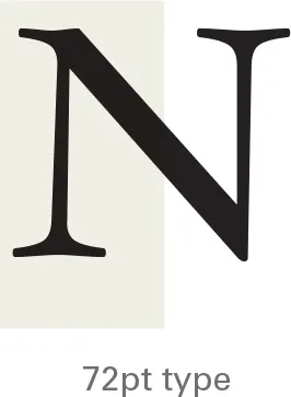
The em is a relative unit of measurement, used in typesetting to define basic spacing functions. It is linked to the size of the type so that if the type size increases, so does the size of the em, i.e. the em of 72pt type is 72 points and the em of 36pt type is 36 points. The em defines elements such as paragraph indents and spacing.
the en
An en is a unit of relative measurement equal to half of one em. In 72pt type, for example, an en would be 36 points. Although the names em and en imply a relationship to the width of the capital ‘M’ and ’N’, in reality they are completely unrelated, as the illustrations above demonstrate.
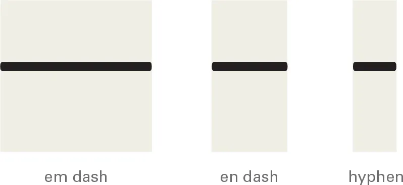
the em dash and en dash
Pictured above are an em dash, en dash and a hyphen. An en dash is half an em dash and a hyphen is one third of an em dash, and so it is smaller than an en dash. The size of all these dashes is relative to the type being set. Em (US) and en (UK) dashes are used to denote nested clauses, and to elide numbers (10—11 and 1975–1981, for example). Hyphens are used in hyphenated words, for example, ‘half-tone’.
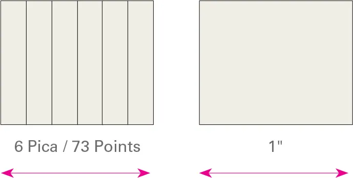
the pica
A pica is a unit of measurement equal to 12 points and is commonly used for measuring lines of type. There are six picas (or 72 points) in an inch (25.4 millimeters). This is the same for both a traditional pica and a modern PostScript pica. There are six PostScript picas to an inch.
a note about preferences
Although there is homogenization in the way computer applications use measurements, care needs to be taken. Programs for desktop-publishing work operate with a bias toward points and picas, while drawing programs favor millimeters. However, the preferences of all programs can be changed to work in whatever measurement is most appropriate. Measurement clarity is crucial in many design aspects as ambiguous terms can often be confusing. For example, line weight (here) might be measured as ‘hairline’ and typesetting often uses automatic leading values. However, using these should present no problem, providing you know what is being expressed.

These two dialog boxes are from a drawing program (below), which expresses measurements in millimeters, and a desktop publishing program (bottom), which expresses type in points.
type
Type is the textural element within a design that is typically applied through the use of typeset characters.
letterforms
Sets of typographic characters contain the le...
Table of contents
- Cover
- Title Page
- Contents
- Introduction
- Chapter 1 Typography
- Chapter 2 Images
- Chapter 3 Color
- Chapter 4 Pre-Press
- Chapter 5 Production
- Chapter 6 Finishing
- Appendix
- Standard Sizes
- Glossary
- eCopyright
Frequently asked questions
Yes, you can cancel anytime from the Subscription tab in your account settings on the Perlego website. Your subscription will stay active until the end of your current billing period. Learn how to cancel your subscription
No, books cannot be downloaded as external files, such as PDFs, for use outside of Perlego. However, you can download books within the Perlego app for offline reading on mobile or tablet. Learn how to download books offline
Perlego offers two plans: Essential and Complete
- Essential is ideal for learners and professionals who enjoy exploring a wide range of subjects. Access the Essential Library with 800,000+ trusted titles and best-sellers across business, personal growth, and the humanities. Includes unlimited reading time and Standard Read Aloud voice.
- Complete: Perfect for advanced learners and researchers needing full, unrestricted access. Unlock 1.4M+ books across hundreds of subjects, including academic and specialized titles. The Complete Plan also includes advanced features like Premium Read Aloud and Research Assistant.
We are an online textbook subscription service, where you can get access to an entire online library for less than the price of a single book per month. With over 1 million books across 990+ topics, we’ve got you covered! Learn about our mission
Look out for the read-aloud symbol on your next book to see if you can listen to it. The read-aloud tool reads text aloud for you, highlighting the text as it is being read. You can pause it, speed it up and slow it down. Learn more about Read Aloud
Yes! You can use the Perlego app on both iOS and Android devices to read anytime, anywhere — even offline. Perfect for commutes or when you’re on the go.
Please note we cannot support devices running on iOS 13 and Android 7 or earlier. Learn more about using the app
Please note we cannot support devices running on iOS 13 and Android 7 or earlier. Learn more about using the app
Yes, you can access The Production Manual by Gavin Ambrose,Paul Harris in PDF and/or ePUB format, as well as other popular books in Design & Graphic Design. We have over one million books available in our catalogue for you to explore.