
- 256 pages
- English
- ePUB (mobile friendly)
- Available on iOS & Android
eBook - ePub
About this book
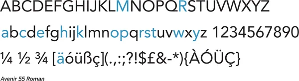
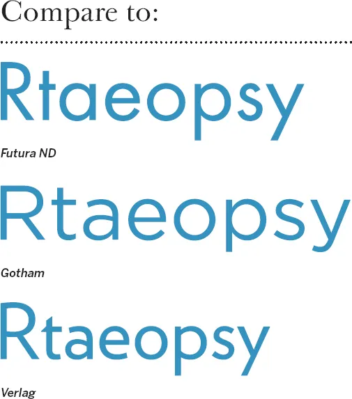
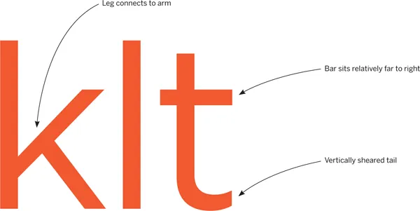
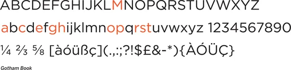
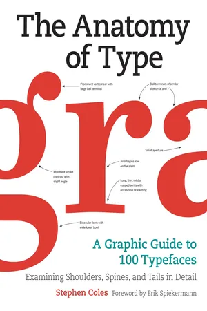
The Anatomy of Type is the ultimate stylistic guide to the intricacies and design of 100 indispensable typefaces. A delightful, colorful, and visual reference guide created by Stephen Coles and Tony Seddon—two acknowledged pros in the font design world—The Anatomy of Type was developed with typographers, graphic designers, and font geeks in mind, graphically and visually expanding on the current font-mania initiated by Simon Garfields's Just My Type.
Frequently asked questions
Yes, you can cancel anytime from the Subscription tab in your account settings on the Perlego website. Your subscription will stay active until the end of your current billing period. Learn how to cancel your subscription.
At the moment all of our mobile-responsive ePub books are available to download via the app. Most of our PDFs are also available to download and we're working on making the final remaining ones downloadable now. Learn more here.
Perlego offers two plans: Essential and Complete
- Essential is ideal for learners and professionals who enjoy exploring a wide range of subjects. Access the Essential Library with 800,000+ trusted titles and best-sellers across business, personal growth, and the humanities. Includes unlimited reading time and Standard Read Aloud voice.
- Complete: Perfect for advanced learners and researchers needing full, unrestricted access. Unlock 1.4M+ books across hundreds of subjects, including academic and specialized titles. The Complete Plan also includes advanced features like Premium Read Aloud and Research Assistant.
We are an online textbook subscription service, where you can get access to an entire online library for less than the price of a single book per month. With over 1 million books across 1000+ topics, we’ve got you covered! Learn more here.
Look out for the read-aloud symbol on your next book to see if you can listen to it. The read-aloud tool reads text aloud for you, highlighting the text as it is being read. You can pause it, speed it up and slow it down. Learn more here.
Yes! You can use the Perlego app on both iOS or Android devices to read anytime, anywhere — even offline. Perfect for commutes or when you’re on the go.
Please note we cannot support devices running on iOS 13 and Android 7 or earlier. Learn more about using the app.
Yes, you can access The Anatomy of Type by Stephen Coles in PDF and/or ePUB format, as well as other popular books in History & History of Architecture. We have over one million books available in our catalogue for you to explore.
Information
Geometric Sans

Futura ND
Avenir
Gotham
ITC Avant Grade Gothic
Calibra/Metric
FF DIN
Interstate
Verlag
Klavika
MVB Solano Gothic
Forza
Futura ND
Designer: (Paul Renner) Marie-Therésè Koreman // Foundry: (Bauer Type Foundry) Neufville // Country of origin: (Germany) Spain // Release years: (1927) 1999–2012 // Classification: Geometric Sans


Futura has become widely known as the prototypical Geometric typeface. Bauhaus experiments in geometric form led Paul Renner to develop a typeface that was initially made entirely of straight lines and circular shapes. This was eventually tamed into more conventional letterforms, but they remained mostly Geometric. Futura’s capitals are based on classical proportions, explaining their variable widths. There are countless digital versions, but Futura ND comes directly from original sources, and the latest release includes alternatives previously unavailable. Caution: the protrusion of pointed apexes (“M,” “N,” “w”) is called “overshoot,” an optical compensation for type intended for Text sizes, but potentially distracting when large.

Avenir
Designer: Adrian Frutiger // Foundry: Linotype, Germany // Country of origin: France, Germany Release year: 1988 // Classification: Geometric Sans


“Right from the beginning, I was convinced that Avenir is the better Futura,” said a confident Adrian Frutiger in a recent interview looking back at his 1988 creation. In some respects, his declaration was more than mere boasting — coming 60 years after Futura, Avenir remedied many of the compromises that Renner made in his quest for geometry. Frutiger abandoned pure circles and strictly even stroke weight for “corrected” curves and a bit of contrast. Letter widths are more regular, the x-height is larger, and a double-story “a” replaces the less legible single-story one. Avenir retains the simplicity and clarity of a Geometric sans serif; it just does it more gracefully, sacrificing graphical purity for readability. Good for: Comfortable geometric type.

Gotham
Designer: Tobias Frere-Jones // Foundry: Hoefler & Frere-Jones // Country of origin: United States Release year: 2000 // Classification: Geometric Sans


One can’t really describe this Hoefler & Frere-Jones creation better than H&FJ themselves: “Gotham. What letters look like.” The typeface is simply self-evident. Each character just feels “normal” and “right.” Inspired by mid-century architectural lettering of New York City, Gotham celebrates the alphabet’s most ...
Table of contents
- Contents
- Foreword
- Introduction
- How to Use This Book
- The Anatomy of Type
- Type Classification at a Glance
- Key Classification Features
- Humanist Serif
- Transitional Serif
- Rational Serif
- Contemporary Serif
- Inscribed/Engraved
- Grotesque Sans
- Neo-Grotesque Sans
- Gothic Sans
- Geometric Sans
- Humanist Sans
- Neo-Humanist Sans
- Grotesque Slab
- Geometric Slab
- Humanist Slab
- Script
- Display
- Glossary of Typographic Terminology
- Searchable Terms
- About the Author
- Credits and Acknowledgments
- Copyright
- About the Publisher