![]()
II
IDENTITY MANAGEMENT
THROUGH AESTHETICS
![]()
3
Corporate and Brand
Expressions
IBM’S CORPORATE AND BRAND EXPRESSIONS1
In the early to mid-1990s, IBM went through a remarkable transformation. The company shed its impression as a static and outdated corporate dinosaur through the use of refreshingly new and consistently integrated identity elements. Through these new expressions, IBM regained the design and aesthetics leadership that it had acquired in the 1950s, 1960s, and 1970s but had gradually lost in the 1980s.
Until the late 1970s IBM was primarily a supplier of mainframe computers and related products and services. In that business IBM had established a formidable market position as an undisputed product leader. During this early period IBM was also known for managing its identity extremely well. From 1956, the year of the inception of the IBM design program, through the mid-1970s, a few individuals were responsible for design and aesthetics management. They included IBM Chairman and CEO Tom Watson; his vice president for communications, Dean McKay; Elliot Noyes as architectural and product design consultant; Paul Rand, who designed IBM’s famous logo, as graphic design consultant; and Charles Eames as the consultant for exhibits and films. This highly personalized management system established IBM positively as Big Blue, an impressive model of a contemporary technology company.
But in the mid-1980s, the situation changed dramatically for IBM: the mass-marketed IBM personal computer was introduced, and IBM’s target market suddenly spread from information systems professionals to end users. IBM’s personality as the king of mainframes worked against the company’s new marketing goals. IBM now gave the impression that it was a dated, old-fashioned, slow company. IBM’s attempt to change these impressions through playful advertising executions—such as a campaign that used Charlie Chaplin—was only partially successful. One problem was that CEO John Akers, in the portfolio-models’ spirit of the times, ran the company as a series of strategic business units, with each unit responsible for its own advertising and identity activities. Altogether, IBM used approximately 40 different advertising agencies. Moreover product design, responding to the pressures of shorter and shorter product life cycles and cost pressures, was producing new products that were unimpressive in their design—in contrast to competitor Apple, for example. Virtually no new facilities were created; instead, existing buildings and offices were refitted in the most cost-efficient way.
In graphic design, internal resources were gradually reduced. Ninety percent of IBM’s graphic design work was outsourced to vendors, which were hired by thousands of individuals worldwide with little experience in graphic design. Also, IBM had become increasingly nonchalant about the use of its logo, theme lines, and advertising and promotional materials; there were several hundred different logos and slogans in circulation. As I.D. magazine noted in 1993, “In 1989, four years before the company would post record losses, IBM’s management was well aware that it was no longer perceived as an innovator in the highly competitive computer industry, even though it remained one of the nation’s strongest research and development laboratories.” Following PC Expo 1994, a major personal-computer trade show held annually in New York City, a reporter for Brandweek joked: “Want some fun? Count the slogans in the IBM booth.”
IBM Today
In early 1993, Lou Gerstner took the helm at IBM. He took steps to capitalize on the value of IBM as a brand and to streamline its communications and identity activities. In May 1994, Ogilvy & Mather was hired as IBM’s sole advertising agency. In October 1994, after PC Expo 1994, 8,000 copies of a publication entitled “The Spirit and Letter of IBM Brand Identity,” developed by IBM Corporate Design in collaboration with Lippincott & Margulies, were printed for internal distribution within each division of IBM. The first section, “The Spirit,” laid out the principles on which the IBM identity was supposed to be based. The second section, “The Letter,” provided specific instructions for applying the IBM brand worldwide. It prohibited varying logos, displaying 22 such variations, many of which had been used or were in use, and which clearly diverged from the traditional logo. One example was a logo with a picture of an eye, a bee, and the letter “M.” Adoption of the standards discussed in the memorandum became mandatory for each division. The following passage appeared at the beginning of the memorandum:
EXHIBIT 3.1 IBM logo and ThinkPad 560
To create a clear, consistent and understandable brand identity in customers’ minds, brand attributes and the way they are expressed must be closely linked. Companies that present a cohesive, distinctive, and relevant brand identity can create a preference in the marketplace, add value to their products and services, and may command a price premium.
New television advertising was used to express simple themes, with “Solutions for a small planet” as the anchor theme in most TV and print ads. The ads stressed that IBM provides solutions to all customers worldwide. The best-known commercial, using English subtitles to show two French retirees in the streets of Paris conversing in computer jargon about hard-drive failures, was first shown during the Superbowl of 1995. It was recognized by Adweek as one of the best commercial spots of the month. Other spots of the same campaign include subtitled shots of two nuns in Prague discussing their Internet experience; surfers in Australia discussing the AS/400; and monks sitting on a hill in Italy discussing interoffice mail. The ads were clutter-breaking and attention getting; they established IBM as a player at the cutting edge of the computer industry.
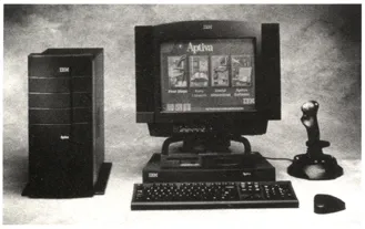
EXHIBIT 3.2 IBM Aptiva S
The print ads all shared a common look and played on the “solutions” theme of the television advertisements. An important word (a concept) that IBM wanted the reader to focus on was magnified in large font and colored in IBM’s corporate blue. At the start of the paragraph was a tab icon similar to an action button in a Windows application. The ad looked similar to a Web page; through this identity element, IBM again established the company as a cutting-edge, media-versatile company. The IBM home page was introduced in October 1994 and was highly praised in a Business Week article of November 14, 1994 as “nonstandard.” The Web page also plays on certain themes of the ad campaigns and follows guidelines established in the “Spirit and Letter.”
In terms of products, 1994 saw the introduction of a series of ThinkPad notebook computers with an unusually compact design based on a keyboard that is expandable once opened. The product introduction was accompanied by an original ad campaign that called the product “The Butterfly” and placed pictures of small butterflies on different pages of major newspapers. This playful approach illustrated the features of the computer in a persuasive way. The product was perceived and remembered very well by consumers and created a separate brand identity endorsed by IBM. Although the product was not very successful in terms of its performance relative to its development costs, it played a significant role in establishing IBM as an innovator after years of disappointing new-product introductions in the PC market. The ThinkPad line of computers has also dramatically improved IBM’s image.
In 1996, IBM introduced a new consumer desktop computer, the Aptiva S. This computer features an innovative approach to reorganizing traditional desktop components. Media access (disk drives, CD-ROM) are contained in a compact pop-up unit on the desktop, while the PC processor sits below the desk. This enhanced functionality packaged in a dynamic black design form is another recent example of IBM reclaiming design leadership.
In 1996, IBM introduced a lightweight, slim series of beautifully designed ThinkPad 560 notebooks, targeted to customers who are increasingly looking for products that they can take from the office to their homes and on the road. In October 1995, Brandweek reversed its earlier dismissal and praised the “unified look and tone of IBM displays at major trade shows which feed off the same messages contained in IBM ads.” New IBM corporate buildings are under construction.
Had this book been written ten years ago, we would have featured Apple Corporation as a leader in the consistent expression of an attractive identity and Big Blue as a stodgy, old-fashioned corporation paying little attention to the management of its identity. Ten years later, the roles have almost flipped. Since the introduction of its PowerBook series, Apple has tried to look more corporate, but has thus far not succeeded. IBM is perceived increasingly as reliable, original, fun, and innovative. The overall image of IBM is that of a growth company on the cutting edge of the computer industry.
IBM tracks customer impressions through telephone surveys on a regular basis and uses focus groups and other research techniques as part of the design process, especially for consumer products. Through the systematic use of some highly successful corporate expressions, the company has successfully changed customer impressions of itself and its products. In 1995 and 1996 several articles appeared in the business media, praising IBM as a growth company. In July 1995, Interbrand Schechter, a London-based identity firm, valued the IBM brand at $17 billion, just behind Coca-Cola and Marlboro. The brand had been ranked at position 282 just one year before. And brand value is a direct function of the management of brand identity.
MANAGING EXPRESSIONS
Large corporations like IBM have a tremendous variety of identity elements from which to communicate an identity about the company and its brands (the IBM brand as such, ThinkPad, and Aptiva, for example). All these identity elements, whether they are explicitly managed or not, have the potential of producing multiple aesthetic experiences for various groups of customers (business customers or end users). Therefore, an organization’s visual (and other sensory) output must be managed in such a way that its planned expressions produce the desired customer impressions.
Regarding corporate expressions, managers may ask themselves the following questions: If we are a hotel, should we analyze and manage the aesthetics of the hotel as a whole, analyze and manage parts of the hotel (e.g., the lobby), or focus on the colors of the flower arrangements in the lobby? If we are a car manufacturer, should we assess the interior of the car as a whole or the feel of the fabric? If we are considering an ad for a pain reliever should we plan the ad as a whole or the tone of voice of the spokesperson or voice-over?
Moreover, how can we express through our identity system that we are a diversified, decentralized company with stand-alone brands, rather than one big, centralized corporation? What are our corporate missions and values and how can we express them visually? How broadly should we manage identity? Is it enough to create a new logo and signage system or should we also manage and perhaps streamline our advertising, packaging, the uniform of our service personnel? Should we be entirely consistent in our aesthetic expressions, repeat elements, styles, and themes throughout our identity elements, or should we introduce some variety?
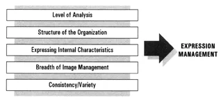
As these questions illustrate, key expression-management issues include
- determining the appropriate level of analysis for identity management;
- selecting and structuring identity elements in such a way that they convey the structure of the organization, its divisions and the role of its brands;
- expressing internal characteristics of the firm (what it does and stands for) through various identity elements;
- determining the breadth with which identity and image should be managed;
- choosing the appropriate degree of consistency and variety among identity elements.
This chapter focuses on these key expression-management issues. Before discussing them, we describe the public face of a firm and its brands—i.e., the identity elements at the disposal of most organizations for managing the identity of their firms and brands. At the end of the chapter, we provide a list of structural, procedural, and task requirements for managing expressions successfully.
FIGURE 3.1 Key Expressions—Management Issues
THE PUBLIC FACE OF THE ORGANIZATION
AND ITS BRANDS
The public face of the organization and its brands manifests itself through a variety of identity elements. These include corporate seals and stock certificates, business cards, invoices, the greetings on voice mails, letterheads, news releases, uniforms, vehicles, plants, showrooms, sales bulletins, sites on the Internet, print and TV ads, background sounds and smells in offices, signs on streets and office buildings, merchandising aids, sales kits, instruction manuals, products as such, packaging, point-of-purchase displays, coupons, videos, and on and on. The list is long and unwieldy. How can we give some structure to this list? Can we sort these identity elements into categories that entail common management tasks?
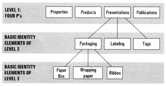
As Figure 3.2 shows, these identity elements may be viewed and analyzed at various levels of generality. We suggest that managers differentiate at least three levels: the level of the Four P’s of identity and image management (Level 1); and two levels of basic elements.
The Four P’s
By analogy to the four P’s of the marketing mix, we can distinguish four major P-types of identity elements: Properties, Products, Presentations, and Publications. The Four P’s are the highest level of analysis. They constitute the four major expression components of identity and image management. They correspond to levels of expertise among those who manage our aesthetics: aesthetic specialists with expertise in spatial design (e.g., architectural firms and interior designers) for Properties; brand and product managers and engineers for Products; graphic design and packaging firms for Presentations; ad agencies, PR agencies, and corporate identity firms for Publications.
FIGURE 3.2 Hierarchy of Identity Elements
Basic Identity Elements
Basic elements of Properties are buildings, offices, retail spaces, and company vehicles. Basic elements of Products include specific aspects or attributes of the good or service. Presentations are the surroundings of the good, such as packaging, labeling, and tags, or surroundings of the service, such as shopping bags, place settings, napkins, and the appearance of employees. Publications include promotional materials, advertising, business cards, and stationery.
It is sometimes useful to view these basic elements as being themselves composed of several different levels. That is, basic elements may be further subdivided. For example, a corporate building (a basic element among properties) may be subdivided into the entrance area, elevators, conference rooms, etc. Conference rooms may be analyzed in terms of the desks and chairs inside the room, the screen, the artwork on the wall, etc. The same applies to other basic elements. As shown in Figure 3.2, Packaging (an identity element among Presentations) may be subdivided into paper box, wrapping paper, and ribbon, for example.
Identity elements vary dramatically according to the type of organization. Figure 3.3 provides examples of basic elements for three types of firms that have applied our categorization.
Differences Between the Organization and the Brand
Some of the Four P’s and basic identity elements are more important to manage for the parent organization’s identity than for the identity of its brands. For example, Properties are more important for parent organizations than for brands.
Also, the types of elements differ. For organizations, key identity elements of Publications are brochures, business cards, annual reports, and corporate advertising. For brand Publications, image advertising is perhaps the most important P-element. For brands there are no important Properties; however the Product aesthetic and ...


