#MakeoverMonday
eBook - ePub

#MakeoverMonday

Improving How We Visualize and Analyze Data, One Chart at a Time

Andy Kriebel, Eva Murray

Share book
  1. English
  2. ePUB (mobile friendly)
  3. Available on iOS & Android
eBook - ePub

#MakeoverMonday

Improving How We Visualize and Analyze Data, One Chart at a Time

Andy Kriebel, Eva Murray

Book details
Book preview
Table of contents
Citations

About This Book

Explore different perspectives and approaches to create more effective visualizations

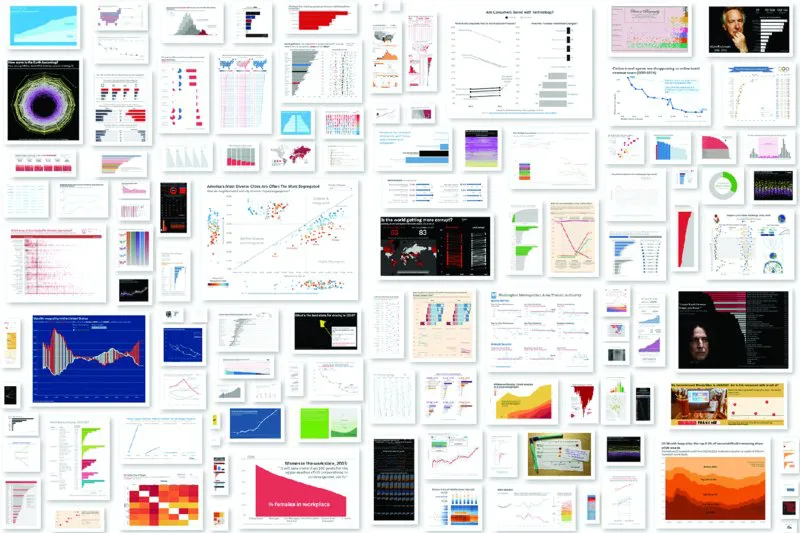
#MakeoverMonday offers inspiration and a giant dose of perspective for those who communicate data. Originally a small project in the data visualization community, #MakeoverMonday features a weekly chart or graph and a dataset that community members reimagine in order to make it more effective. The results have been astounding; hundreds of people have contributed thousands of makeovers, perfectly illustrating the highly variable nature of data visualization. Different takes on the same data showed a wide variation of theme, focus, content, and design, with side-by-side comparisons throwing more- and less-effective techniques into sharp relief.

This book is an extension of that project, featuring a variety of makeovers that showcase various approaches to data communication and a focus on the analytical, design and storytelling skills that have been developed through #MakeoverMonday. Paging through the makeovers ignites immediate inspiration for your own work, provides insight into different perspectives, and highlights the techniques that truly make an impact.

  • Explore the many approaches to visual data communication
  • Think beyond the data and consider audience, stakeholders, and message
  • Design your graphs to be intuitive and more communicative
  • Assess the impact of layout, color, font, chart type, and other design choices

Creating visual representation of complex datasets is tricky. There's the mandate to include all relevant data in a clean, readable format that best illustrates what the data is saying—but there is also the designer's impetus to showcase a command of the complexity and create multidimensional visualizations that "look cool." #MakeoverMonday shows you the many ways to walk the line between simple reporting and design artistry to create exactly the visualization the situation requires.

Frequently asked questions

How do I cancel my subscription?
Simply head over to the account section in settings and click on “Cancel Subscription” - it’s as simple as that. After you cancel, your membership will stay active for the remainder of the time you’ve paid for. Learn more here.
Can/how do I download books?
At the moment all of our mobile-responsive ePub books are available to download via the app. Most of our PDFs are also available to download and we're working on making the final remaining ones downloadable now. Learn more here.
What is the difference between the pricing plans?
Both plans give you full access to the library and all of Perlego’s features. The only differences are the price and subscription period: With the annual plan you’ll save around 30% compared to 12 months on the monthly plan.
What is Perlego?
We are an online textbook subscription service, where you can get access to an entire online library for less than the price of a single book per month. With over 1 million books across 1000+ topics, we’ve got you covered! Learn more here.
Do you support text-to-speech?
Look out for the read-aloud symbol on your next book to see if you can listen to it. The read-aloud tool reads text aloud for you, highlighting the text as it is being read. You can pause it, speed it up and slow it down. Learn more here.
Is #MakeoverMonday an online PDF/ePUB?
Yes, you can access #MakeoverMonday by Andy Kriebel, Eva Murray in PDF and/or ePUB format, as well as other popular books in Business & Business Communication. We have over one million books available in our catalogue for you to explore.

Information

Publisher
Wiley
Year
2018
ISBN
9781119510796
Edition
1

Part I

Introduction

“Practice makes perfect.” Our parents, teachers and coaches have said this simple phrase ever since we were old enough to think for ourselves. And we all know now that if you want to be great at anything, you have to practice, over and over and over again. Whether it is data visualization, golf, or underwater basket weaving, in order to be great you have to dedicate time to perfecting your craft. On top of practice, you need to engage with a community that can help you learn, provide you with feedback, and inspire you. This is what Makeover Monday is all about. Makeover Monday will help you go from good to great at data visualization, data analysis, communication, and storytelling, as long as you make the effort, week after week.

What Is Makeover Monday?

Makeover Monday, the social data project, started in January 2016 as a collaboration between me (Andy Kriebel) and Andy Cotgreave. Makeover Monday as a concept, however, had been around for several years as a weekly project I did by myself to advance my learning and practice my craft.
Makeover Monday is simple: take an existing chart and make it better. The goal is straightforward: improve how we visualize and analyze data, one chart at a time. Here is how it works:
  1. Eva Murray (my partner from January 2017) and I find charts that we think do not communicate information as effectively as they could.
  2. We prepare the necessary data for each chart so that people can focus on visualizing and analyzing the data (without the need to prepare it first), thus eliminating a big barrier to participation.
  3. The original visualization and data, along with the source article, are posted on our website on Sundays.
  4. Throughout the week, participants create their own chart, dashboard, or story, publish it to the web, and share it via our data.world page (data.world) and Twitter.
  5. In addition to members of the community giving one another feedback, Eva and I run a weekly webinar to provide live feedback.
  6. People iterate on the feedback and republish.
  7. Each week we identify our favorite visualizations, a few lessons learned, and summarize the week in a blog post on Friday.
  8. It starts all over again two days later.
Makeover Monday is open to everyone. Maybe you are just getting started and need a place to practice data visualization or basic data analysis. Maybe you have years of experience and want to improve your storytelling, communication skills, or learn advanced techniques. Wherever you are in your career as a data analyst, Makeover Monday has a place for you.

How Did Makeover Monday Start?

I started using Tableau Software on 11 April 2007 and immediately began reading all I could to understand the fundamental data visualization principles that Tableau was built upon. Based on a recommendation, the first book I read was Stephen Few’s Information Dashboard Design: The Effective Visual Communication of Data (O’Reilly Media, 2006). The idea that really stuck with me was how Stephen would teach his readers by reviewing poorly designed charts, indicating what did not work and how he would visualize it differently.
I read the book cover to cover in a day and was blown away that I had not heard anything about data visualization before. I knew at this moment that my world had changed. This was the work I wanted to do.
Fast-forward to August 2009. I noticed that not many people were writing about data visualization and I believed that writing about what I was learning would help make the concepts stick and help me improve faster. VizWiz.com was born and I started doing “makeovers.” The first blog post I wrote was a makeover of a pie chart similar to the one in Figure I.1 about the RBIs (runs batted in; baseball) contributed by New York Yankees players:
Pie chart shows 2008 Yankees batting runs where season 1 percent, Abreu 13 percent, bet emit 3 percent, Cano 9 percent, Duncan 1 percent, Matsu 6 percent, et cetera.
Figure I.1: The alphabetical sorting of the pie chart makes ranking the players difficult.
Following Few’s style, I asked a simple question:
  • Which player had the fifth most RBIs?
Given the design of this chart, particularly with its alphabetical sort order, finding the fifth-highest player takes too long. When visualizing data, I wanted to aim for simplicity and make it easy for my audience to understand the data. With that in mind, I created the simple bar chart in Figure I.2 as my first makeover.
Bar graph shows ranking of players on percent of team RBI versus player where Alex Rodriguez is highest in ranking and Juan Miranda is lowest in ranking.
Figure I.2: A bar chart is much better for representing the ranking of the players.
I explained how displaying the data as a bar chart, sorted by the team RBI percentage from highest to lowest, makes answering the same question much easier. All the reader needs to do is scan down to the fifth bar and see that Johnny Damon had the fifth most RBIs for the Yankees in 2008.
The core principle I was following was to make the charts as simple as possible, as quickly as possible, often timeboxing the make-overs to 60 minutes. Giving myself an hour to create a better, more effective chart for a specific topic forced me to make quick design decisions and to be satisfied with charts that were not “perfect” when it came to advanced design.

The Community Project

Six years and hundreds of makeovers later, my friend Emily Kund noticed that nearly all of the makeovers that I had been posting were on Mondays. Emily is a huge fan of alliterations and suggested that I start calling the weekly series “Makeover Monday.” On 28 April 2014, Makeover Monday officially became a project, even though it was still a one-man show.

The Andys: Makeover Monday 2016

I continued creating these makeovers week after week until November 2015, when Andy Cotgreave, Technical Evangelist at Tableau and author of The Big Book of Dashboards, reached out and asked if he could join me each week. Andy C found that, although he was a Tableau employee, he was not exploring data as much as he used to. He committed to do every weekly makeover with me throughout 2016.
Here is how it worked. I posted a data set every week and Andy and I would each visualize the data and post it on our blogs (Andy C’s is at gravyanecdote.com). We followed the three-part review format that I had been using:
  1. What works with the original chart?
  2. What could be improved?
  3. What did we do to make it better?
This format helped with consistency, conciseness, and focus. It also helped us each understand the thought process of the other. Andy Cotgreave then had the idea to open it up to the “Tableau Community” by setting up a website (makeovermonday.co.uk), posting the data sets there each week, along with a link to the original visualization to make over, then sharing the details on Twitter (Figure I.3).
Sheet shows collection of images created by Andy and Andy for makeover during Monday 2016 with maps, graphs, pie charts, charts, et cetera.
Figure I.3: Collection of the images created by Andy & Andy for Makeover Monday 2016.
And so, 3239 visualizations and 519 contributors later, year one of Makeover Monday was a huge success.
I could not believe it! How did my little way of learning each week go from just me to hundreds of people in a single year? I love how inspired everyone was, how willing they’ve been to help each other with their eagerness to learn and improve week after week.
So, what did Andy C think?
I was blown away. Andy K and I thought we might just be producing charts and nothing would happen, but within weeks we were seeing a bunch of people getting involved each week. As the year developed, more and more people got involved. The talent, passion, and dedication of the community was the most rewarding and surprising aspect of 2016.
To say we were blown away by the p...

Table of contents