Bootstrap 4 Quick Start
eBook - ePub

Bootstrap 4 Quick Start

A Beginner's Guide to Building Responsive Layouts with Bootstrap 4

Jacob D Lett

Condividi libro
  1. English
  2. ePUB (disponibile sull'app)
  3. Disponibile su iOS e Android
eBook - ePub

Bootstrap 4 Quick Start

A Beginner's Guide to Building Responsive Layouts with Bootstrap 4

Jacob D Lett

Dettagli del libro
Anteprima del libro
Indice dei contenuti
Citazioni

Informazioni sul libro

Want to improve the design of your website or web application without having to write CSS styles from scratch?

Updated to v4.2.1 January 2019

Learning web development is a lot more challenging than it used to be. Responsive web design adds more layers of complexity to design and develop websites. In this book you will become familiar with the new cards component, setting up the new flexbox grid layout, customizing the look and feel, how to follow the mobile-first development workflow, and more!

Web designer and developer Jacob Lett has built 100+ websites and WordPress themes. Let him show you exactly how to build responsive layouts that look great in every browser and device. He shares what you can't learn from the official documentation... the process of actually building a full web design layout.

This book is focused on the workflow and does not duplicate what you can already find in the official documentation. This book will show you how to reference the documentation and use it effectively in your projects.

BONUS: Includes a link to download a free cheat sheets bundle and a 1 hour training video.

Who is this for?

  • You're a web development beginner and want to learn how to become a developer.
  • You learned HTML5 & CSS3 but are new to responsive web design basics.
  • You have used Bootstrap before but want to learn new techniques and workflow.

What will I learn?

  • Learn what responsive web design is, the history behind it, and how the Bootstrap 4 frontend framework makes it easier to implement.
  • Learn the web design process and how to build a website using Bootstrap 4.
  • Learn what's new in Bootstrap 4 with a deep focus on CSS3 Flexbox, Cards, and the responsive grid layout.

What will I build?

  • Responsive Marketing Homepage - Topics covered: responsive images, image cards, parallax background images, Google fonts, carousel cross-fade, and vertical centered text.
  • Bootstrap Admin Dashboard - Topics covered: 100% height sidebar, card deck, FontAwesome icons, responsive charts and tables, and custom navigation tree menu.

How is this training unique?

  • Learn by doing as you build two professional responsive layouts examples step-by-step.
  • Focused on the workflow vs duplicating what you can find in the official documentation. This book will show you how to reference the documentation and use it effectively in your projects.
  • Uses hyperlinks to point to code demos, snippets, videos, and external resources.

What do I need?

  • Some experience with HTML coding and CSS is helpful but not necessary.
  • Does not require knowing Sass, command line, or Photoshop.
  • A computer with Google Chrome.
  • A text editor like Atom and an internet connection.

You want to build

Domande frequenti

Come faccio ad annullare l'abbonamento?
È semplicissimo: basta accedere alla sezione Account nelle Impostazioni e cliccare su "Annulla abbonamento". Dopo la cancellazione, l'abbonamento rimarrà attivo per il periodo rimanente già pagato. Per maggiori informazioni, clicca qui
È possibile scaricare libri? Se sì, come?
Al momento è possibile scaricare tramite l'app tutti i nostri libri ePub mobile-friendly. Anche la maggior parte dei nostri PDF è scaricabile e stiamo lavorando per rendere disponibile quanto prima il download di tutti gli altri file. Per maggiori informazioni, clicca qui
Che differenza c'è tra i piani?
Entrambi i piani ti danno accesso illimitato alla libreria e a tutte le funzionalità di Perlego. Le uniche differenze sono il prezzo e il periodo di abbonamento: con il piano annuale risparmierai circa il 30% rispetto a 12 rate con quello mensile.
Cos'è Perlego?
Perlego è un servizio di abbonamento a testi accademici, che ti permette di accedere a un'intera libreria online a un prezzo inferiore rispetto a quello che pagheresti per acquistare un singolo libro al mese. Con oltre 1 milione di testi suddivisi in più di 1.000 categorie, troverai sicuramente ciò che fa per te! Per maggiori informazioni, clicca qui.
Perlego supporta la sintesi vocale?
Cerca l'icona Sintesi vocale nel prossimo libro che leggerai per verificare se è possibile riprodurre l'audio. Questo strumento permette di leggere il testo a voce alta, evidenziandolo man mano che la lettura procede. Puoi aumentare o diminuire la velocità della sintesi vocale, oppure sospendere la riproduzione. Per maggiori informazioni, clicca qui.
Bootstrap 4 Quick Start è disponibile online in formato PDF/ePub?
Sì, puoi accedere a Bootstrap 4 Quick Start di Jacob D Lett in formato PDF e/o ePub, così come ad altri libri molto apprezzati nelle sezioni relative a Design e Web Design. Scopri oltre 1 milione di libri disponibili nel nostro catalogo.

Informazioni

Anno
2018
ISBN
9781732205802
Edizione
1
Argomento
Design
Categoria
Web Design
What’s New in Bootstrap 4
FLEXBOX GRID SYSTEM
The most important element of any CSS framework is the grid system. The Bootstrap grid has been used on many websites worldwide which make it extremely stable. This cross-browser support is why you probably are considering using Bootstrap for your website (it was for me).
In this section, I will provide an overview of the grid and provide examples to help you quickly apply it to your projects.
Important
Before you begin a project, you should know what set of web browsers you are going to support. This will actually determine what version of Bootstrap you use because Bootstrap 4 is not supported on IE9 and below.
What Versions of Internet Explorer Do You Need to Support?
So how do you know what browsers to support? If you are redesigning an existing site, I suggest looking at your Google Analytics to see what browser the majority of your site visitors use. Look for trends to determine if it makes sense to remove support for an older browser.
If you have no analytics to work with I suggest looking at StatCounter to see the top browsers in your country. But from my experience, it is best to have a clear understanding of your ideal site visitor. Because there are a lot of factors, tools like StatCounter do not factor in. One of those being corporate environments that are slow to upgrade to newer browsers.
One way to get a clear picture of your target site visitor is through surveys or live interviews. Talk to likely site visitors and ask them what browsers they use and if there are any IT restrictions preventing them to upgrade browsers.
Once you have your data and some assumptions follow the decision chart below (Fig. 7) to determine what Bootstrap version you should use.
Bootstrap Version Decision Chart
I need to support IE10+Use Bootstrap 4
I need to support IE9+Use Bootstrap 3
I need to support IE8+
What is Flexbox?
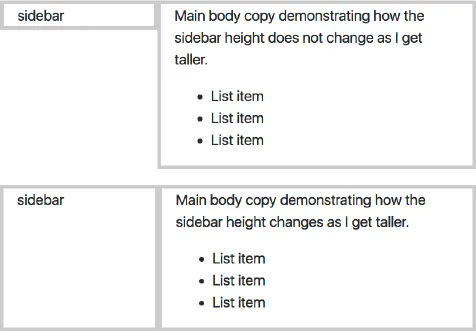
In Bootstrap 3 and for the majority of websites, the only way to build multi-column layouts was to set column widths and use floats. Then on mobile, you would just remove the float and width property so that it would change to be one column.
images
Fig. 8: Demonstrates how a flexbox grid adjusts the height of sibling columns while a float grid does not. Top: Float columns; Bottom: Flexbox columns
Now with flexbox, or flexible box, you will be able to build complex grid layouts with more control and flexibility to adapt the layout as the viewport changes.
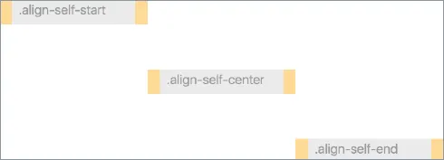
If you are familiar with an UL and LI relationship, flexbox is very similar in how it has sub items or flexbox items inside a parent wrapping container. But since flexbox is a display property it can be applied to any parent and child HTML elements and does not have its own HTML element like <flexbox>.
Keep in mind, Bootstrap is a CSS framework that builds
images
Fig. 9: One of the most exciting features of flexbox is how it handles vertical alignment.
upon the core language of CSS. So flexbox is the core CSS technology that Bootstrap uses for grid layout and is not a component created by Bootstrap. So it is helpful to know the fundamentals of flexbox in case you need to override something.
Here are some additional sources to learn more about flexbox: Solved by Flexbox and my Bootstrap 4 flexbox cheat sheet and flexbox tutorial.
12 Column Grid
So now that you understand flexbox and why it's superior to floats for layout, lets look at how Bootstrap uses this for their grid system.
The Bootstrap grid system is based on a 12 column grid because the number 12 is divisible by 12, 6, 4, 3, 2. So your column sizes inside each row will need to equal 12. This math makes the grid more flexible for a wide range of layouts.
Common Grid Layout Examples:
• 2 column grid
.col-sm-6 + .col-sm-6 = 12
• 2 column golden ratio grid
.col-sm-8 + .col-sm-4 = 12
• 3 column grid
.col-sm-4 + .col-sm-4 + .col-sm-4 = 12
images
Fig. 10: By default, Flexbox item widths are equally distributed to fill the width of the container. If you set the column class to .col it makes each column horizontal at all breakpoints. So it doesn't respect the 12 column grid like you think it would as shown in this example.
images
Fig. 11: In this example, I changed the column class to .col-sm-1 instead of .col which res...

Indice dei contenuti