Bootstrap 4 Quick Start
eBook - ePub

Bootstrap 4 Quick Start

A Beginner's Guide to Building Responsive Layouts with Bootstrap 4

Jacob D Lett

Share book
  1. English
  2. ePUB (mobile friendly)
  3. Available on iOS & Android
eBook - ePub

Bootstrap 4 Quick Start

A Beginner's Guide to Building Responsive Layouts with Bootstrap 4

Jacob D Lett

Book details
Book preview
Table of contents
Citations

About This Book

Want to improve the design of your website or web application without having to write CSS styles from scratch?

Updated to v4.2.1 January 2019

Learning web development is a lot more challenging than it used to be. Responsive web design adds more layers of complexity to design and develop websites. In this book you will become familiar with the new cards component, setting up the new flexbox grid layout, customizing the look and feel, how to follow the mobile-first development workflow, and more!

Web designer and developer Jacob Lett has built 100+ websites and WordPress themes. Let him show you exactly how to build responsive layouts that look great in every browser and device. He shares what you can't learn from the official documentation... the process of actually building a full web design layout.

This book is focused on the workflow and does not duplicate what you can already find in the official documentation. This book will show you how to reference the documentation and use it effectively in your projects.

BONUS: Includes a link to download a free cheat sheets bundle and a 1 hour training video.

Who is this for?

  • You're a web development beginner and want to learn how to become a developer.
  • You learned HTML5 & CSS3 but are new to responsive web design basics.
  • You have used Bootstrap before but want to learn new techniques and workflow.

What will I learn?

  • Learn what responsive web design is, the history behind it, and how the Bootstrap 4 frontend framework makes it easier to implement.
  • Learn the web design process and how to build a website using Bootstrap 4.
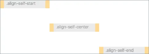
  • Learn what's new in Bootstrap 4 with a deep focus on CSS3 Flexbox, Cards, and the responsive grid layout.

What will I build?

  • Responsive Marketing Homepage - Topics covered: responsive images, image cards, parallax background images, Google fonts, carousel cross-fade, and vertical centered text.
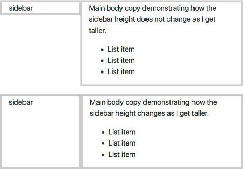
  • Bootstrap Admin Dashboard - Topics covered: 100% height sidebar, card deck, FontAwesome icons, responsive charts and tables, and custom navigation tree menu.

How is this training unique?

  • Learn by doing as you build two professional responsive layouts examples step-by-step.
  • Focused on the workflow vs duplicating what you can find in the official documentation. This book will show you how to reference the documentation and use it effectively in your projects.
  • Uses hyperlinks to point to code demos, snippets, videos, and external resources.

What do I need?

  • Some experience with HTML coding and CSS is helpful but not necessary.
  • Does not require knowing Sass, command line, or Photoshop.
  • A computer with Google Chrome.
  • A text editor like Atom and an internet connection.

You want to build

Frequently asked questions

How do I cancel my subscription?
Simply head over to the account section in settings and click on ā€œCancel Subscriptionā€ - itā€™s as simple as that. After you cancel, your membership will stay active for the remainder of the time youā€™ve paid for. Learn more here.
Can/how do I download books?
At the moment all of our mobile-responsive ePub books are available to download via the app. Most of our PDFs are also available to download and we're working on making the final remaining ones downloadable now. Learn more here.
What is the difference between the pricing plans?
Both plans give you full access to the library and all of Perlegoā€™s features. The only differences are the price and subscription period: With the annual plan youā€™ll save around 30% compared to 12 months on the monthly plan.
What is Perlego?
We are an online textbook subscription service, where you can get access to an entire online library for less than the price of a single book per month. With over 1 million books across 1000+ topics, weā€™ve got you covered! Learn more here.
Do you support text-to-speech?
Look out for the read-aloud symbol on your next book to see if you can listen to it. The read-aloud tool reads text aloud for you, highlighting the text as it is being read. You can pause it, speed it up and slow it down. Learn more here.
Is Bootstrap 4 Quick Start an online PDF/ePUB?
Yes, you can access Bootstrap 4 Quick Start by Jacob D Lett in PDF and/or ePUB format, as well as other popular books in Design & Web Design. We have over one million books available in our catalogue for you to explore.

Information

Year
2018
ISBN
9781732205802
Edition
1
Topic
Design
Subtopic
Web Design
Whatā€™s New in Bootstrap 4
FLEXBOX GRID SYSTEM
The most important element of any CSS framework is the grid system. The Bootstrap grid has been used on many websites worldwide which make it extremely stable. This cross-browser support is why you probably are considering using Bootstrap for your website (it was for me).
In this section, I will provide an overview of the grid and provide examples to help you quickly apply it to your projects.
Important
Before you begin a project, you should know what set of web browsers you are going to support. This will actually determine what version of Bootstrap you use because Bootstrap 4 is not supported on IE9 and below.
What Versions of Internet Explorer Do You Need to Support?
So how do you know what browsers to support? If you are redesigning an existing site, I suggest looking at your Google Analytics to see what browser the majority of your site visitors use. Look for trends to determine if it makes sense to remove support for an older browser.
If you have no analytics to work with I suggest looking at StatCounter to see the top browsers in your country. But from my experience, it is best to have a clear understanding of your ideal site visitor. Because there are a lot of factors, tools like StatCounter do not factor in. One of those being corporate environments that are slow to upgrade to newer browsers.
One way to get a clear picture of your target site visitor is through surveys or live interviews. Talk to likely site visitors and ask them what browsers they use and if there are any IT restrictions preventing them to upgrade browsers.
Once you have your data and some assumptions follow the decision chart below (Fig. 7) to determine what Bootstrap version you should use.
Bootstrap Version Decision Chart
I need to support IE10+Use Bootstrap 4
I need to support IE9+Use Bootstrap 3
I need to support IE8+
What is Flexbox?
In Bootstrap 3 and for the majority of websites, the only way to build multi-column layouts was to set column widths and use floats. Then on mobile, you would just remove the float and width property so that it would change to be one column.
images
Fig. 8: Demonstrates how a flexbox grid adjusts the height of sibling columns while a float grid does not. Top: Float columns; Bottom: Flexbox columns
Now with flexbox, or flexible box, you will be able to build complex grid layouts with more control and flexibility to adapt the layout as the viewport changes.
If you are familiar with an UL and LI relationship, flexbox is very similar in how it has sub items or flexbox items inside a parent wrapping container. But since flexbox is a display property it can be applied to any parent and child HTML elements and does not have its own HTML element like <flexbox>.
Keep in mind, Bootstrap is a CSS framework that builds
images
Fig. 9: One of the most exciting features of flexbox is how it handles vertical alignment.
upon the core language of CSS. So flexbox is the core CSS technology that Bootstrap uses for grid layout and is not a component created by Bootstrap. So it is helpful to know the fundamentals of flexbox in case you need to override something.
Here are some additional sources to learn more about flexbox: Solved by Flexbox and my Bootstrap 4 flexbox cheat sheet and flexbox tutorial.
12 Column Grid
So now that you understand flexbox and why it's superior to floats for layout, lets look at how Bootstrap uses this for their grid system.
The Bootstrap grid system is based on a 12 column grid because the number 12 is divisible by 12, 6, 4, 3, 2. So your column sizes inside each row will need to equal 12. This math makes the grid more flexible for a wide range of layouts.
Common Grid Layout Examples:
ā€¢ 2 column grid
.col-sm-6 + .col-sm-6 = 12
ā€¢ 2 column golden ratio grid
.col-sm-8 + .col-sm-4 = 12
ā€¢ 3 column grid
.col-sm-4 + .col-sm-4 + .col-sm-4 = 12
images
Fig. 10: By default, Flexbox item widths are equally distributed to fill the width of the container. If you set the column class to .col it makes each column horizontal at all breakpoints. So it doesn't respect the 12 column grid like you think it would as shown in this example.
images
Fig. 11: In this example, I changed the column class to .col-sm-1 instead of .col which res...

Table of contents