An instant classic when first published in 1991, How to Lie with Maps revealed how the choices mapmakers make—consciously or unconsciously—mean that every map inevitably presents only one of many possible stories about the places it depicts. The principles Mark Monmonier outlined back then remain true today, despite significant technological changes in the making and use of maps. The introduction and spread of digital maps and mapping software, however, have added new wrinkles to the ever-evolving landscape of modern mapmaking.
?Fully updated for the digital age, this new edition of How to Lie with Maps examines the myriad ways that technology offers new opportunities for cartographic mischief, deception, and propaganda. While retaining the same brevity, range, and humor as its predecessors, this third edition includes significant updates throughout as well as new chapters on image maps, prohibitive cartography, and online maps. It also includes an expanded section of color images and an updated list of sources for further reading.
Trusted by 375,005 students
Access to over 1.5 million titles for a fair monthly price.
Not only is it easy to lie with maps, it’s essential. To portray meaningful relationships for a complex, three-dimensional world on a flat sheet of paper or a screen, a map must distort reality. As a scale model, the map must use symbols that almost always are proportionally much bigger or thicker than the features they represent. To avoid hiding critical information in a fog of detail, the map must offer a selective, incomplete view of reality. There’s no escape from the cartographic paradox: to present a useful and truthful picture, an accurate map must tell white lies.
Because most map users willingly tolerate white lies on maps, it’s not difficult for maps to also tell more serious lies. Map users have traditionally been a trusting lot: they understand the need to distort geometry and suppress features, and they believe the cartographer really does know where to draw the line, figuratively as well as literally. As with many things beyond their full understanding, they generally entrust mapmaking to a priesthood of technically competent designers and geographers working for government agencies and commercial firms. Yet cartographers are not licensed, and many mapmakers competent in commercial art or in the use of graphics software have never studied cartography. Even map users who know that such software is widely available and who see maps in an increasing range of media seldom question these authorities, and they often fail to appreciate the map’s power as a tool of deliberate falsification or subtle propaganda.
Because anyone with the right software and an internet connection can now make and publish maps, mapmakers can also easily lie to themselves and others—and be unaware of it. Before the electronic age, folk cartography consisted largely of hand-drawn maps giving directions. The direction giver had full control over pencil and paper and usually had no difficulty transferring routes, landmarks, and other relevant recollections from mind to map, but the result was clearly amateurish. Technology allows people without cartographic savvy to create modern-day folk maps with the crisp type, uniform symbols, and verisimilitude of maps from the cartographic priesthood. Yet software developers have also made it easy for the lay cartographer to select an inappropriate projection or a misleading set of symbols. Because of advances in graphics software and online mapping, inadvertent yet serious cartographic lies can appear respectable and accurate.
The potential for cartographic mischief extends well beyond the deliberate manipulations used by some cartographer-propagandists and the electronic blunders made by the cartographically ignorant. If any single caveat can alert map users to their unhealthy but widespread naïveté, it is that a single map is but one of an indefinitely large number of maps that might be produced for the same situation or from the same data. The italics reflect an academic lifetime of browbeating undergraduates with this obvious but readily ignored warning. How easy it is to forget—and how revealing to recall—that map authors can experiment freely with features, measurements, area of coverage, and symbols and can pick the map that best presents their case or supports their unconscious bias. Map users must be aware that cartographic license is enormously broad.
The purpose of this book is to promote a healthy skepticism about maps, not to foster either cynicism or deliberate dishonesty. In showing how to lie with maps, I want to make readers aware that maps, like speeches and paintings, are authored collections of information and are also subject to distortions arising from ignorance, greed, ideological blindness, or malice.
Examining the misuses of maps—both paper and digital—also provides an interesting introduction to the nature of maps and their range of appropriate uses. The four chapters that follow this one address general cartographic principles that apply to all different types of maps. Chapter 2 considers the map’s main elements—scale, projection, and symbolization—as potential sources of distortion. Chapter 3 further explores the effects of scale by examining the various white lies cartographers justify as necessary generalization, and chapter 4 looks at common blunders resulting from the mapmaker’s ignorance or oversight. Chapter 5 looks at how a careless or Machiavellian choice of colors can confuse or mislead the map viewer.
The rest of the chapters treat specific types of maps and how they can be manipulated. Chapter 6 treats the seductive use of symbols in advertising maps, and chapter 7 explores exaggeration and suppression in maps prepared for development plans and environmental-impact statements. Chapters 8 and 9 examine distorted maps used by governments as political propaganda and as “disinformation” for military opponents. Government mapping is also a central concern in chapter 10, which investigates the effects of national culture and bureaucratic inertia—and, increasingly, commercial interests—on detailed topographic maps. Chapter 11 addresses distortion and self-deception in maps made from census and survey data and other quantitative information. Chapter 12 examines the specific challenges posed by image maps that are based on satellite technology and other measurements, chapter 13 acknowledges the emergence of prohibitive mapping as a pervasive and potentially threatening cartographic genre, and chapter 14 addresses the diverse types of dynamic maps and the distinctive advantages and constraints of online maps. Chapter 15 concludes by noting how maps can have dual and sometimes conflicting roles and by recommending a skeptical assessment of a map author’s motives.
In an era of increasing skepticism about the nature of knowledge, a book about what it means to lie with maps is more useful than ever. For all the interest in verbal lies, nefarious as well as white, and in how words can be manipulated, education in the use of maps and other visuals is spotty and limited, and many otherwise-educated people are graphically and cartographically illiterate. Maps, like numbers, are often arcane images accorded undue respect and credibility. This book’s principal goal is to dispel this cartographic mystique and promote a more informed use of maps based on an understanding and appreciation of their flexibility as a medium of communication.
As technology continues to lower the barriers dividing map users from mapmakers, this book’s insights can be especially useful for those who might more effectively use maps in their work or as citizens fighting environmental deterioration or social ills. The informed skeptic becomes a perceptive map author, better able to describe locational characters and explain geographic relationships and better equipped to recognize and counter the self-serving arguments of biased or dishonest mapmakers.
CHAPTER2
Elements of the Map
Maps have three basic attributes: scale, projection, and symbolization. Each element is a source of distortion. As a group, they describe the essence of the map’s possibilities and limitations. No one can use maps or make maps safely and effectively without understanding map scales, map projections, and map symbols.
Scale
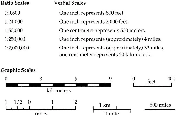
Most maps are smaller than the reality they represent, and map scales tell us how much smaller. A map can state its scale in three ways: as a ratio, as a short sentence, or as a simple graph. Figure 2.1 shows some typical statements of map scale.
Ratio scales relate one unit of distance on the map to a specific distance on the ground. The units must be the same, so that a ratio of 1:10,000 means that a 1-inch line on the map represents a 10,000-inch stretch of road—or that 1 centimeter represents 10,000 centimeters or 1 foot stands for 10,000 feet. As long as they are the same, the units don’t matter and need not be stated; the ratio scale is a dimensionless number. By convention, the part of the ratio to the left of the colon is always 1.
Some maps state the ratio scale as a fraction, but both forms have the same meaning. Whether the mapmaker uses 1:24,000 or 1/24,000 is solely a matter of style.
Fractional statements help the user compare map scales. A scale of 1/10,000 (or 1:10,000) is larger than a scale of 1/250,000 (or 1:250,000) because 1/10,000 is a larger fraction than 1/250,000. Recall that small fractions have big denominators and big fractions have small denominators, or that half (1/2) of a pie is more than a quarter (1/4) of the pie. In general, “large-scale” maps have scales of 1:24,000 or larger, whereas “small-scale” maps have scales of 1:500,000 or smaller. But these distinctions are relative: in a city-planning office where the smallest map scale is 1:50,000, “small-scale” might refer to maps at 1:24,000 or smaller and “large-scale” to maps at 1:4,800 or larger.
Figure 2.1. Types of map scales.
Large-scale maps tend to be more detailed than small-scale maps. Consider two maps, one at 1:10,000 and the other at 1:10,000,000. A 1-inch line at 1:10,000 represents 10,000 inches, which is 833 1/3 feet, or roughly 0.16 miles. At this scale a square measuring 1 inch on each side represents an area of 0.025 square miles, or roughly 16 acres. In contrast, at 1:10,000,000 the 1-inch line on the map represents almost 158 miles, and the square inch would represent an area slightly over 24,900 square miles, or nearly 16 million acres. In this example the square inch on the large-scale map could show features on the ground in far greater detail than the square inch on the small-scale map. Both maps would have to suppress some details, but the designer of the 1:10,000,000-scale map must be far more selective than the cartographer producing the 1:10,000-scale map. In the sense that all maps tell white lies about the planet, small-scale maps have a smaller capacity for truth than large-scale maps.
Verbal statements such as “one inch represents one mile” relate units convenient for measuring distances on the map to units commonly used for estimating and thinking about distances on the ground. For most users this simple sentence is more meaningful than the corresponding ratio scale of 1:63,360, or its close approximation, 1:62,500. British map users used to identify various map series with adjective phrases such as “inch to the mile” or “four miles to the inch” (a close approximation for 1:250,000).
Sometimes a mapmaker might say “equals” instead of “represents.” Although technically absurd, “equals” in these cases might more kindly be considered a shorthand for “is the equivalent of.” Yet the skeptic rightly warns of cartographic seduction, for “one inch equals one mile” not only robs the user of a subtle reminder that the map is merely a symbolic model but also falsely suggests that the mapped image is reality. As later chapters show, this delusion can be dangerous.
Metric units make verbal scales less necessary. Persons familiar with centimeters and kilometers have little need for sentences to tell them that at 1:100,000 one centimeter represents one kilometer, or that at 1:25,000 four centimeters represent one kilometer. In Europe, where metric units are standard, round-number map scales of 1:10,000, 1:25,000, 1:50,000, and 1:100,000 are common. In the United States, where the metric system’s most prominent inroads have been in the liquor and drug businesses, large-scale maps typically represent reality at scales of 1:9,600 (“one inch represents eight hundred feet”), 1:24,000 (“one inch represents two thousand feet”), and 1:62,500 (“one inch represents [slightly less than] one mile”).
Graphic scales are not only the most helpful means of communicating map scale but also the safest. An alternative to blind trust in the user’s sense of distance and skill in mental arithmetic, the simple bar scale typically portrays a series of conveniently rounded distances appropriate to the map’s function and the area covered. Graphic scales are particularly safe for maps that might be reduced or enlarged for publication, or by users. For example, a 5-inch-wide map labeled “1:50,000” would have a scale less than 1:80,000 if reduced to fit a newspaper column or a mobile-device screen that is 3 inches wide, whereas a scale bar representing a half mile would shrink along with the map’s other symbols and distances. Ratio and verbal scales are useless on digital maps, since screens and thus the map scales vary widely and unpredictably.
Web-based maps and similar interactive applications occasion a fourth type of map scale: the zoom slider that moves up or down to indicate relative distance above the surface, or the interactive plus and minus buttons that produce the same effect. Zooming out yields a broader geographic scope with a smaller scale and less detail, and zooming in provides a narrower view with greater detail.
Map Projections
Map projections, which transform the curved, three-dimensional surface of the planet into a flat, two-dimensional plane, can greatly distort map scale. Although the globe can be a true scale model of the earth, with a constant scale at all points and in all directions, the flat map stretches some distances and shortens others, so that scale varies from point to point. Indeed, the bar scale sometimes included in the lower right of an online map can be blatantly misleading when the user zooms out to show an entire continent. Moreover, scale at a point tends to vary with direction as well.
The world-map projection in figure 2.2 illustrates the often severe scale differences found on maps portraying large areas. In this instance map scale is constant along the eq...
Table of contents
Cover
Title Page
Copyright Page
Dedication
Contents
Preface to the Third Edition
1 Introduction
2 Elements of the Map
3 Map Generalization: Little White Lies and Lots of Them
4 Blunders That Mislead
5 Color: Attraction and Distraction
6 Maps That Advertise
7 Development Maps (Or, How to Seduce the Town Board)
8 Maps for Political Propaganda
9 Maps, Defense, and Disinformation: Fool Thine Enemy
10 Large-Scale Mapping, Culture, and the National Interest
11 Data Maps: A Thicket of Thorny Choices
12 Image Maps: Picture That
13 Prohibitive Cartography: Maps That Say “No!”
14 Fast Maps: Animated, Interactive, or Mobile
15 Epilogue
Acknowledgments
Appendix: Latitude and Longitude
Selected Readings for Further Exploration
Sources of Illustrations
Index
Gallery
Frequently asked questions
Yes, you can cancel anytime from the Subscription tab in your account settings on the Perlego website. Your subscription will stay active until the end of your current billing period. Learn how to cancel your subscription
No, books cannot be downloaded as external files, such as PDFs, for use outside of Perlego. However, you can download books within the Perlego app for offline reading on mobile or tablet. Learn how to download books offline
Perlego offers two plans: Essential and Complete
Essential is ideal for learners and professionals who enjoy exploring a wide range of subjects. Access the Essential Library with 800,000+ trusted titles and best-sellers across business, personal growth, and the humanities. Includes unlimited reading time and Standard Read Aloud voice.
Complete: Perfect for advanced learners and researchers needing full, unrestricted access. Unlock 1.5M+ books across hundreds of subjects, including academic and specialized titles. The Complete Plan also includes advanced features like Premium Read Aloud and Research Assistant.
Both plans are available with monthly, semester, or annual billing cycles.
We are an online textbook subscription service, where you can get access to an entire online library for less than the price of a single book per month. With over 1.5 million books across 990+ topics, we’ve got you covered! Learn about our mission
Look out for the read-aloud symbol on your next book to see if you can listen to it. The read-aloud tool reads text aloud for you, highlighting the text as it is being read. You can pause it, speed it up and slow it down. Learn more about Read Aloud
Yes! You can use the Perlego app on both iOS and Android devices to read anytime, anywhere — even offline. Perfect for commutes or when you’re on the go. Please note we cannot support devices running on iOS 13 and Android 7 or earlier. Learn more about using the app
Yes, you can access How to Lie with Maps, Third Edition by Mark Monmonier in PDF and/or ePUB format, as well as other popular books in Technology & Engineering & Geography. We have over 1.5 million books available in our catalogue for you to explore.