The Big Book of Dashboards
eBook - ePub

The Big Book of Dashboards

Visualizing Your Data Using Real-World Business Scenarios

Steve Wexler, Jeffrey Shaffer, Andy Cotgreave

Compartir libro
  1. English
  2. ePUB (apto para móviles)
  3. Disponible en iOS y Android
eBook - ePub

The Big Book of Dashboards

Visualizing Your Data Using Real-World Business Scenarios

Steve Wexler, Jeffrey Shaffer, Andy Cotgreave

Detalles del libro
Vista previa del libro
Índice
Citas

Información del libro

The definitive reference book with real-world solutions you won't find anywhere else

The Big Book of Dashboards presents a comprehensive reference for those tasked with building or overseeing the development of business dashboards.

Comprising dozens of examples that address different industries and departments (healthcare, transportation, finance, human resources, marketing, customer service, sports, etc.) and different platforms (print, desktop, tablet, smartphone, and conference room display) The Big Book of Dashboards is the only book that matches great dashboards with real-world business scenarios.

By organizing the book based on these scenarios and offering practical and effective visualization examples, The Big Book of Dashboards will be the trusted resource that you open when you need to build an effective business dashboard.

In addition to the scenarios there's an entire section of the book that is devoted to addressing many practical and psychological factors you will encounter in your work. It's great to have theory and evidenced-based research at your disposal, but what will you do when somebody asks you to make your dashboard 'cooler' by adding packed bubbles and donut charts?

The expert authors have a combined 30-plus years of hands-on experience helping people in hundreds of organizations build effective visualizations. They have fought many 'best practices' battles and having endured bring an uncommon empathy to help you, the reader of this book, survive and thrive in the data visualization world.

A well-designed dashboard can point out risks, opportunities, and more; but common challenges and misconceptions can make your dashboard useless at best, and misleading at worst. The Big Book of Dashboards gives you the tools, guidance, and models you need to produce great dashboards that inform, enlighten, and engage.

Preguntas frecuentes

¿Cómo cancelo mi suscripción?
Simplemente, dirígete a la sección ajustes de la cuenta y haz clic en «Cancelar suscripción». Así de sencillo. Después de cancelar tu suscripción, esta permanecerá activa el tiempo restante que hayas pagado. Obtén más información aquí.
¿Cómo descargo los libros?
Por el momento, todos nuestros libros ePub adaptables a dispositivos móviles se pueden descargar a través de la aplicación. La mayor parte de nuestros PDF también se puede descargar y ya estamos trabajando para que el resto también sea descargable. Obtén más información aquí.
¿En qué se diferencian los planes de precios?
Ambos planes te permiten acceder por completo a la biblioteca y a todas las funciones de Perlego. Las únicas diferencias son el precio y el período de suscripción: con el plan anual ahorrarás en torno a un 30 % en comparación con 12 meses de un plan mensual.
¿Qué es Perlego?
Somos un servicio de suscripción de libros de texto en línea que te permite acceder a toda una biblioteca en línea por menos de lo que cuesta un libro al mes. Con más de un millón de libros sobre más de 1000 categorías, ¡tenemos todo lo que necesitas! Obtén más información aquí.
¿Perlego ofrece la función de texto a voz?
Busca el símbolo de lectura en voz alta en tu próximo libro para ver si puedes escucharlo. La herramienta de lectura en voz alta lee el texto en voz alta por ti, resaltando el texto a medida que se lee. Puedes pausarla, acelerarla y ralentizarla. Obtén más información aquí.
¿Es The Big Book of Dashboards un PDF/ePUB en línea?
Sí, puedes acceder a The Big Book of Dashboards de Steve Wexler, Jeffrey Shaffer, Andy Cotgreave en formato PDF o ePUB, así como a otros libros populares de Business y Meetings & Presentations. Tenemos más de un millón de libros disponibles en nuestro catálogo para que explores.

Información

Editorial
Wiley
Año
2017
ISBN
9781119282730
Edición
1
Categoría
Business


PART I


A STRONG FOUNDATION

Chapter 1

Data Visualization: A Primer

This book is about real-world dashboards and why they succeed. In many of the scenarios, we explain how the designers use visualization techniques to contribute to that success. For those new to the field, this chapter is a primer on data visualization. It provides enough information for you to understand why we picked many of the dashboards. If you are more experienced, this chapter recaps data visualization fundamentals.

Why Do We Visualize Data?

Let's see why it's vital to visualize numbers by beginning with Table 1.1. There are four groups of numbers, each with 11 pairs. In a moment, we will create a chart from them, but before we do, take a look at the numbers. What can you see? Are there any discernible differences in the patterns or trends among them?
Table 1.1 Table with four groups of numbers: What do they tell you?
Group A Group B Group C Group D
x y x y x y x y
10.00
8.04
10.00
9.14
10.00
7.46
8.00
6.58
8.00
6.95
8.00
8.14
8.00
6.77
8.00
5.76
13.00
7.58
13.00
8.74
13.00
12.74
8.00
7.71
9.00
8.81
9.00
8.77
9.00
7.11
8.00
8.84
11.00
8.33
11.00
9.26
11.00
7.81
8.00
8.47
14.00
9.96
14.00
8.10
14.00
8.84
8.00
7.04
6.00
7.24
6.00
6.13
6.00
6.08
8.00
5.25
4.00
4.26
4.00
3.10
4.00
5.39
19.00
12.50
12.00
10.84
12.00
9.13
12.00
8.15
8.00
5.56
7.00
4.82
7.00
7.26
7.00
6.42
8.00
7.91
5.00
5.68
5.00
4.74
5.00
5.73
8.00
6.89
Let me guess: You don't really see anything clearly. It's too hard.
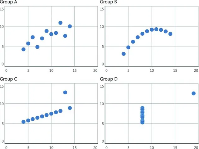
Before we put the numbers in a chart, we might consider their statistical properties. Were we to do that, we'd find that the statistical properties of each group of numbers are very similar. If the table doesn't show anything and statistics don't reveal much, what happens when we plot the numbers? Take a look at Figure 1.1.
Set of four scatterplots group A, B, C, D shows linear scatter, linear curved, linear straight and closely vertical clustered.
Figure 1.1 Now can you see a difference in the four groups?
Now do you see the differences? Seeing the numbers in a chart shows you something that tables and some statistical measures cannot. We visualize data to harness the incredible power of our visual system to spot relationships and trends.
This brilliant example is the creation of Frank Anscombe, a British statistician. He created this set of numbers—called “Anscombe's Quartet”—in his paper “Graphs in Statistical Analysis” in 1973. In the paper, he fought against the notion that “numerical calculations are exact, but graphs are roug...

Índice