The Big Book of Dashboards
Visualizing Your Data Using Real-World Business Scenarios
- English
- ePUB (mobile friendly)
- Available on iOS & Android
The Big Book of Dashboards
Visualizing Your Data Using Real-World Business Scenarios
About this book
The definitive reference book with real-world solutions you won't find anywhere else
The Big Book of Dashboards presents a comprehensive reference for those tasked with building or overseeing the development of business dashboards.
Comprising dozens of examples that address different industries and departments (healthcare, transportation, finance, human resources, marketing, customer service, sports, etc.) and different platforms (print, desktop, tablet, smartphone, and conference room display) The Big Book of Dashboards is the only book that matches great dashboards with real-world business scenarios.
By organizing the book based on these scenarios and offering practical and effective visualization examples, The Big Book of Dashboards will be the trusted resource that you open when you need to build an effective business dashboard.
In addition to the scenarios there's an entire section of the book that is devoted to addressing many practical and psychological factors you will encounter in your work. It's great to have theory and evidenced-based research at your disposal, but what will you do when somebody asks you to make your dashboard 'cooler' by adding packed bubbles and donut charts?
The expert authors have a combined 30-plus years of hands-on experience helping people in hundreds of organizations build effective visualizations. They have fought many 'best practices' battles and having endured bring an uncommon empathy to help you, the reader of this book, survive and thrive in the data visualization world.
A well-designed dashboard can point out risks, opportunities, and more; but common challenges and misconceptions can make your dashboard useless at best, and misleading at worst. The Big Book of Dashboards gives you the tools, guidance, and models you need to produce great dashboards that inform, enlighten, and engage.
Frequently asked questions
- Essential is ideal for learners and professionals who enjoy exploring a wide range of subjects. Access the Essential Library with 800,000+ trusted titles and best-sellers across business, personal growth, and the humanities. Includes unlimited reading time and Standard Read Aloud voice.
- Complete: Perfect for advanced learners and researchers needing full, unrestricted access. Unlock 1.4M+ books across hundreds of subjects, including academic and specialized titles. The Complete Plan also includes advanced features like Premium Read Aloud and Research Assistant.
Please note we cannot support devices running on iOS 13 and Android 7 or earlier. Learn more about using the app.
Information
PART I
A STRONG FOUNDATION
Chapter 1
Data Visualization: A Primer
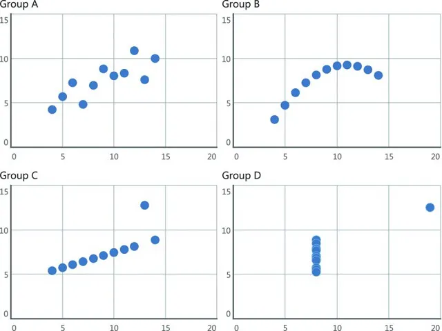
Why Do We Visualize Data?
| Group A | Group B | Group C | Group D | ||||
| x | y | x | y | x | y | x | y |
10.00 | 8.04 | 10.00 | 9.14 | 10.00 | 7.46 | 8.00 | 6.58 |
8.00 | 6.95 | 8.00 | 8.14 | 8.00 | 6.77 | 8.00 | 5.76 |
13.00 | 7.58 | 13.00 | 8.74 | 13.00 | 12.74 | 8.00 | 7.71 |
9.00 | 8.81 | 9.00 | 8.77 | 9.00 | 7.11 | 8.00 | 8.84 |
11.00 | 8.33 | 11.00 | 9.26 | 11.00 | 7.81 | 8.00 | 8.47 |
14.00 | 9.96 | 14.00 | 8.10 | 14.00 | 8.84 | 8.00 | 7.04 |
6.00 | 7.24 | 6.00 | 6.13 | 6.00 | 6.08 | 8.00 | 5.25 |
4.00 | 4.26 | 4.00 | 3.10 | 4.00 | 5.39 | 19.00 | 12.50 |
12.00 | 10.84 | 12.00 | 9.13 | 12.00 | 8.15 | 8.00 | 5.56 |
7.00 | 4.82 | 7.00 | 7.26 | 7.00 | 6.42 | 8.00 | 7.91 |
5.00 | 5.68 | 5.00 | 4.74 | 5.00 | 5.73 | 8.00 | 6.89 |

Table of contents
- Cover
- Title page
- Copyright
- Acknowledgments
- About the Authors
- Introduction
- PART I A STRONG FOUNDATION
- PART II THE SCENARIOS
- PART III SUCCEEDING IN THE REAL WORLD
- Glossary
- Bibliography
- Index
- EULA