The first thing to learn is to understand how a Japanese candlestick can take shape.
The most evident difference between a traditional financial chart and a Japanese candlestick is about how they can be observed by traders. A candlestick is a price line divided into many single bars, which are similar to a candle.
Each of them takes shape and develops according to two factors:
The temporal sample with which the construction of a price chart is planned;
The volatility measure that the financial tool has shown while it is observed.
These points immediately highlight an interesting norm: the Japanese candlesticks can visually offer a different representation of the price volatility, which is a factor that facilitates enormously the task to understand the markets. The easiest way to notice this difference consists in comparing the same financial tool according to the graphic representation rules.
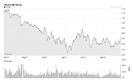
All the graphs that we usually know, which come from the specialized press and the main financial media, are the so-called ‘linear type’.
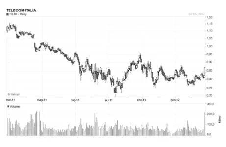
In the image below, you can observe that the price course is shown as a line that moves with the passage of time.
In this kind of graph, which is an example of a bear trend, you can literally see and understand what a trend course is:
The most evident difference between a traditional financial chart and a Japanese candlestick is about how they can be observed by traders. A candlestick is a price line divided into many single bars, which are similar to a candle.
Each of them takes shape and develops according to two factors:
The temporal sample with which the construction of a price chart is planned;
The volatility measure that the financial tool has shown while it is observed.
These points immediately highlight an interesting norm: the Japanese candlesticks can visually offer a different representation of the price volatility, which is a factor that facilitates enormously the task to understand the markets. The easiest way to notice this difference consists in comparing the same financial tool according to the graphic representation rules.
All the graphs that we usually know, which come from the specialized press and the main financial media, are the so-called ‘linear type’.
In the image below, you can observe that the price course is shown as a line that moves with the passage of time.
In this kind of graph, which is an example of a bear trend, you can literally see and understand what a trend course is:
Here is an example:
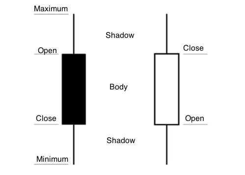
On the left side of the bar, there is a hyphen showing the opening price, while on the right one it is possible to observe the closing price. We see through an enlargement the details of what we have just stated:
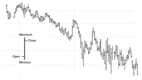
The dimension of the peaks and dips of the day allows getting precious information if you want to understand the course of the market and the price struggle between buyers and sellers.
However, thanks to the Japanese candlesticks, we can be offered an even more interesting graphic visualization:
Please, observe how the course dimension of the prices changes, according to their representation, which is common among candlesticks.
Apart from the measure of the (linear) trend and the openings and closings comprehension, the bar color immediately offers us a visual relation as far as the purchases or sales predominance is concerned.
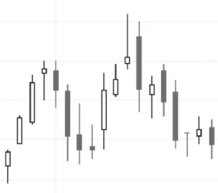
What really makes interesting this representation is the fact that the candlesticks set between the trend peaks and dips can offer some valid and anticipating signs about the possible continuation or investment of the price trend. The Japanese candlesticks research will let us anticipate so many changes that we can use them profitably during our trading activity.